
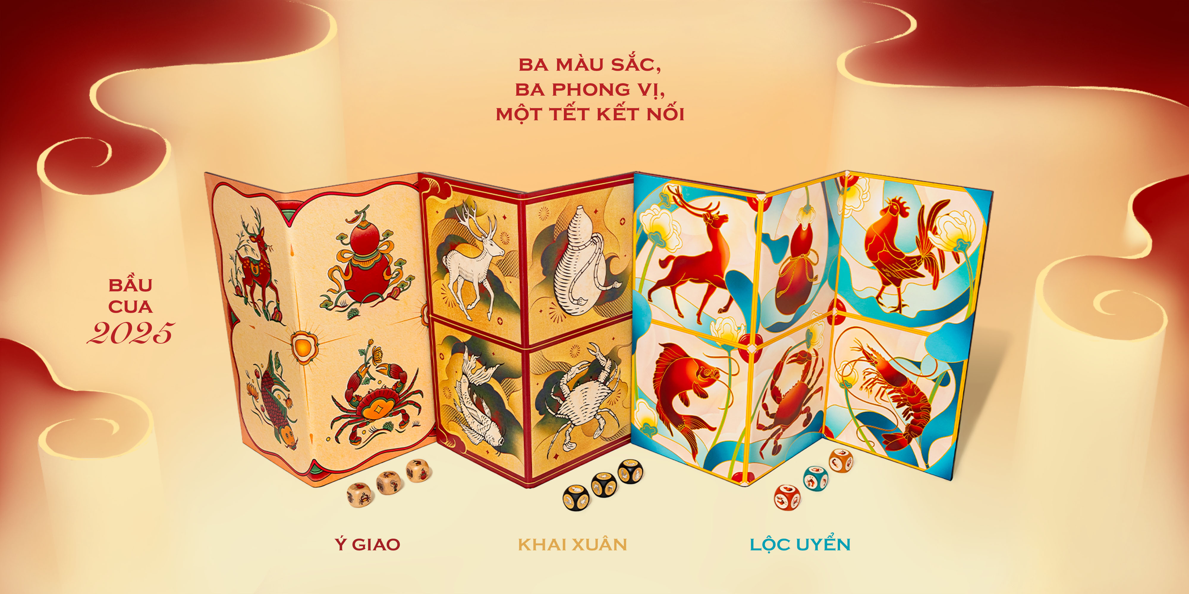
Returning to the Bầu Cua project for the 2025 edition felt like revisiting an old friend with a new mission. This year, my role expanded beyond promotion; I was tasked with breathing new life into the product’s visual soul, ensuring that three years of disparate designs could finally speak the same language.
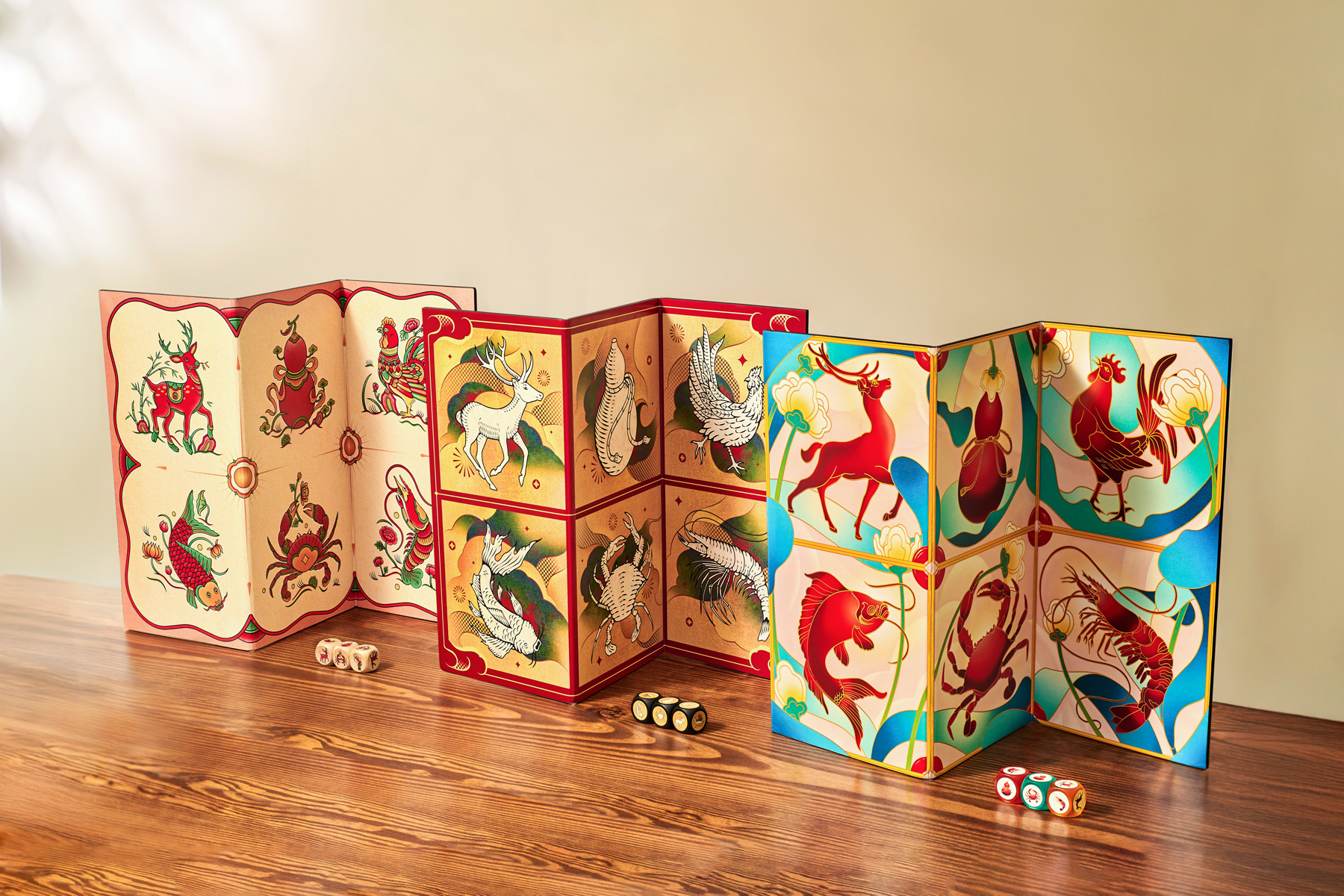
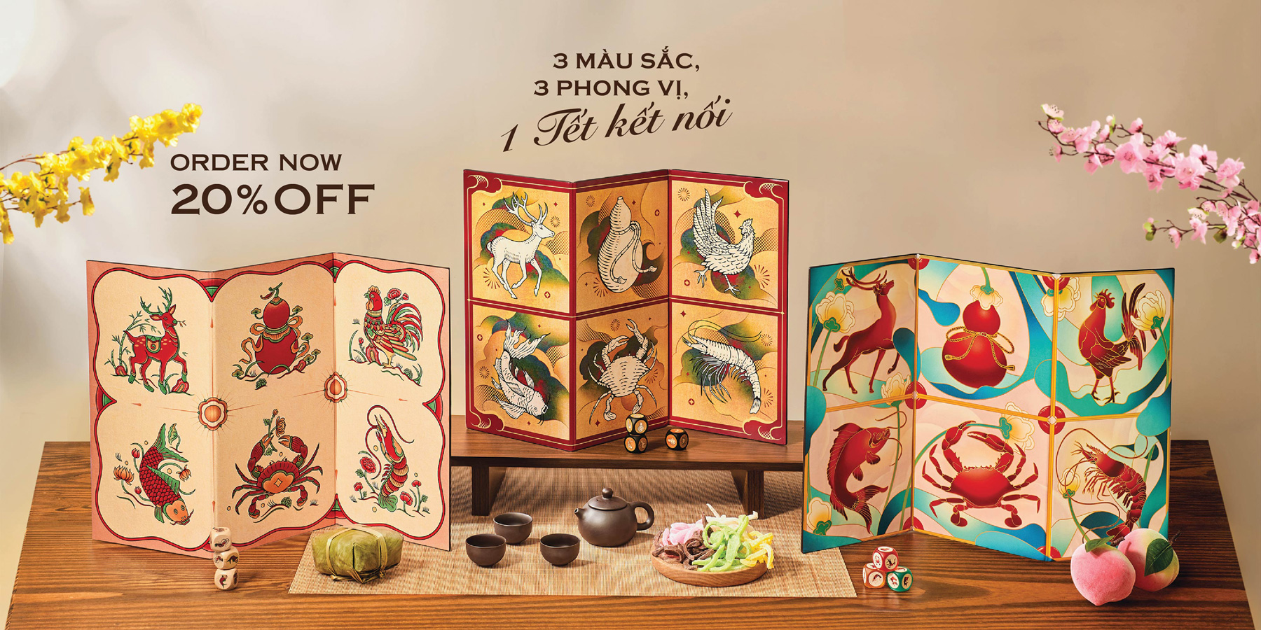
The 2025 brief was a lesson in creative pragmatism. The goal was to take the successful artworks from 2022, 2023, and 2024 and optimize them for a wider, mass-market audience. By focusing on a "color refresh," we leveraged production efficiencies to lower costs without sacrificing the brand’s premium feel. My challenge was to make these "recycled" designs feel intentional and fresh—a true "Trilogy of Art" rather than a mere reprint.
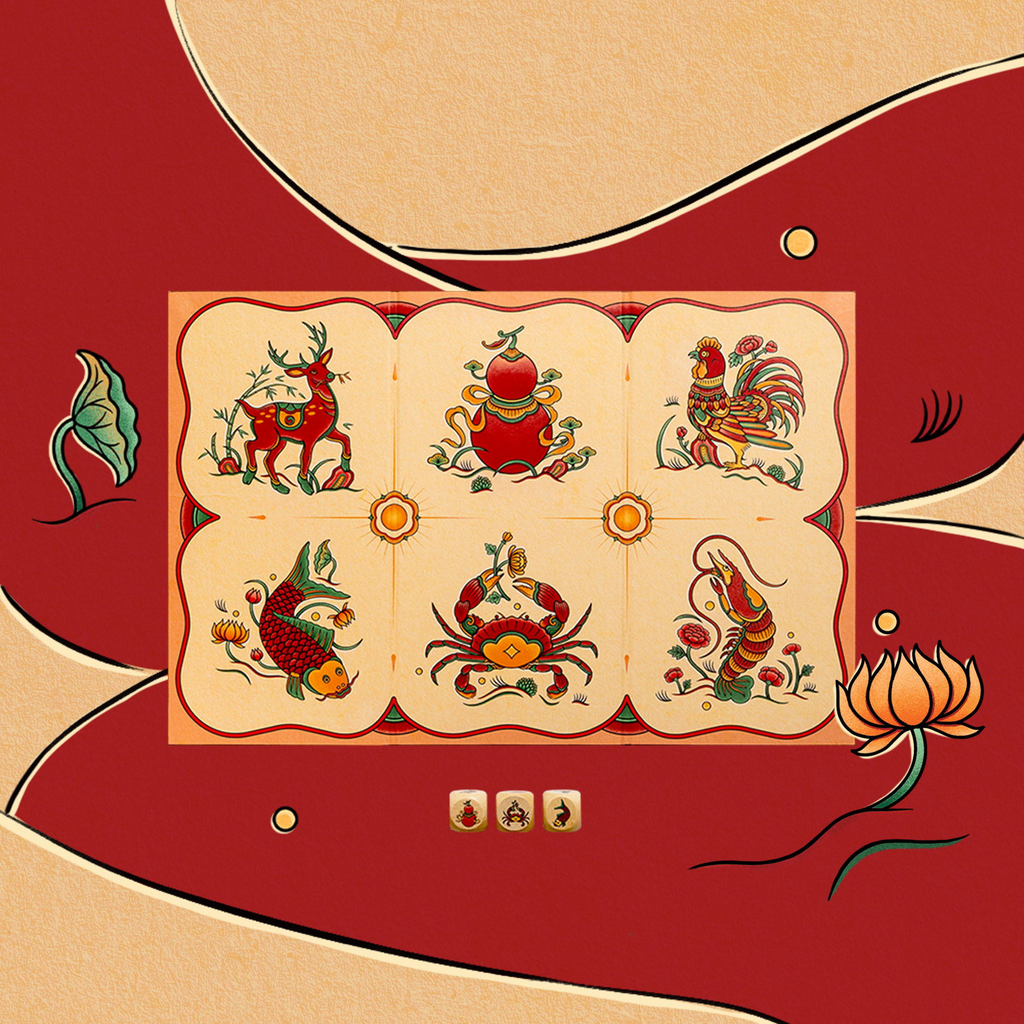
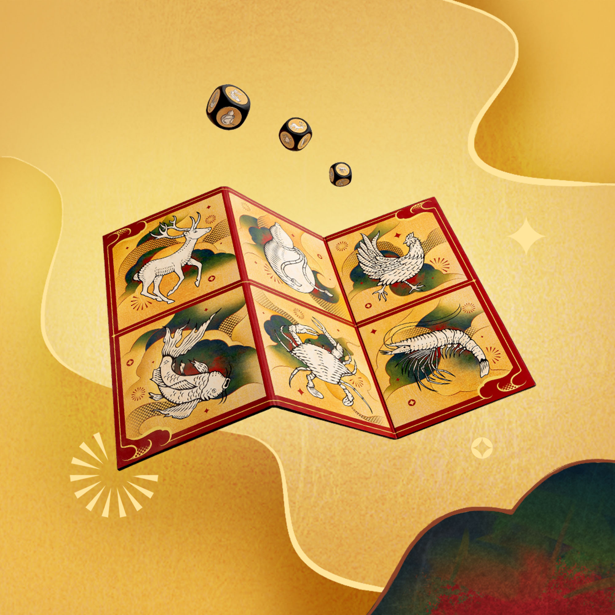
Art direction is about listening to what the existing work wants to become. By stripping away the original colors, I found that each year’s linework had a distinct personality, which I redefined through three new chromatic narratives:
The execution phase was defined by remote collaboration and meticulous refinement. Working closely with my collaborator, Trang, was seamless; despite the distance, our shared history let us work with shared intuition. Because the project centered so heavily on the artwork, the process required intensive visual calibration. We spent long hours fine-tuning every detail and color balance to ensure the final output reached the highest level of polish.
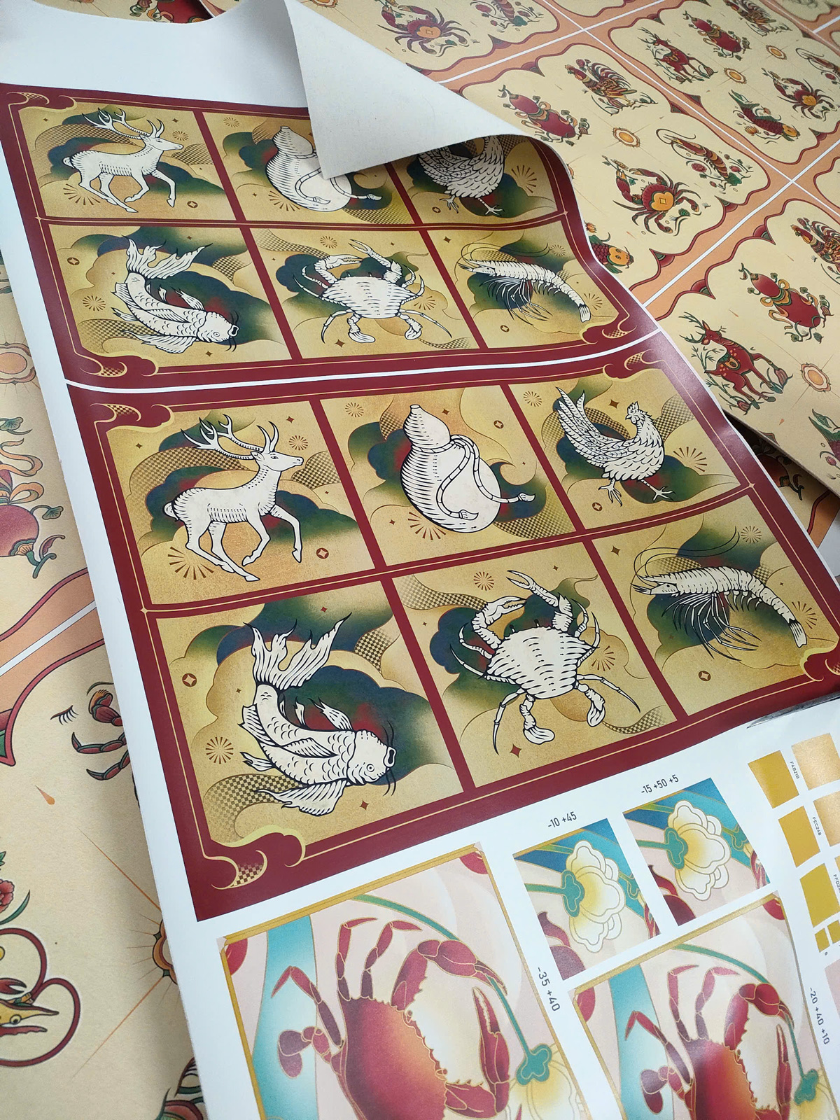
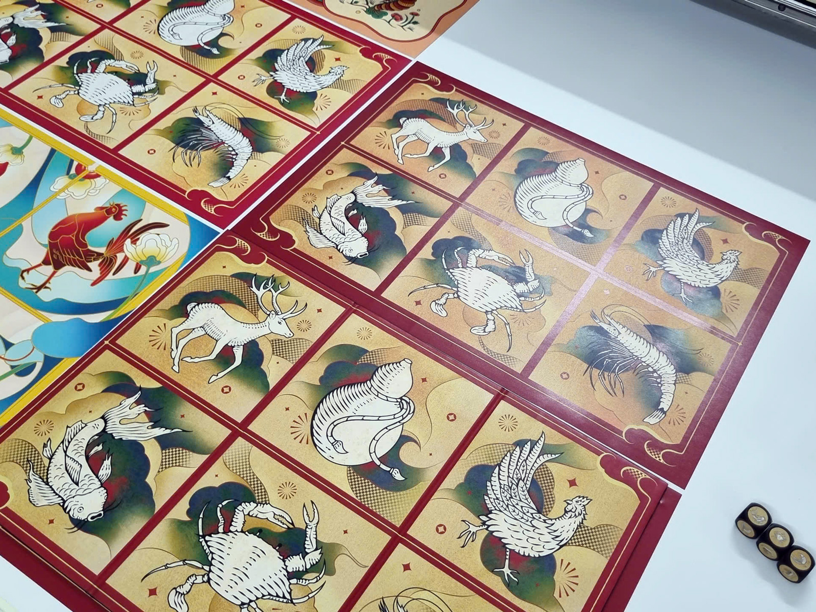 Test prints on PU leather. At some point, Trang went to the printing house to get the color done right.
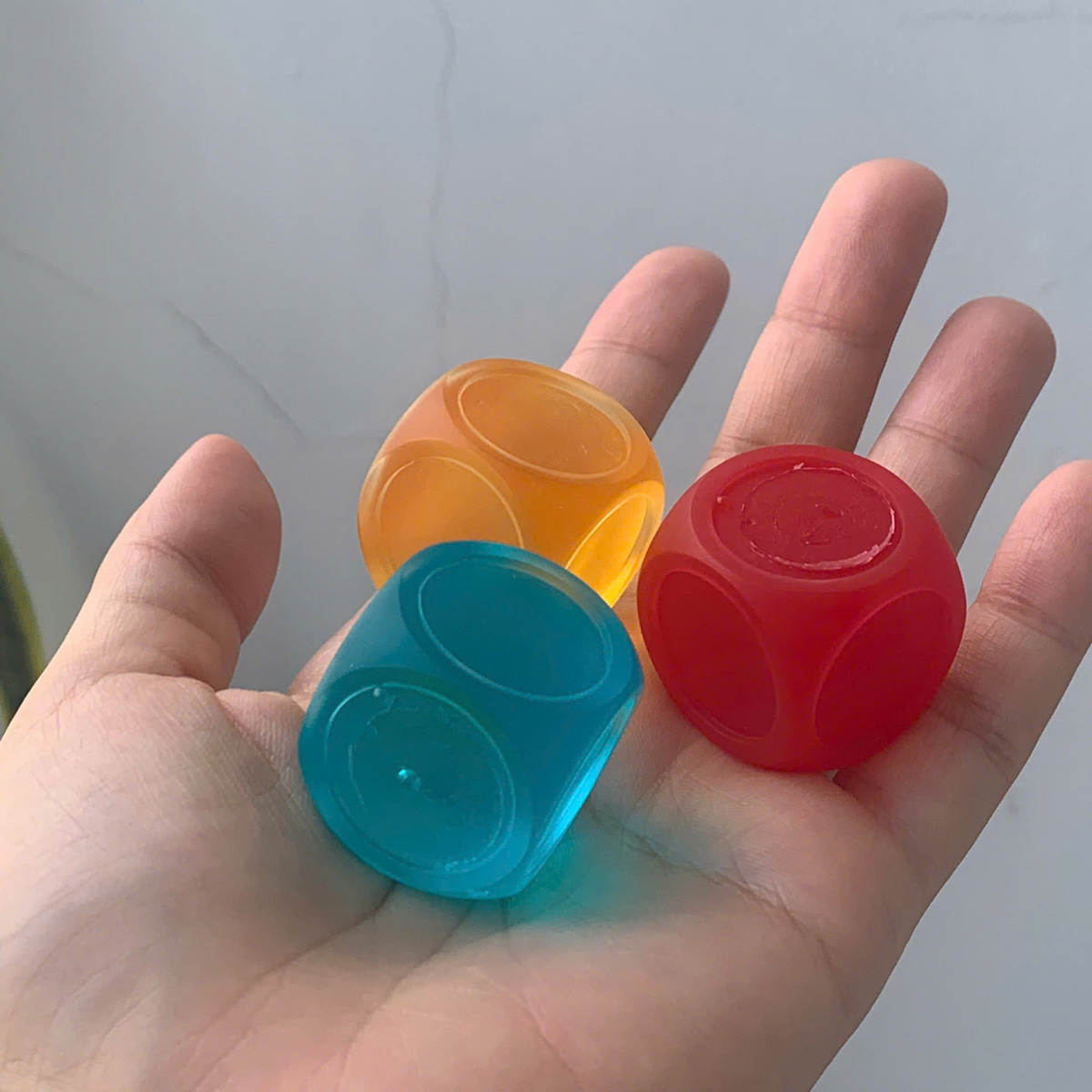
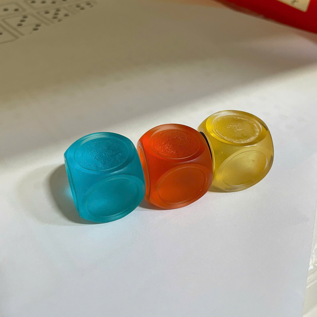
As the boards neared completion, we extended this focus to the entire ecosystem, creating the right dice and a cohesive packaging suite that included the brochure and carry-on bag.
As the Visual Lead, I managed the creative output across a high-pressure, two-phase rollout with a lean team of three:
I designed the Key Visual, utilizing fluid, serpentine curves to weave the three artworks into a single graphic identity.
My role shifted toward collaborative direction for the official concept photography. I worked alongside the team lead to build three distinct Tết-themed environments, each tailored to match the specific personality of the three Bầu Cua versions.
To introduce the 2025 vision, I directed and co-produced an animated short that translated the trilogy’s static artwork into a fluid narrative. The animation uses the 2025 Snake as a central guide, navigating through the distinct visual "gardens" of each edition - merging the structural, organic, and traditional styles into one continuous journey. While the aesthetics vary across the three gardens, the animation serves as the unifying thread, ultimately delivering a message of Reunion that connects the disparate designs into a single, cohesive story for the new year.
(to be updated)
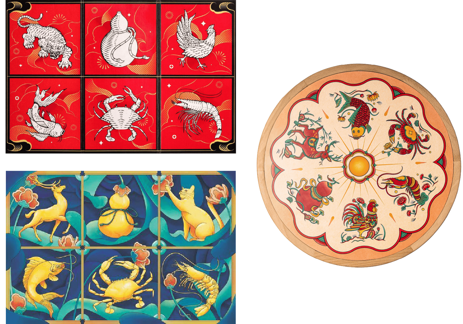 Designs of previous years
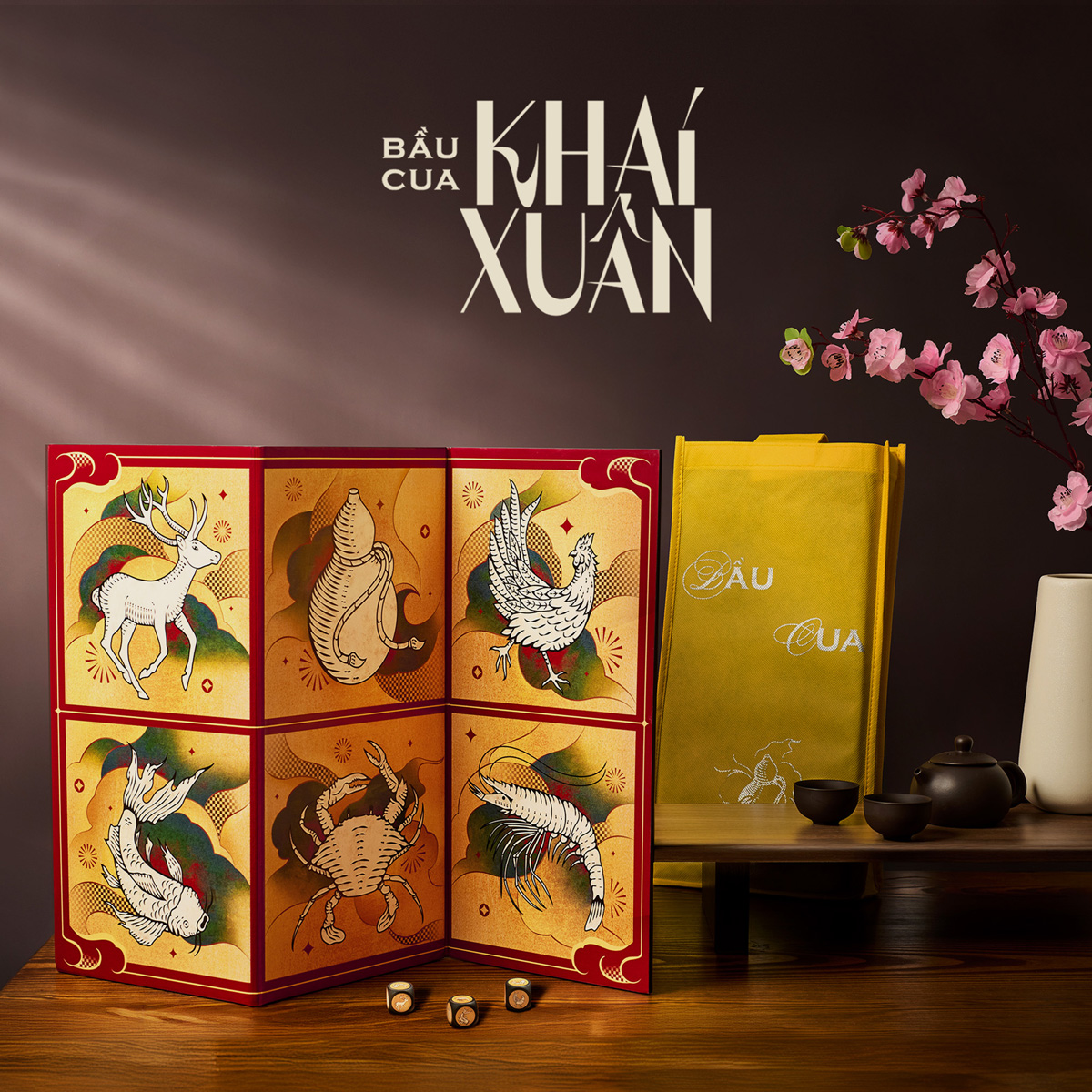
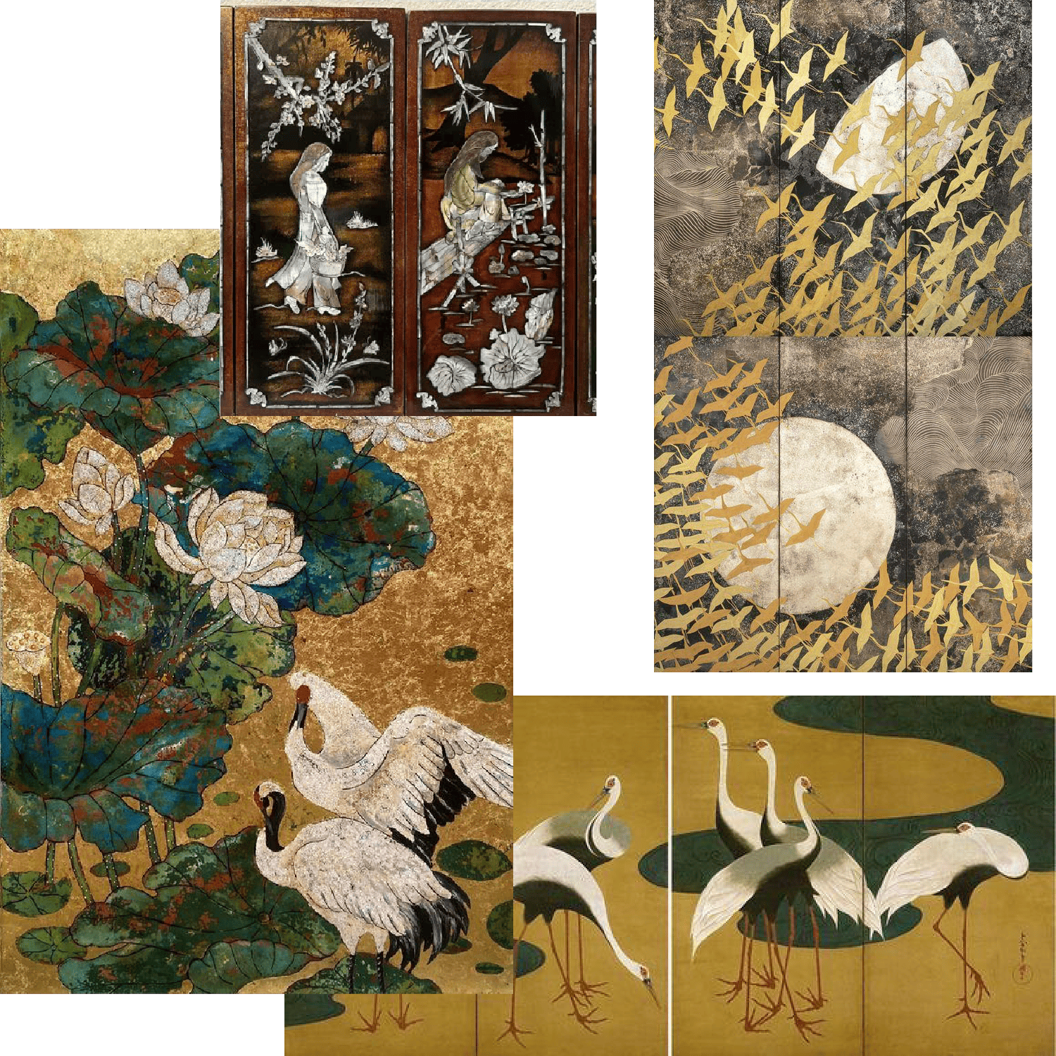 Lacquer - Khai Xuân
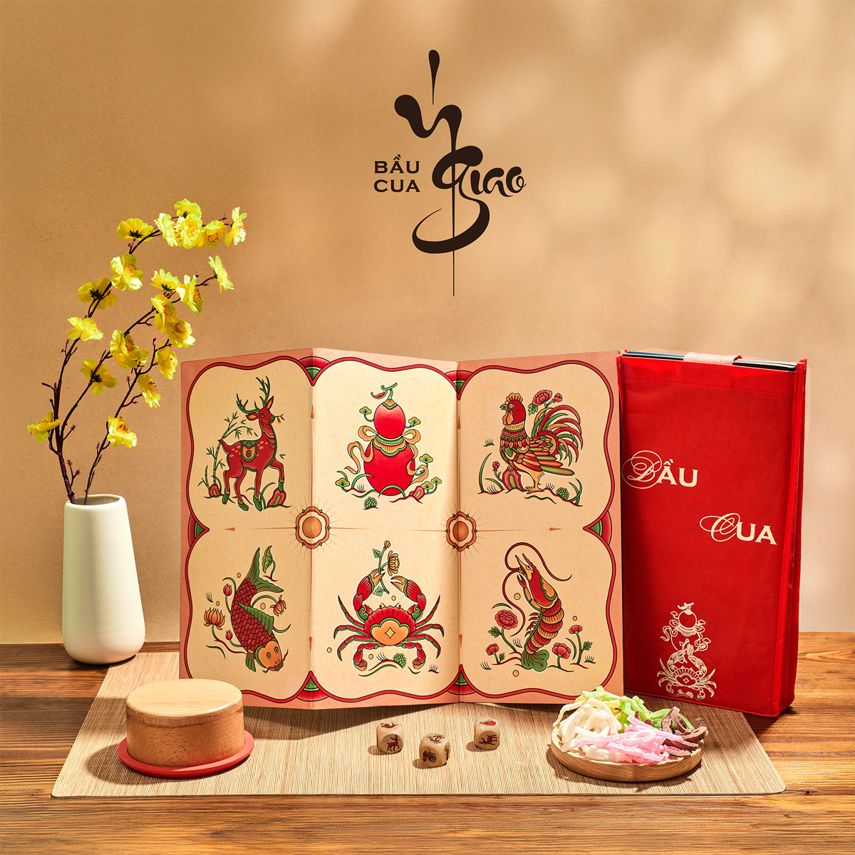
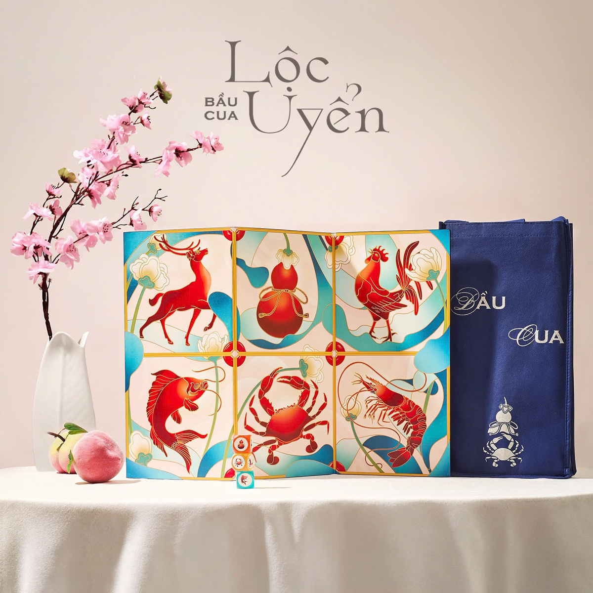
 Cloisonné - Lộc Uyển
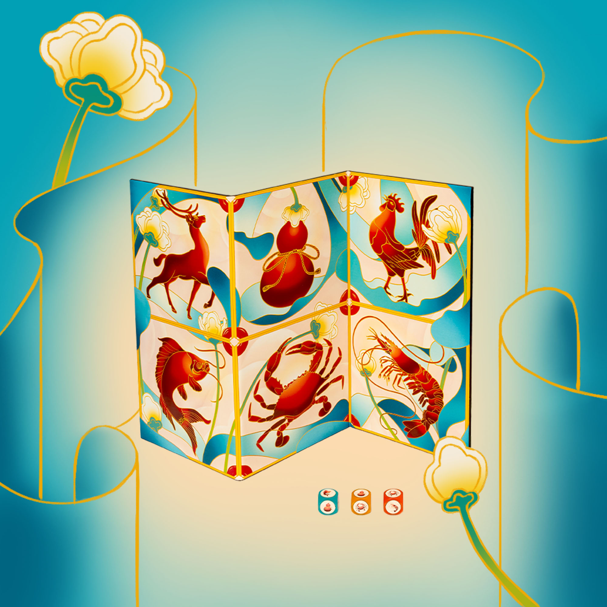
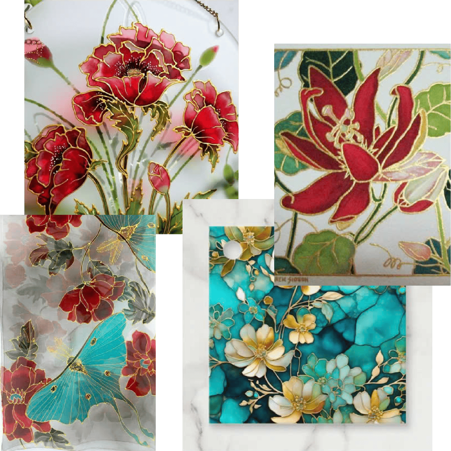
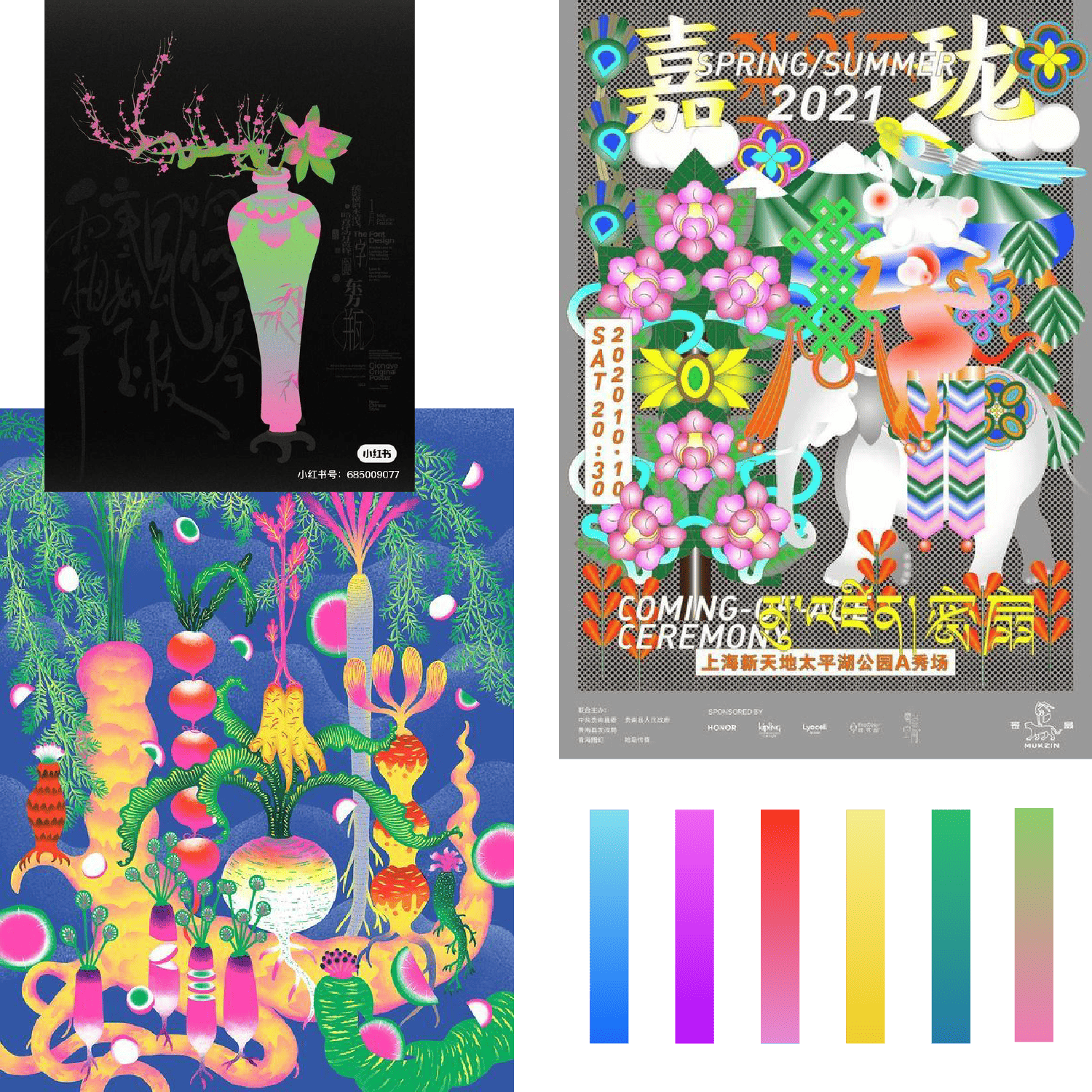 Multicolor Gradients - Ý Giao's rejected moodboard
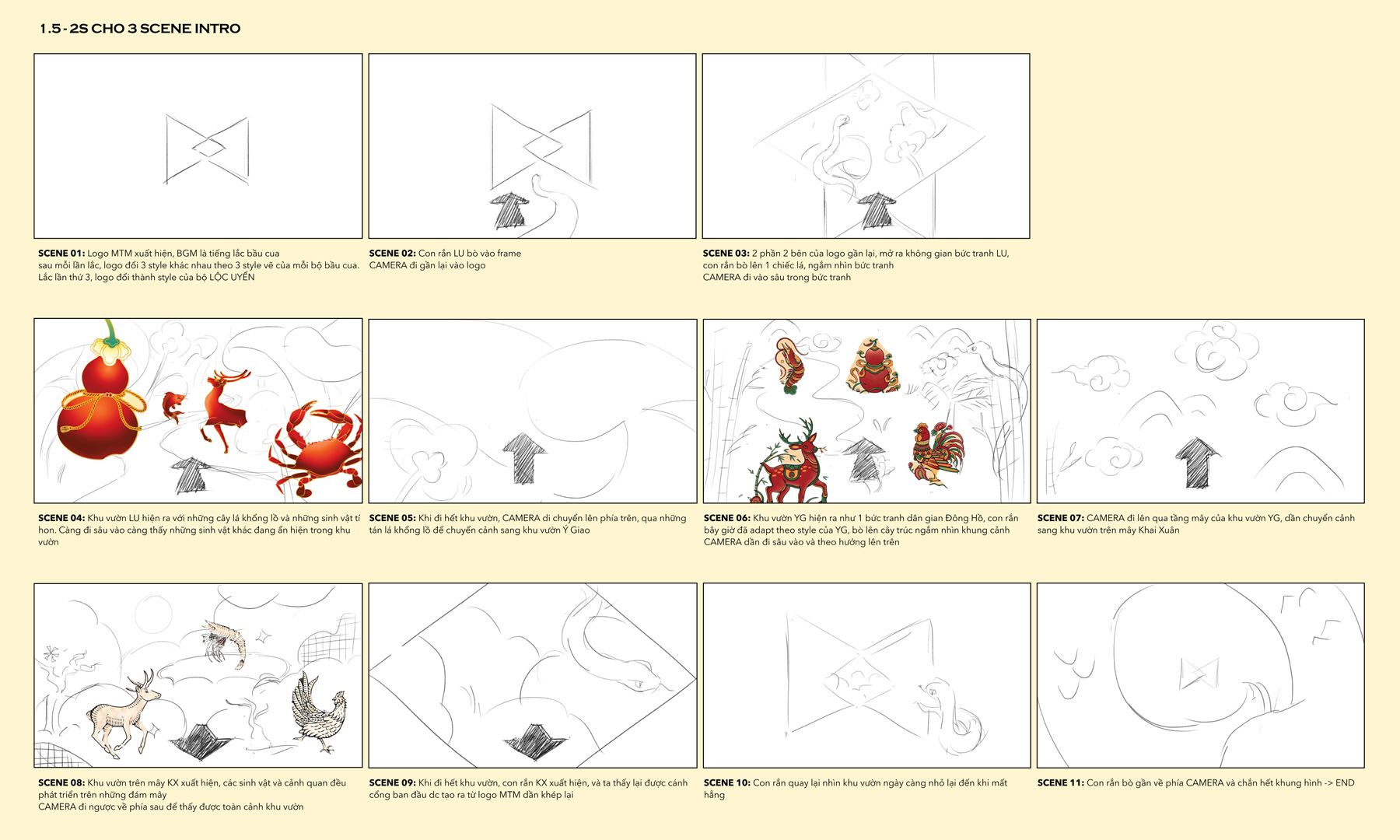 Storyboard for the animation
 Detailed sketch of each garden
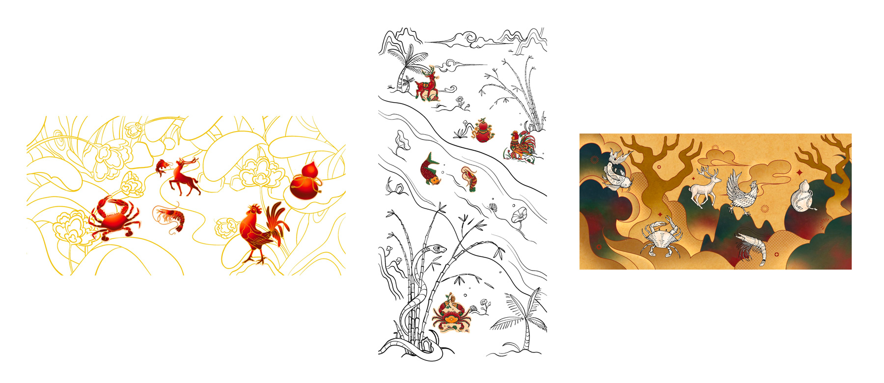
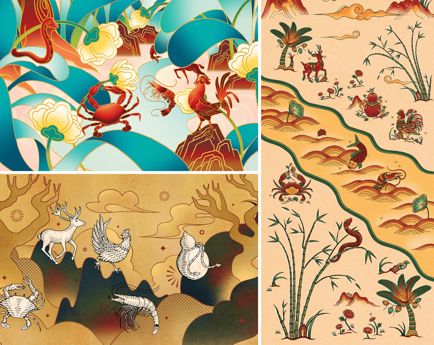 The full-colored layout for animation
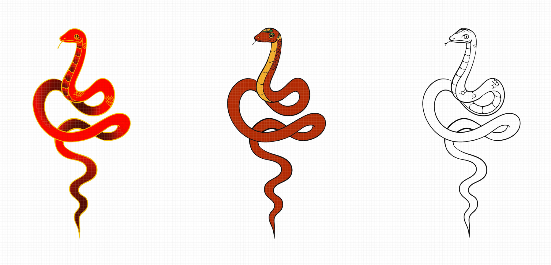 The snake, which change its' skin throughout the plot to match each theme

 My frame-by-frame snake animation breakdown