
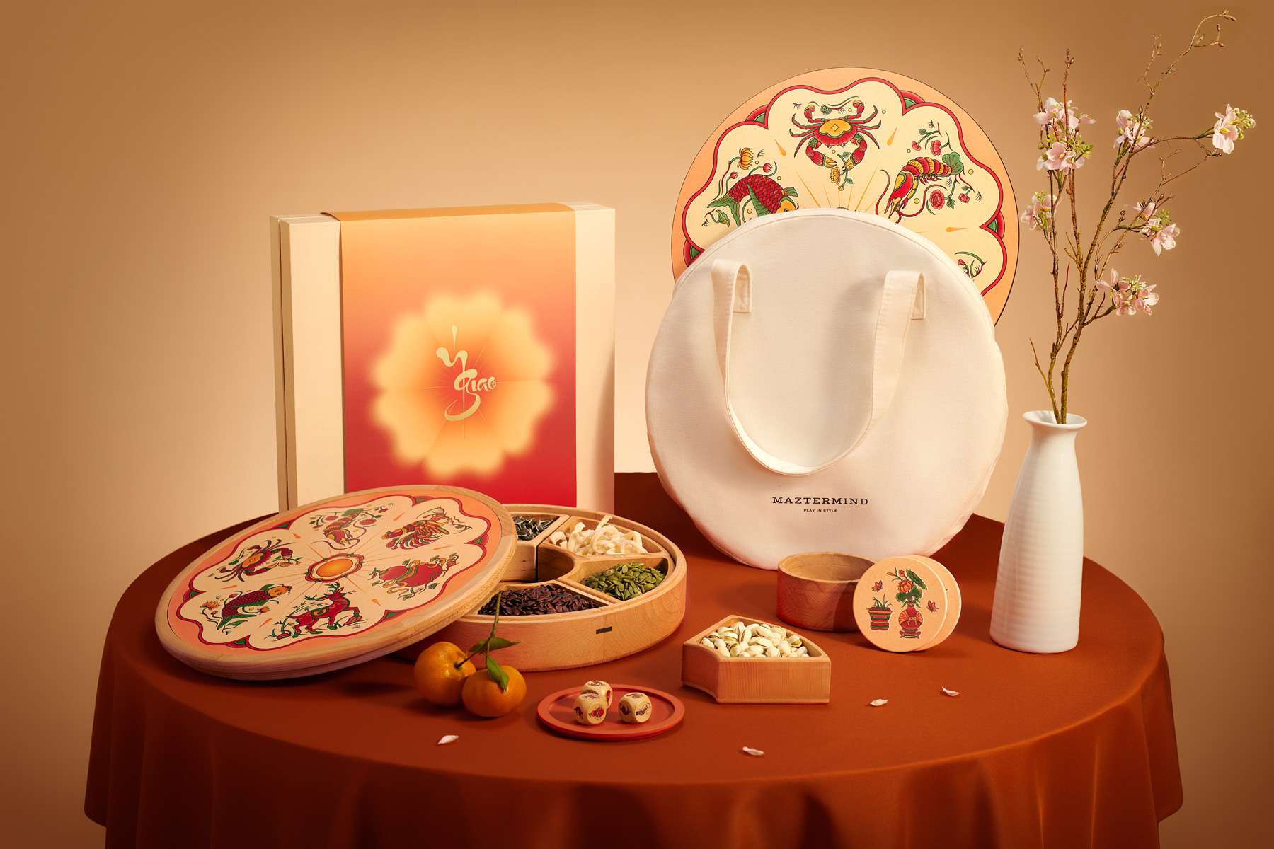
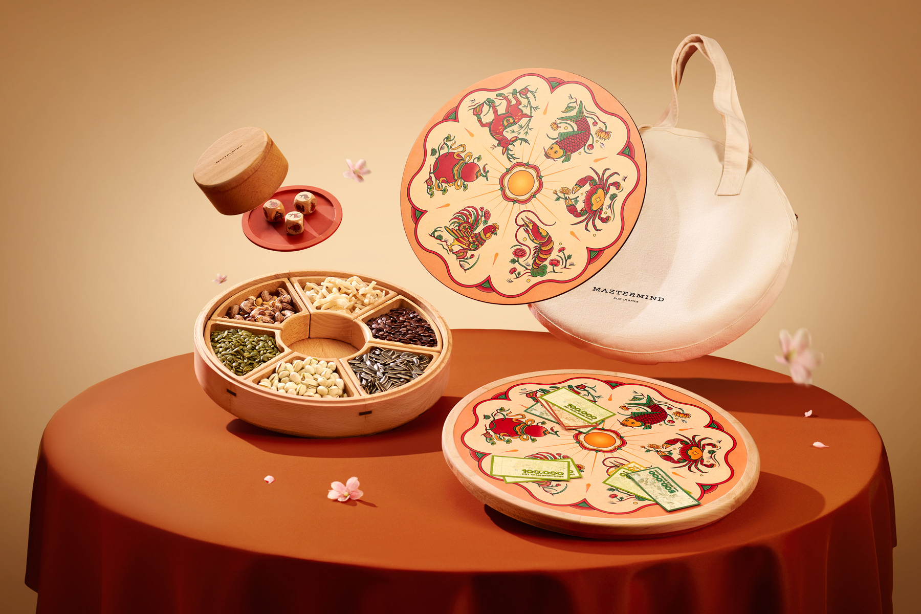
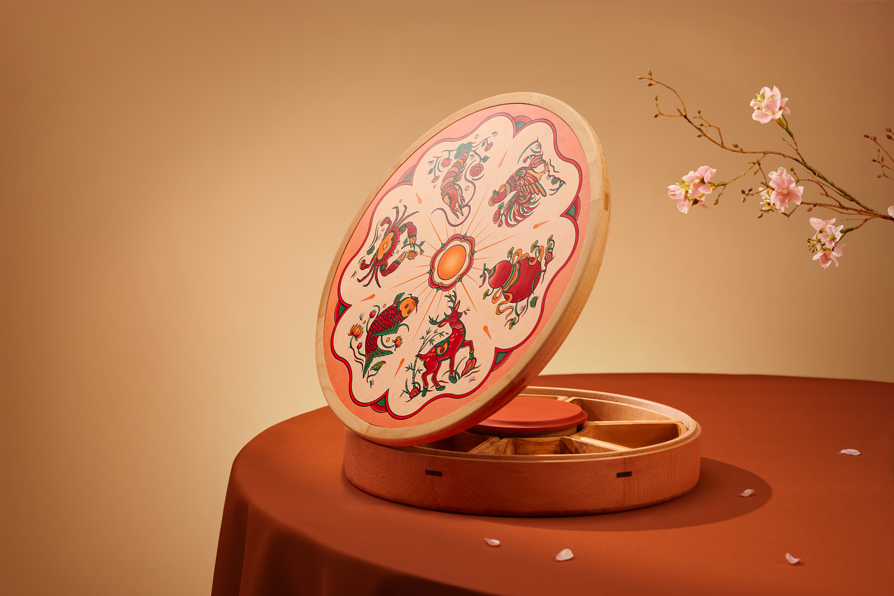
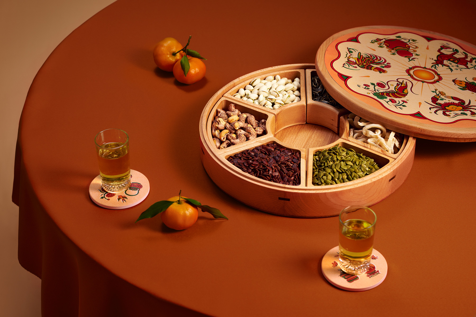
Continuing Maztermind’s Tết tradition, the 2024 edition was titled Ý Giao - representing a convergence of unique ideas. More than just a game, the set was designed with dual functionality as a Tết jam box. It was a small move toward sustainability, allowing the product to live on in the home long after the holidays are over.
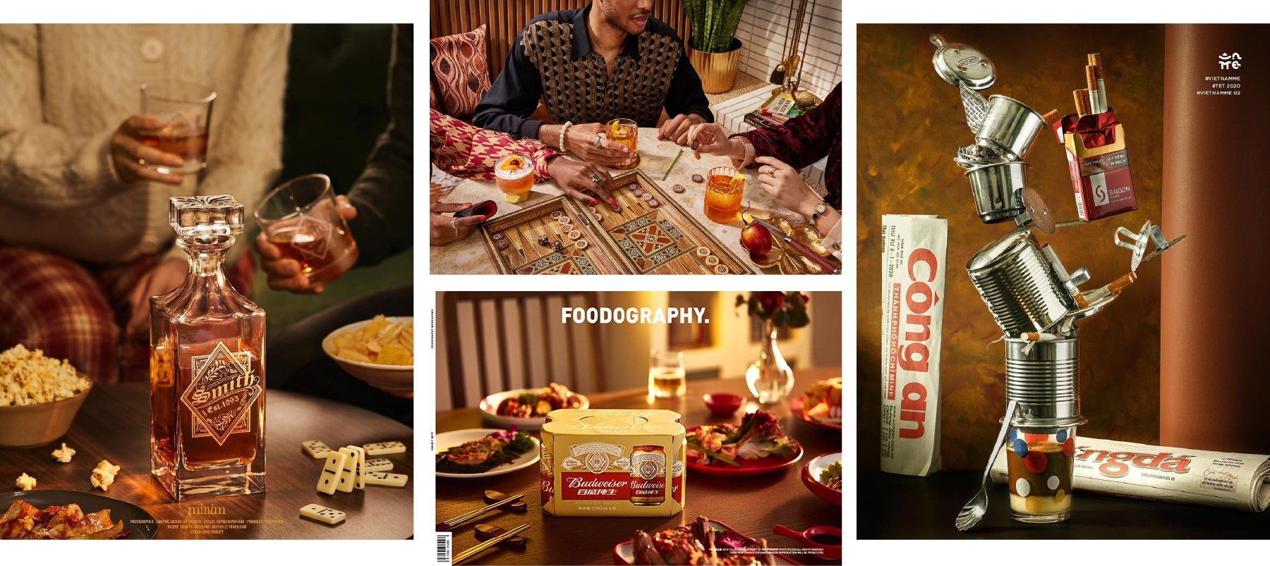
My practice for this project involved the graphic design for the logotype and packaging, alongside the art direction for the campaign’s photography and introductory video.
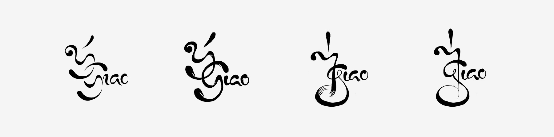
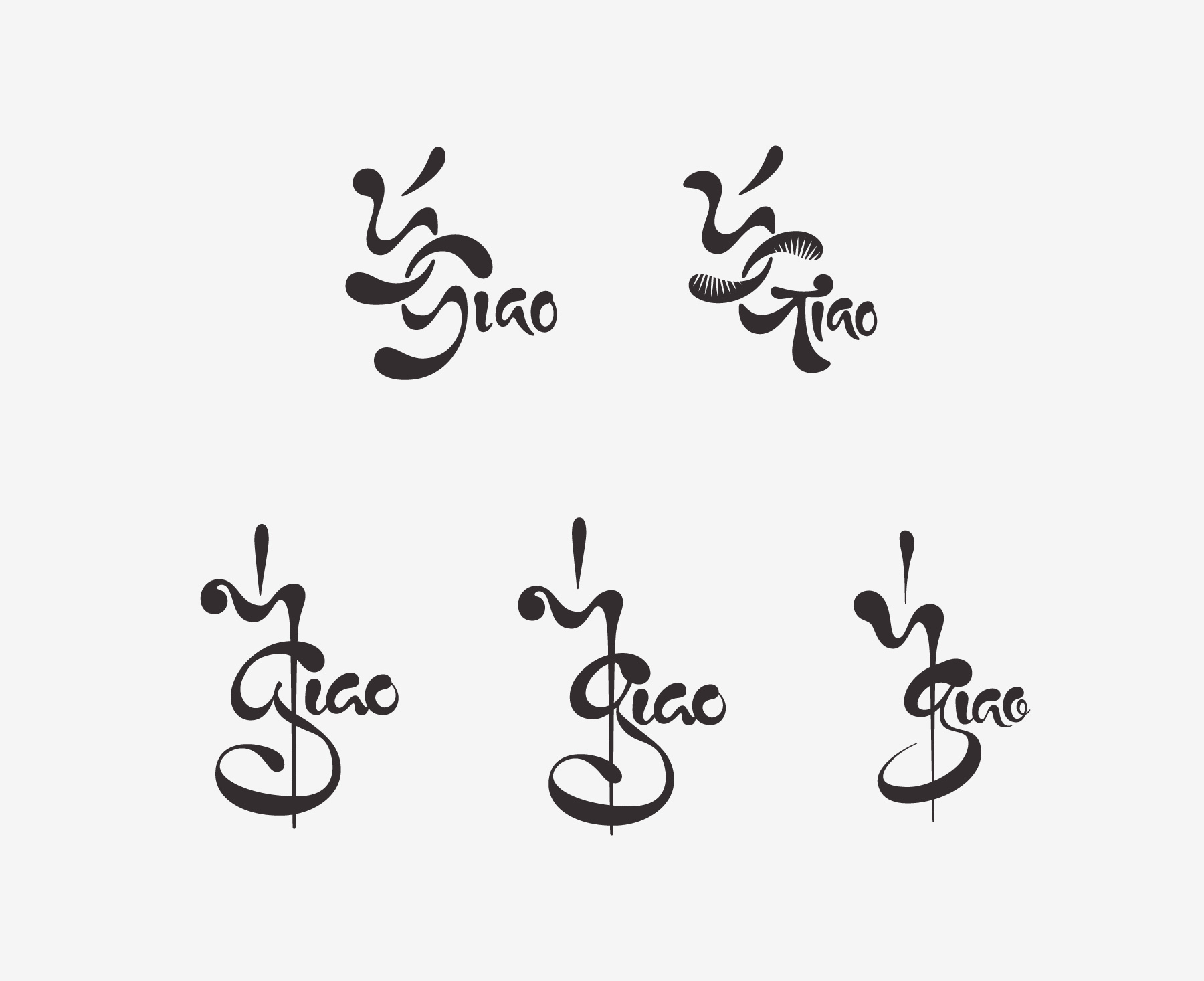
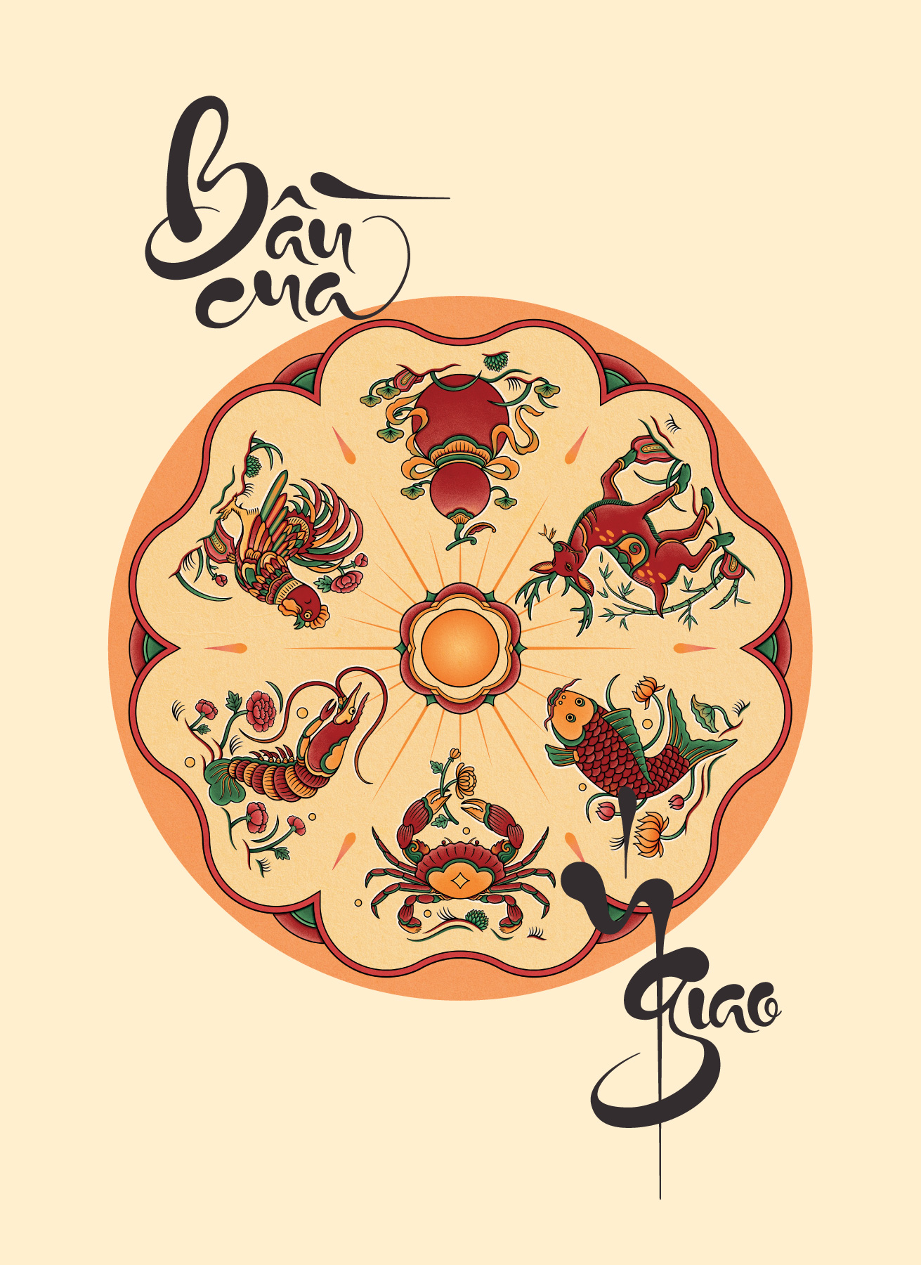
I spent a few thoughtful sessions on the logotype, exploring how to honor the Đông Hồ folk art inspiration within the product. I looked at Han script and traditional calligraphy to find a stroke language that felt right.
My sketches moved between two paths: one featuring soft, fluid curves and another rooted more deeply in calligraphic structures. I ended up with a result that felt balanced and honest - a quiet bridge between the old and the new.
In contrast to the detailed artwork found inside, I kept the exterior packaging simple and minimalist. This was a practical choice to help with production during the year-end rush, but it also creates a nice sense of curiosity for the recipient.
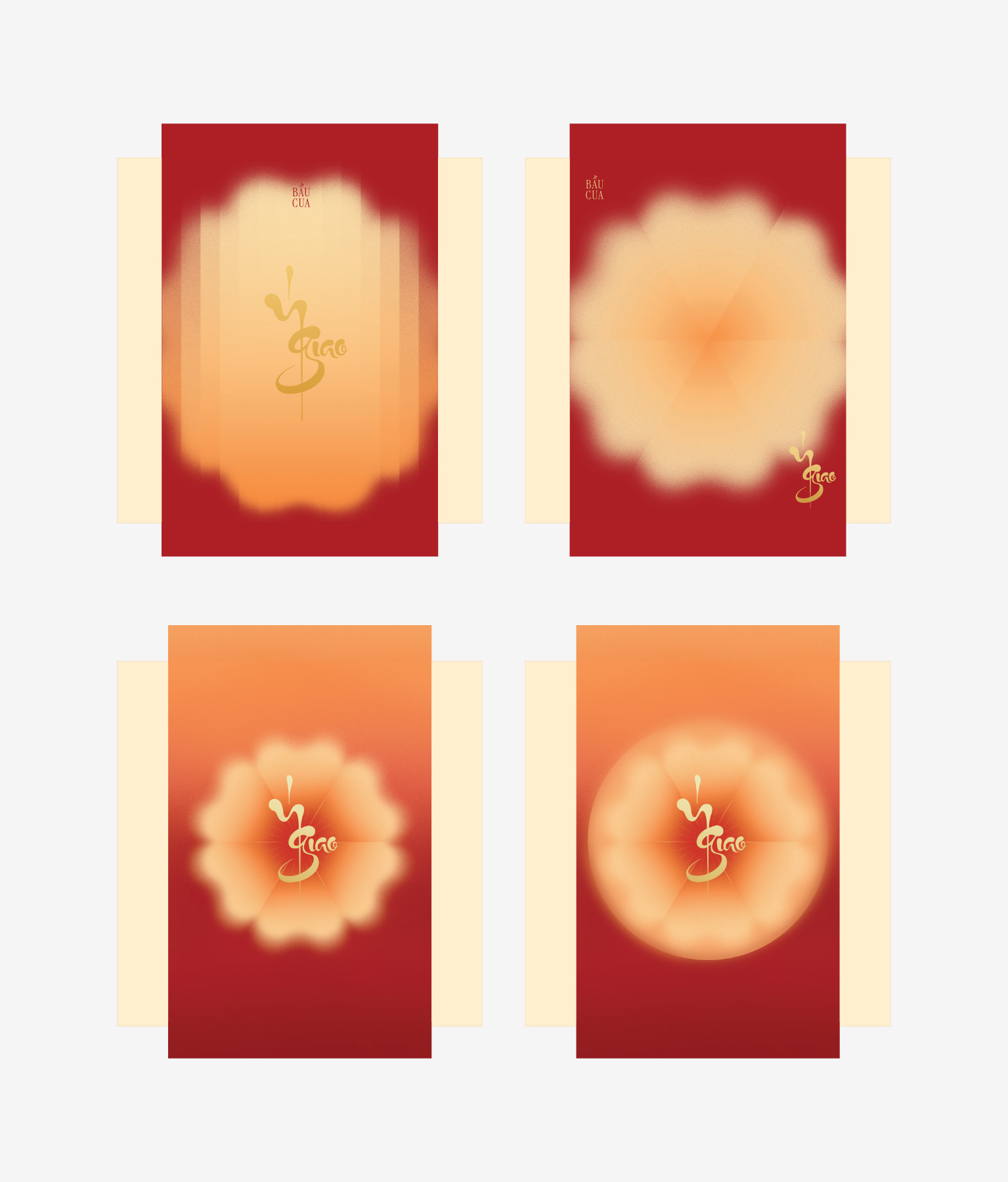
I used a paper band to symbolize the "intersection" of the name, utilizing traditional color tones to keep it grounded in the spirit of Tết. To keep the focus entirely on the new identity, I made the deliberate choice to remove the word “Bầu Cua” from the box, letting "Ý Giao" stand on its own.
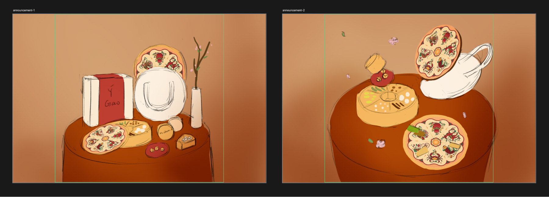
For the campaign, I directed the photography and video under the theme “Tri Xuân Tương Phùng” (Springtime reunion). I wanted the visuals to feel warm and nostalgic, capturing that sense of family connection that matches the soul of the artwork.
While the mood is intimate and warm, I kept the compositions quiet. By keeping the arrangements minimalist, I made sure the intricate details of the Bầu Cua set remained the hero of every frame.
 Sketch refinements
 Vector iterations
 Paper band variations
 Mood & tone
 Layout sketches
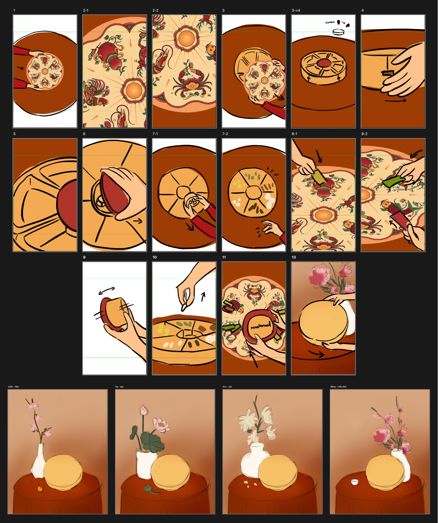 Intro Video Storyboard
 Additional “Bầu Cua” lettering for video composition