
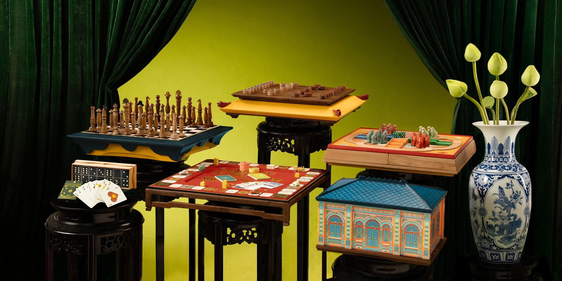
→ Indochine Collection → Pre-order Indochinopoly
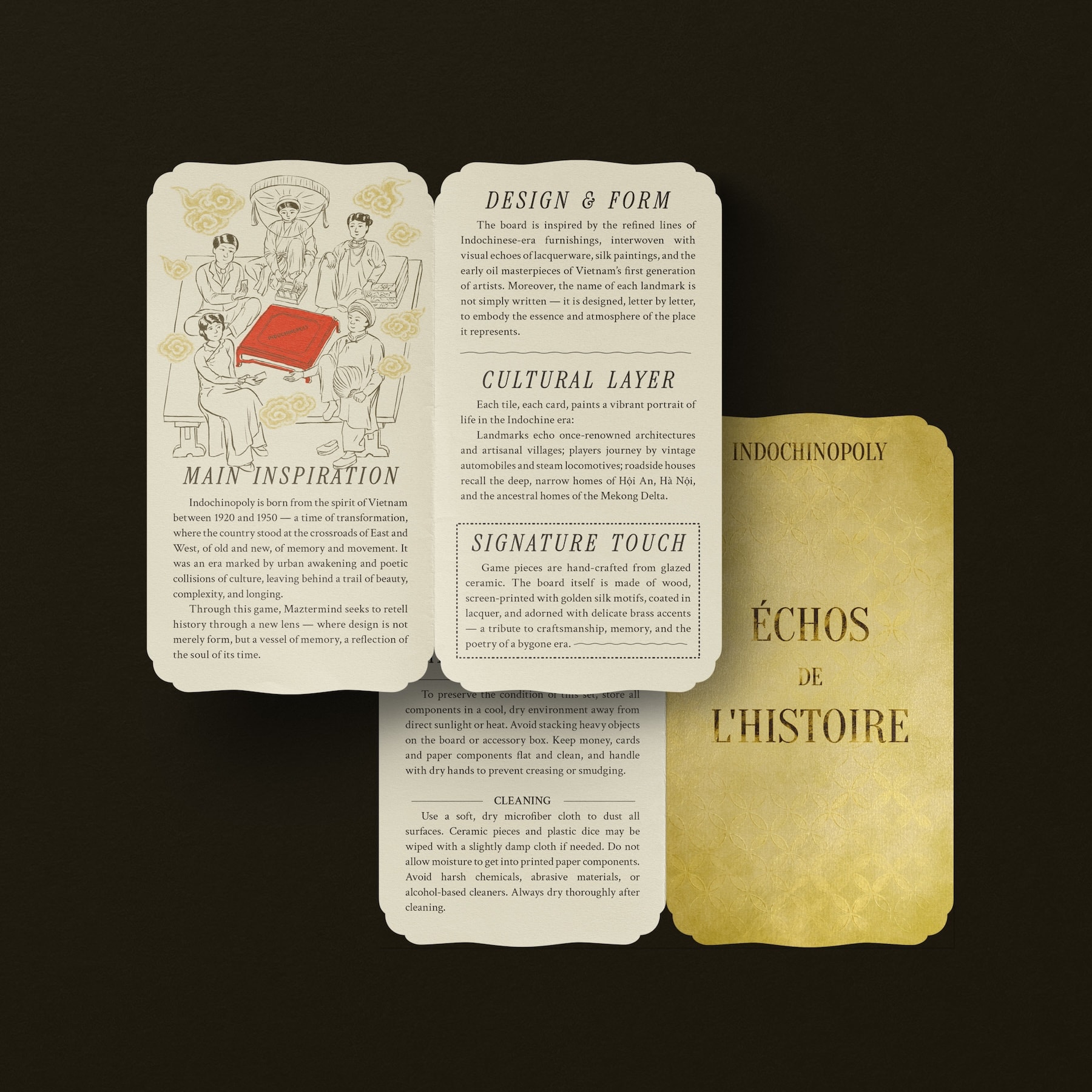
Indochinopoly stems from my ongoing interest in researching and interpreting historical design languages. As design lead, I brought together research on the Indochine style and its broader cultural context into a unified system.
Rather than treating Indochine purely as an architectural style, I approached it as a moment of cultural intersection - where French neoclassical structures met local materials, climate, and ways of living across Vietnam, Laos, and Cambodia. This blend extended beyond buildings into everyday life, forming a layered visual and social identity. What drew me in was this tension - between adaptation and preservation, between imposed structures and local ways of living.
The project imagines a return to Vietnam between the 1920s and 1950s - a period when tradition and Western influence coexisted. Players move through locations, professions, and cultural fragments that reflect a society in flux. Ultimately, Indochinopoly is less about recreating a fixed past and more about constructing a space where these fragments of history, design, and culture are experienced through play.
 Concept photos by Maztermind
The core idea is simple: time travel. The game presents a reconstructed past - not as a fixed historical document, but as a designed experience. When I joined, much of the core structure was already in place, allowing me to focus on expressing its world visually and materially. This constraint became a useful starting point rather than a limitation.
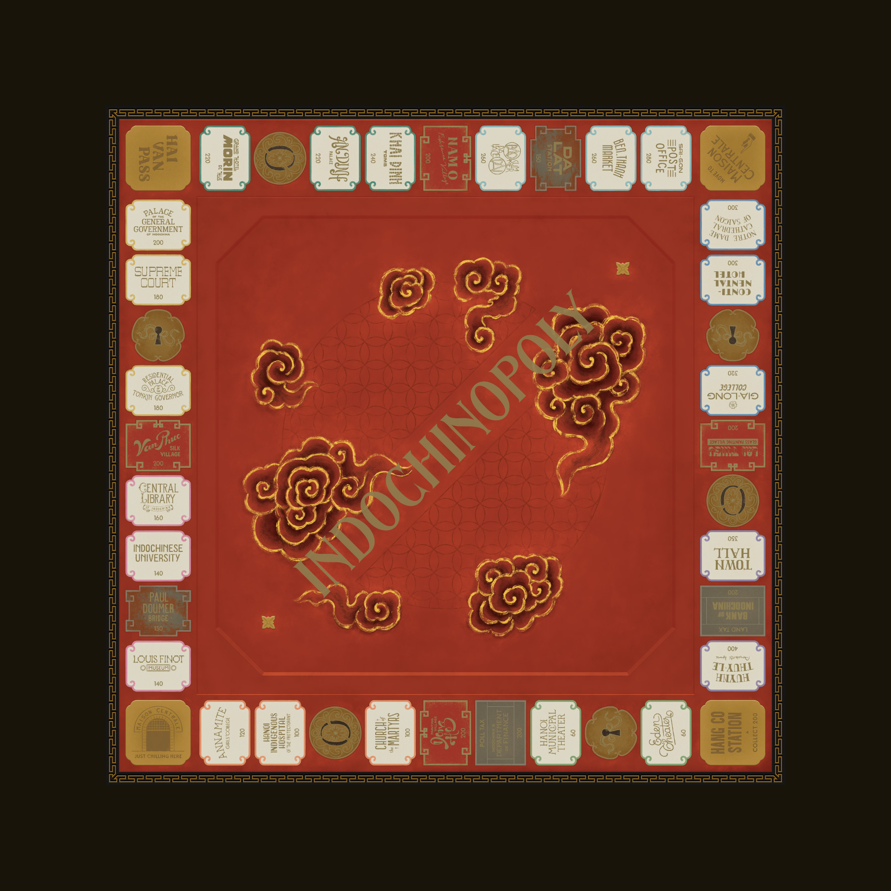
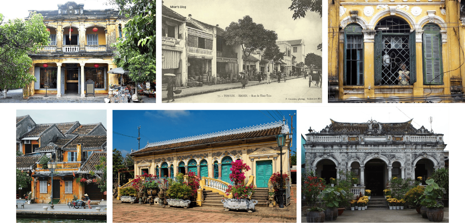
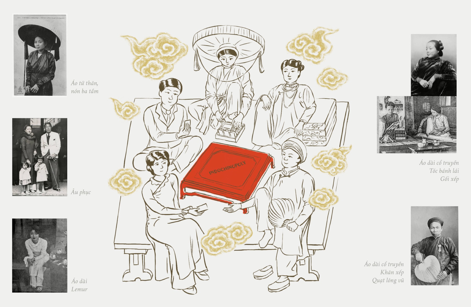
The game brings together a wide range of references from across Vietnam, including architectural landmarks, traditional craft villages, social classes, professions, and cultural activities.
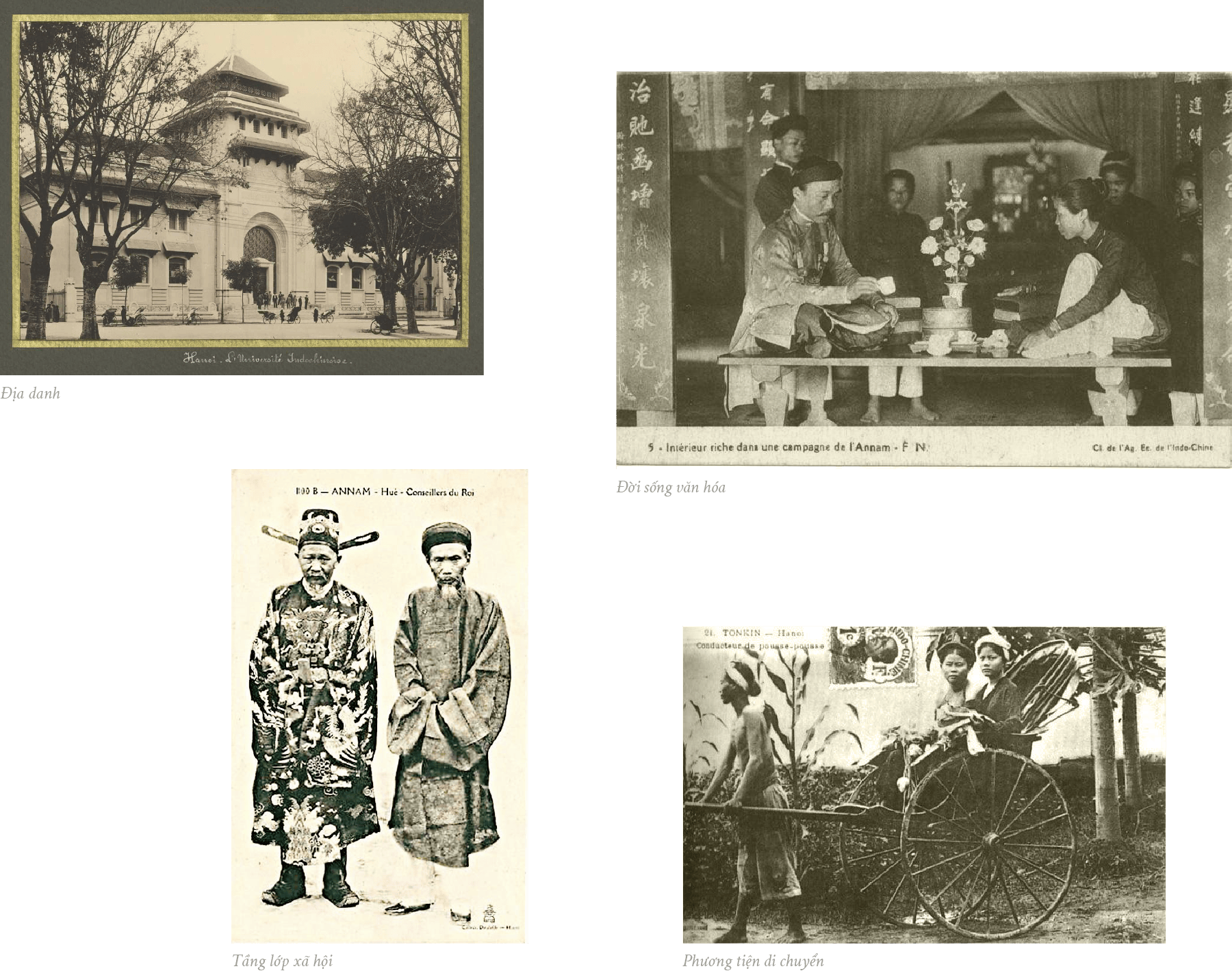
These elements build a layered picture of everyday life during the period - a society undergoing significant change, absorbing Western influence while maintaining local traditions. I was particularly interested in how these contrasts could coexist within a single system.
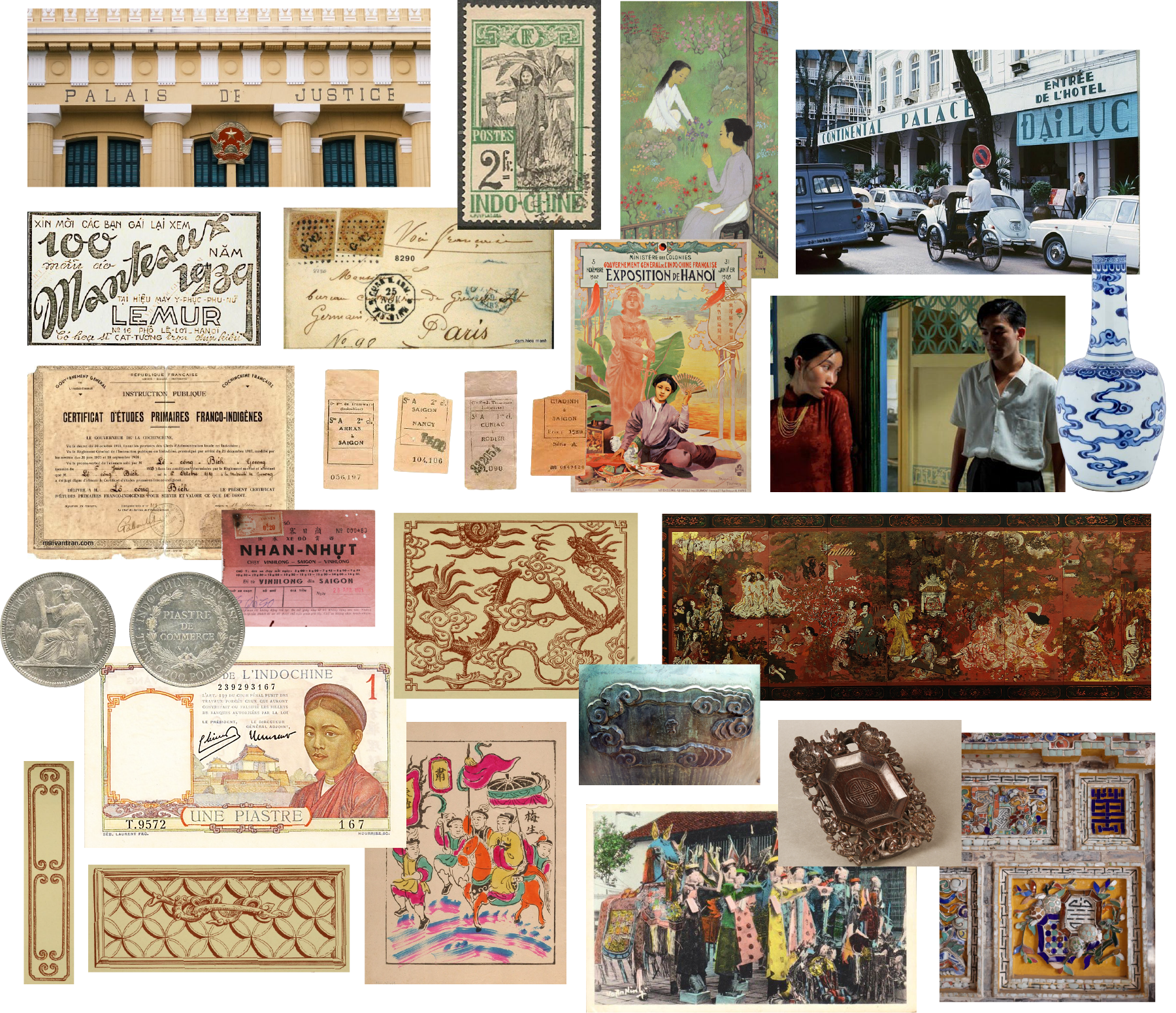
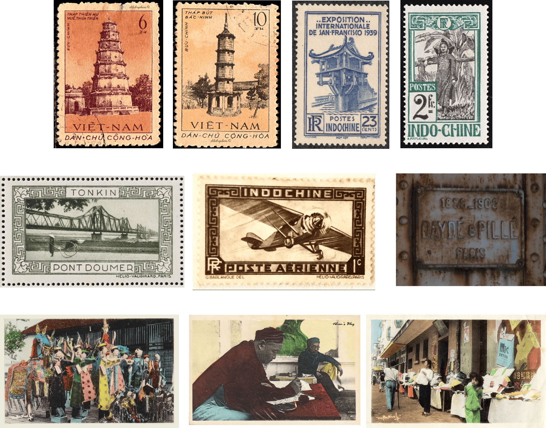
The visual system references multiple aspects of Indochine-period life - architecture, interiors, printed matter, transportation, and visual culture.
The direction leans toward reconstruction rather than replication. Elements are simplified and reinterpreted to fit a cohesive system, while retaining a sense of historical texture. The goal wasn’t accuracy alone, but a balance between clarity and atmosphere.
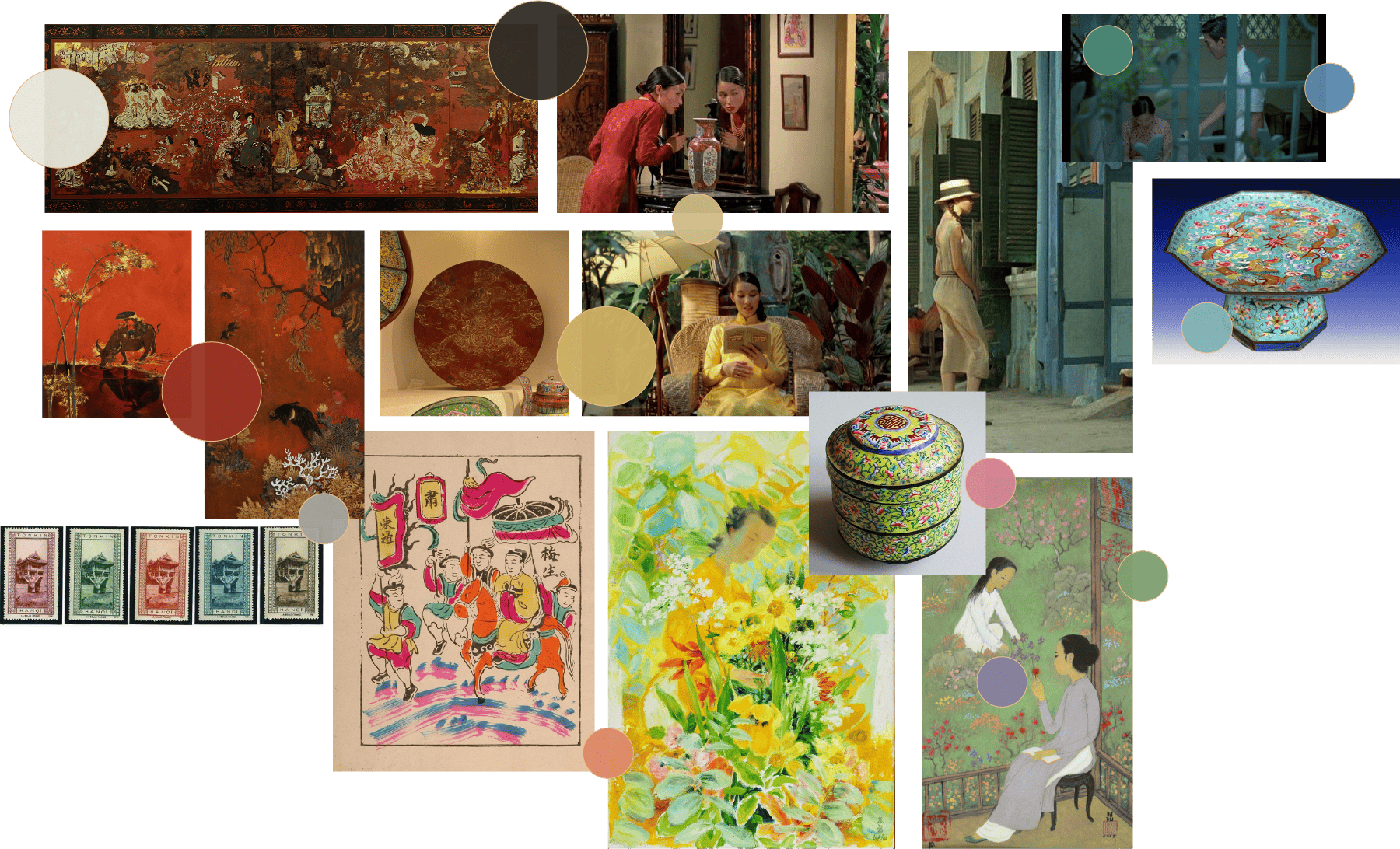
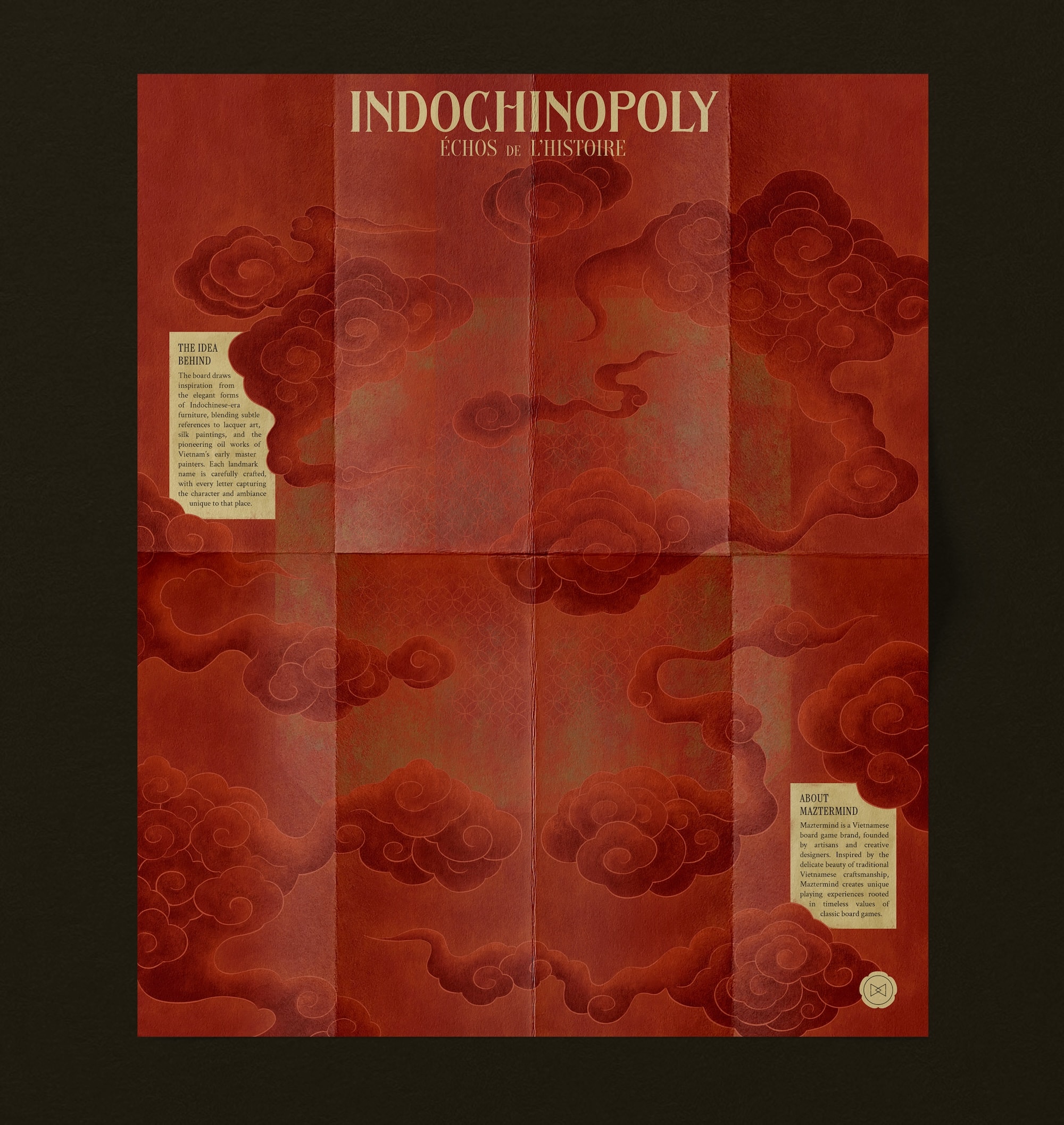
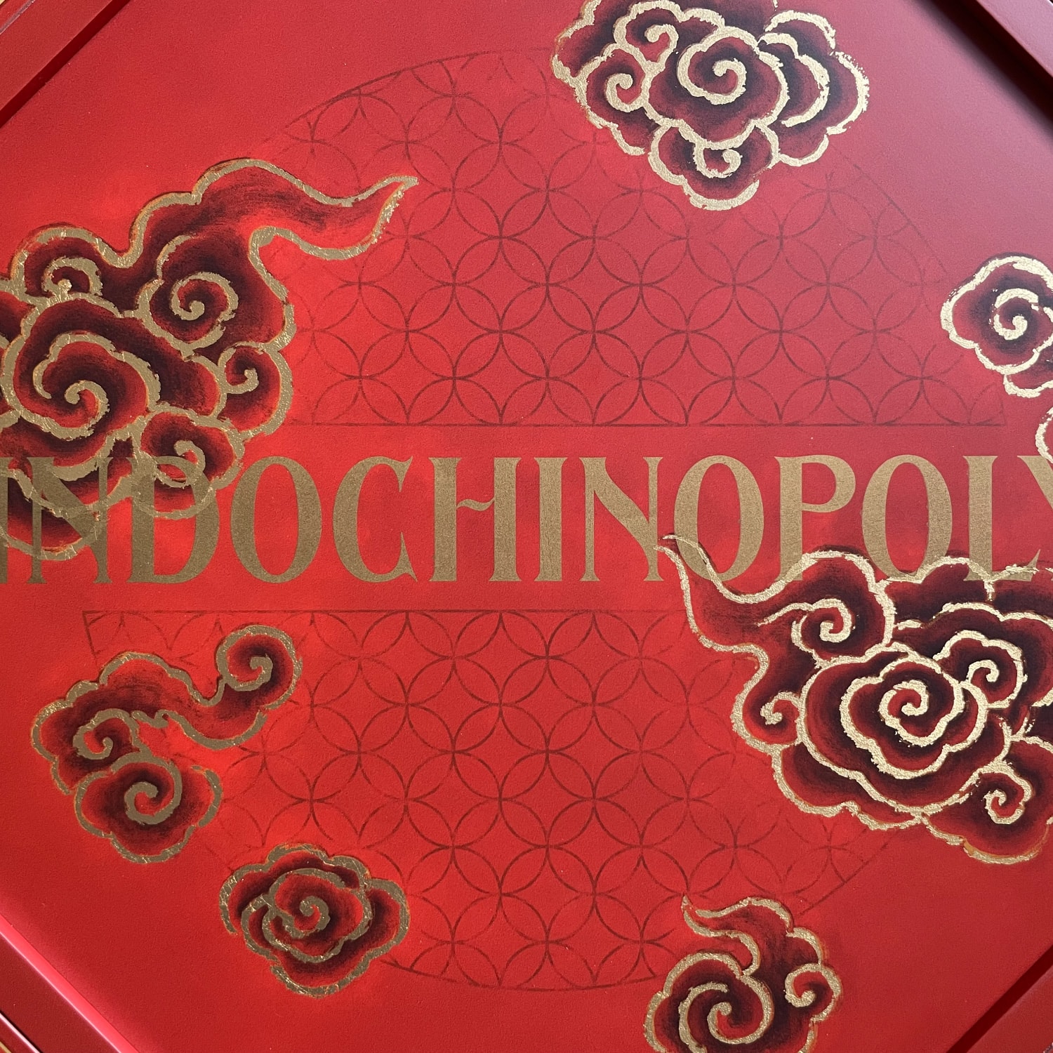
The visual language is built around traditional Eastern cloud motifs, often associated with celestial or symbolic imagery. These patterns run throughout the system, framing the game as a self-contained world - slightly fictional, but rooted in recognizable references.
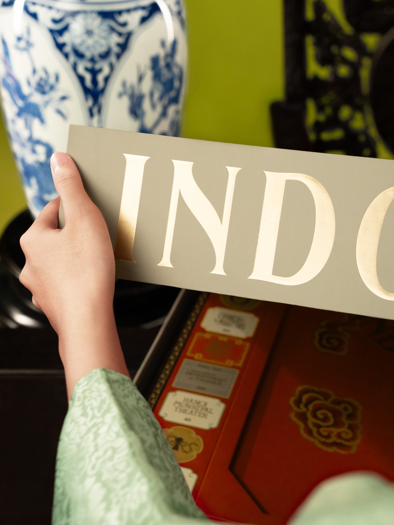
The Indochinopoly logotype was custom-designed, drawing from Art Nouveau typography seen in early 20th-century travel posters. It extends across packaging and campaign materials, forming a consistent visual anchor.

Color required careful balance. The palette needed to support a wide range of content while remaining cohesive with the collection. After exploring multiple directions, a red-dominant scheme was selected, with supporting colors informed by archival imagery, film, and print references.
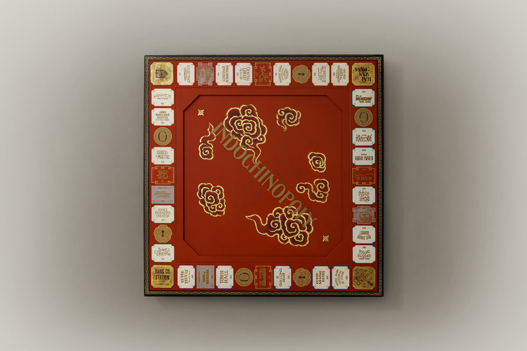
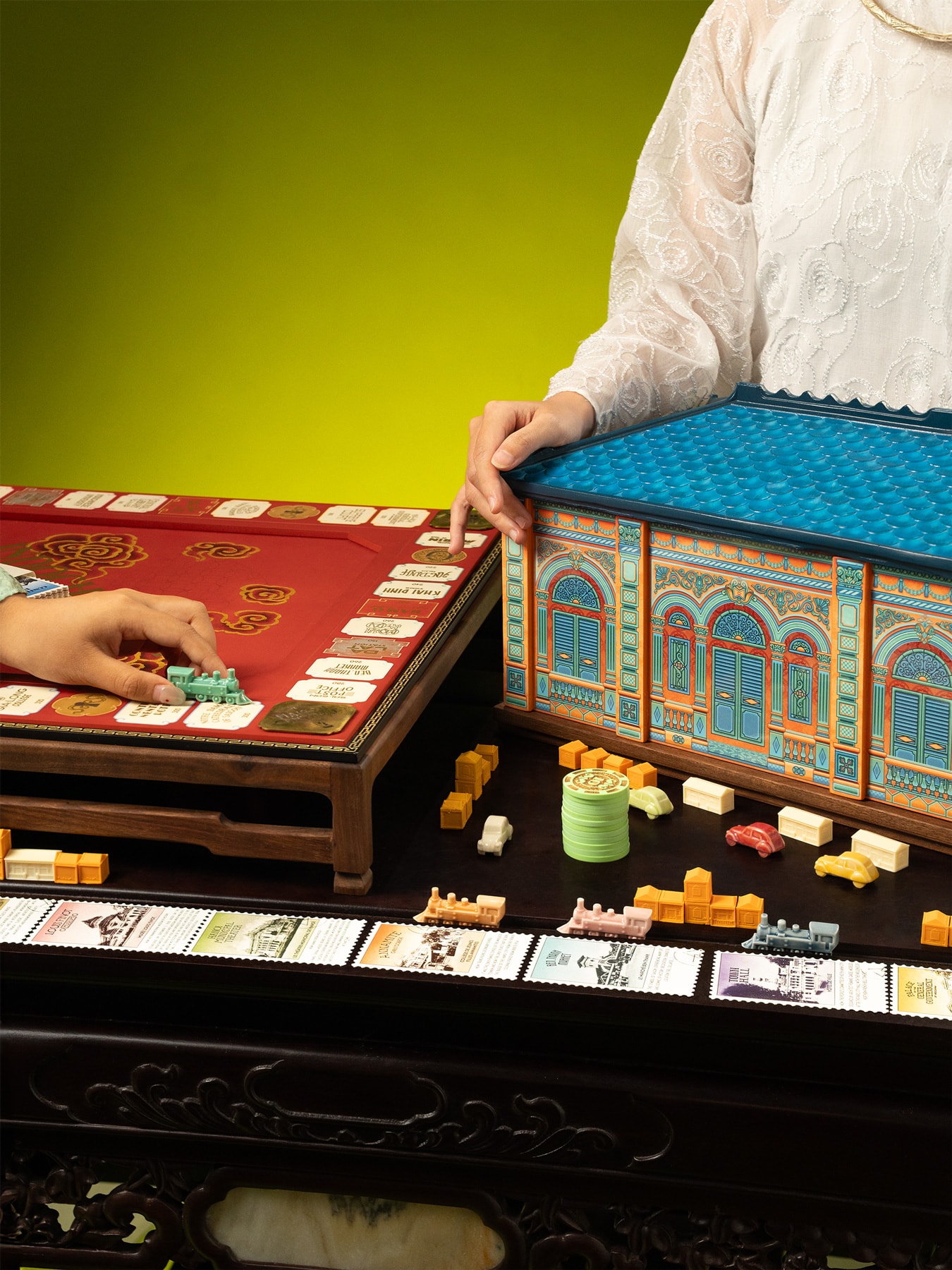
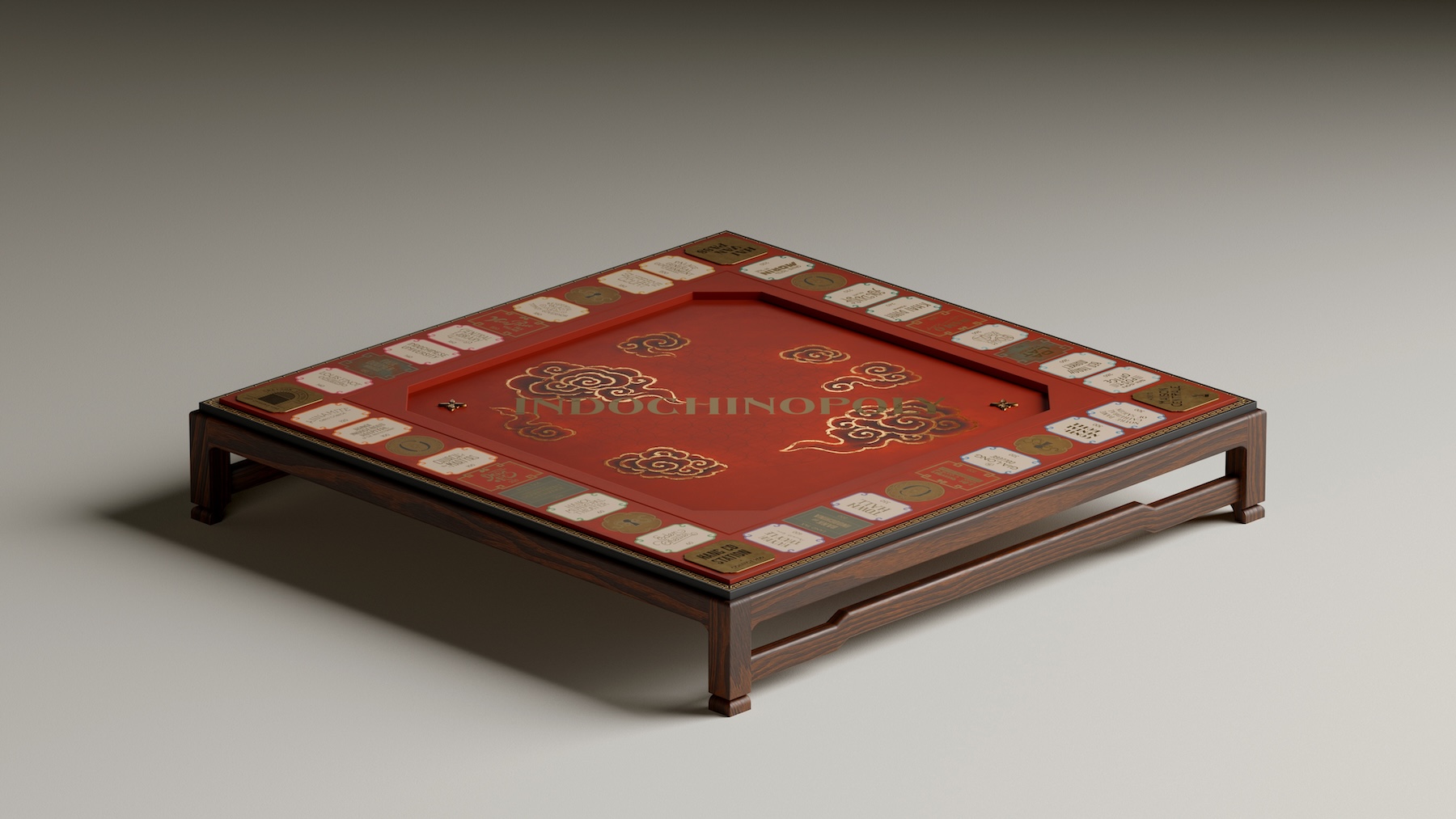
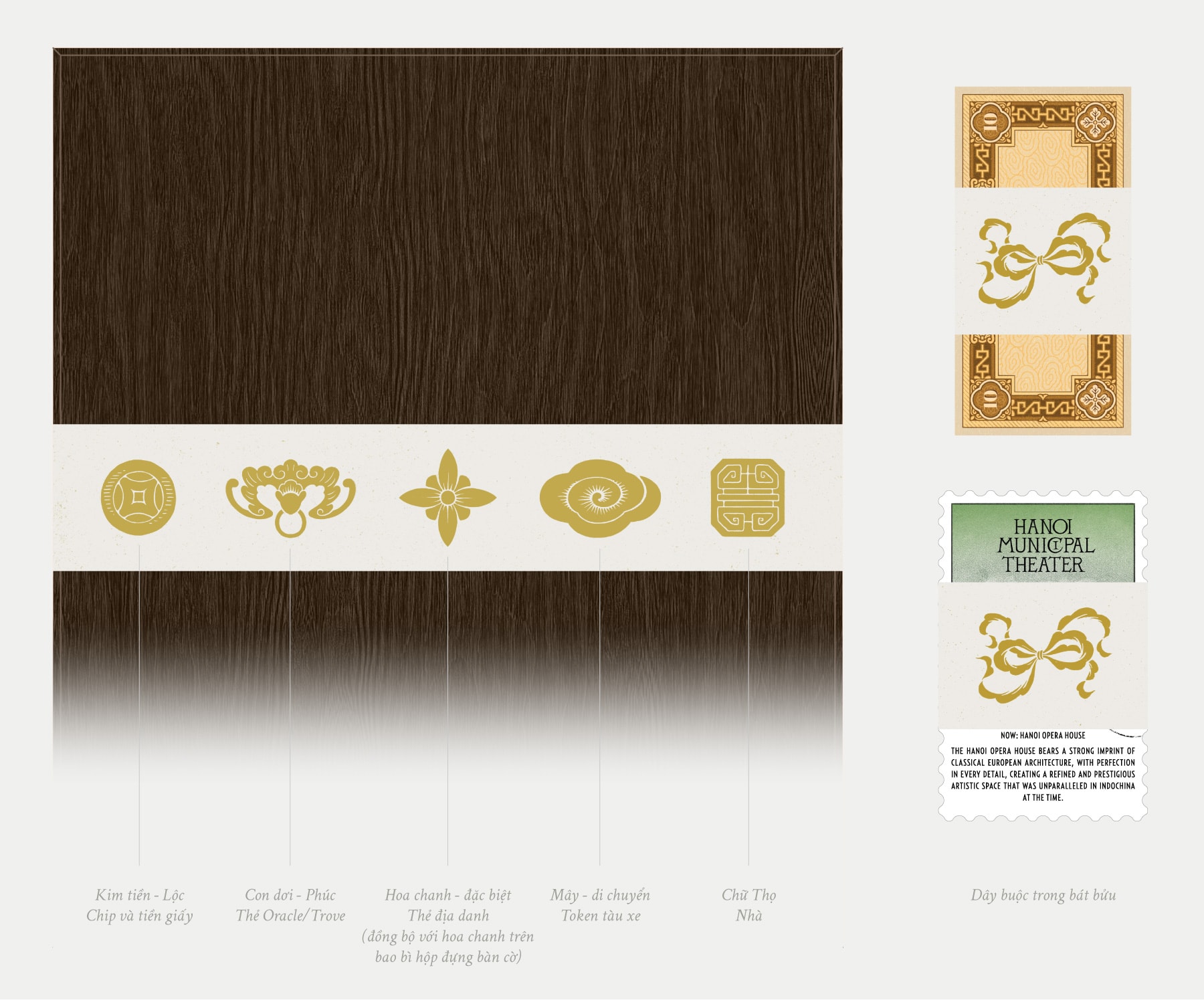
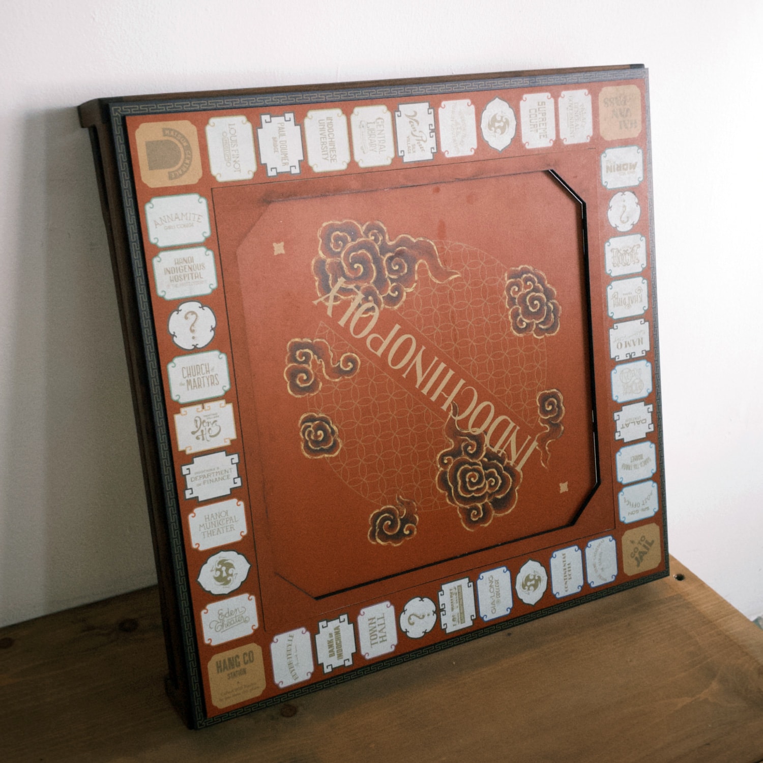
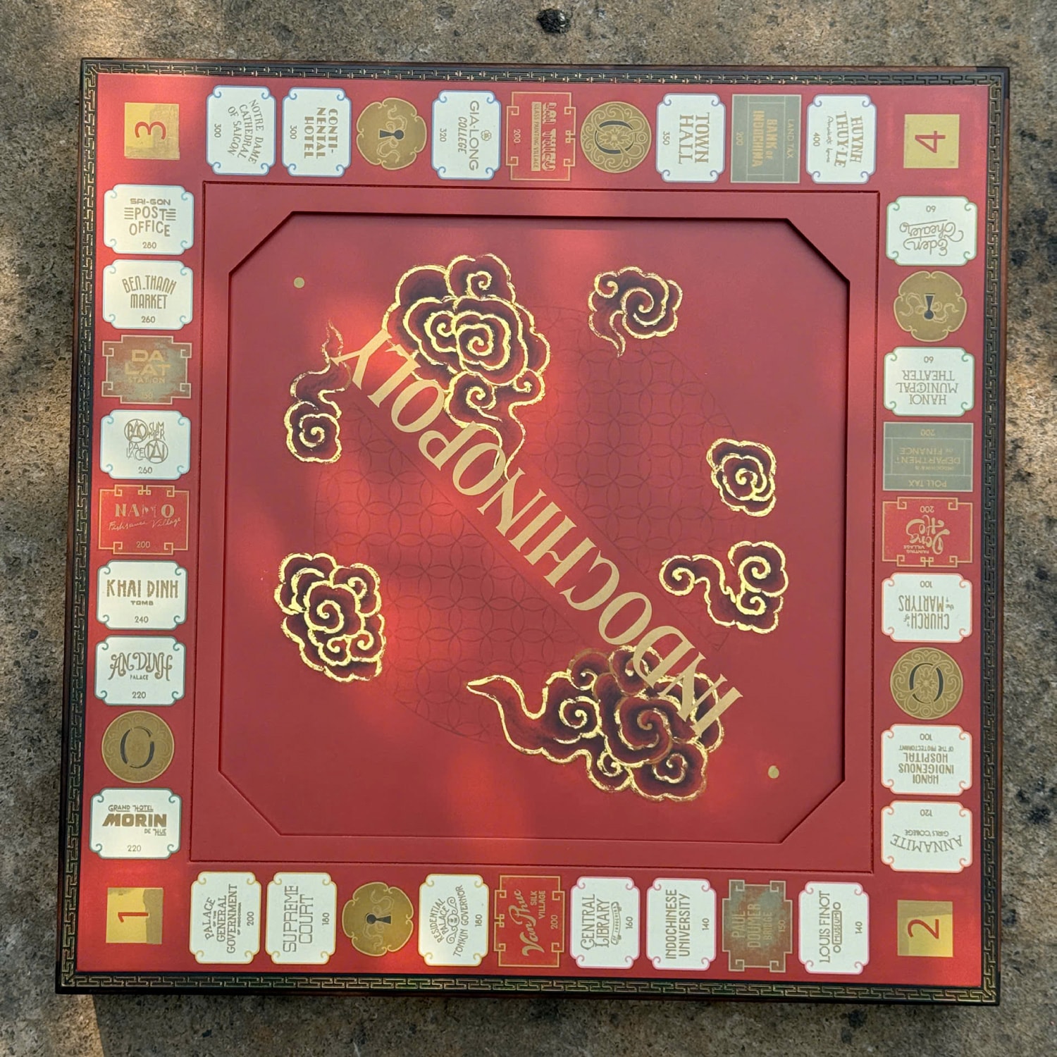
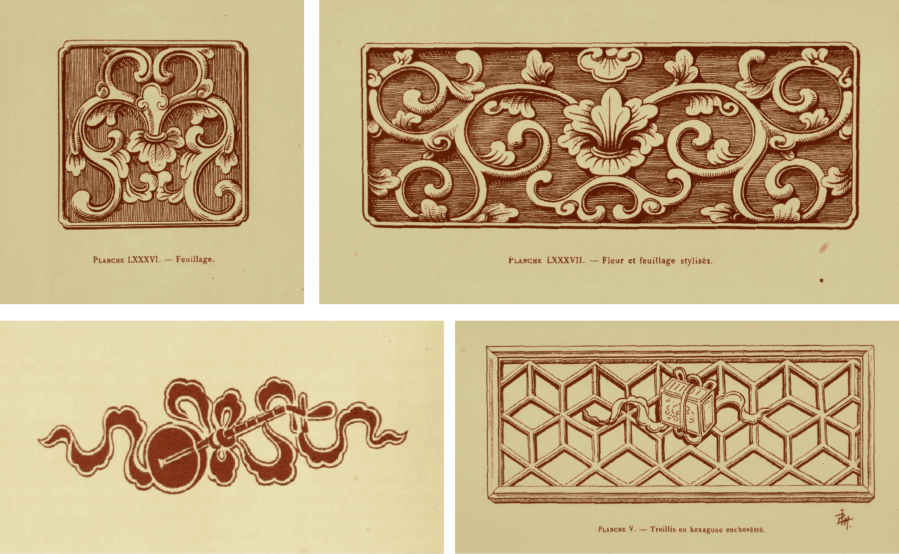
The board takes its form from traditional furniture structures, simplified into a more contemporary geometry. Its layout follows a spatial hierarchy — square, octagon, and circle — referencing Eastern cosmology and the balance between earth and sky.
The board surface is divided into three primary layers - outer frame, path, and center - each with varying height. This structure draws from spatial qualities in Indochine architecture while also serving functional considerations.
 Small functional details like this often shaped design decisions
more than expected. ↳
Tính lập thể trong kiến trúc Đông Dương
Small functional details like this often shaped design decisions
more than expected. ↳
Tính lập thể trong kiến trúc Đông Dương
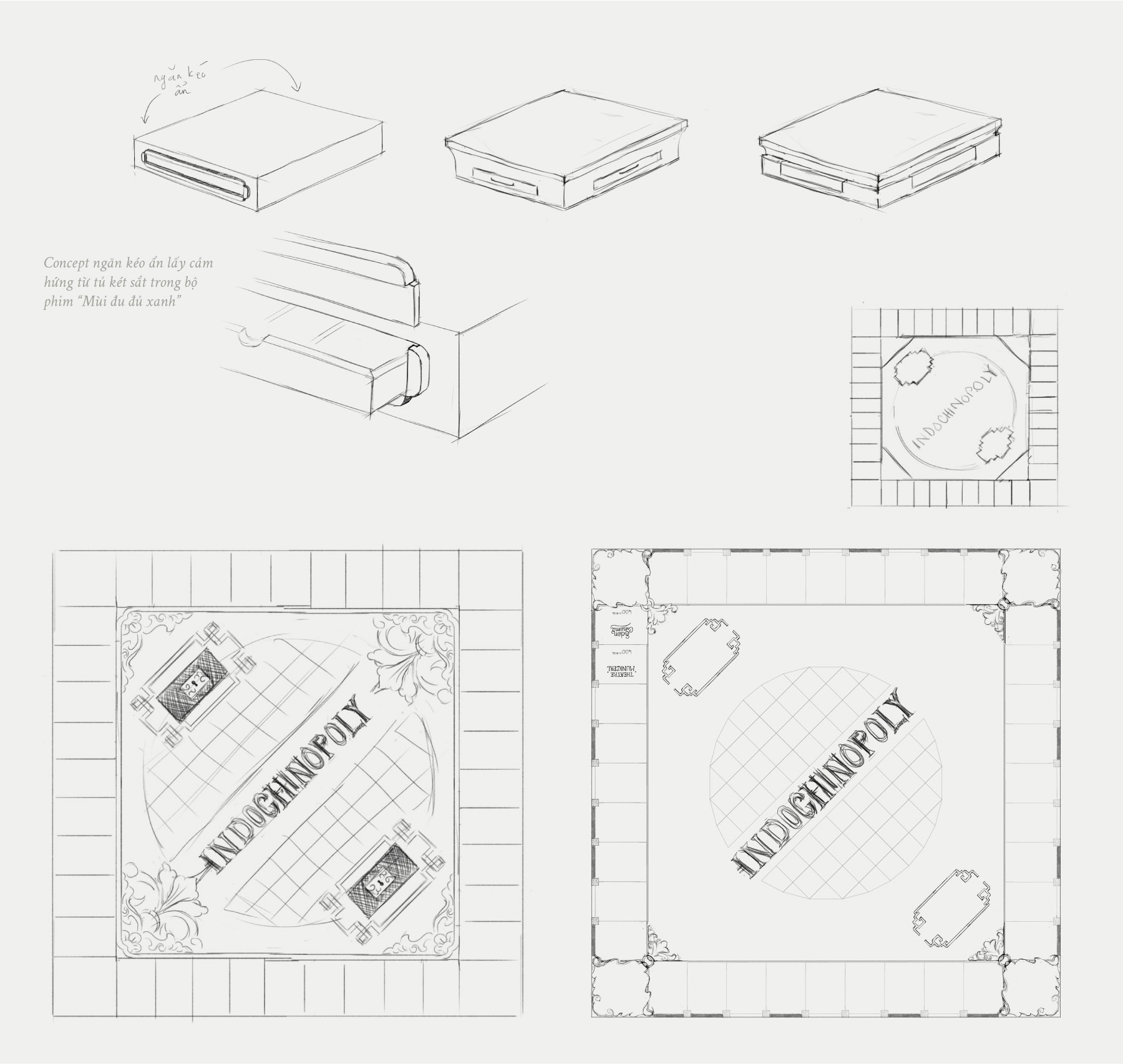 Some of my first drafts
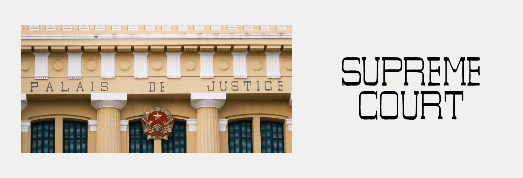
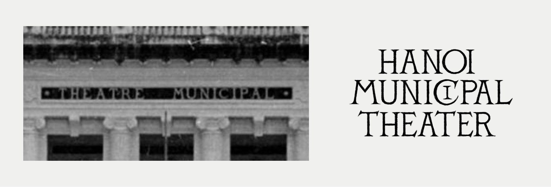
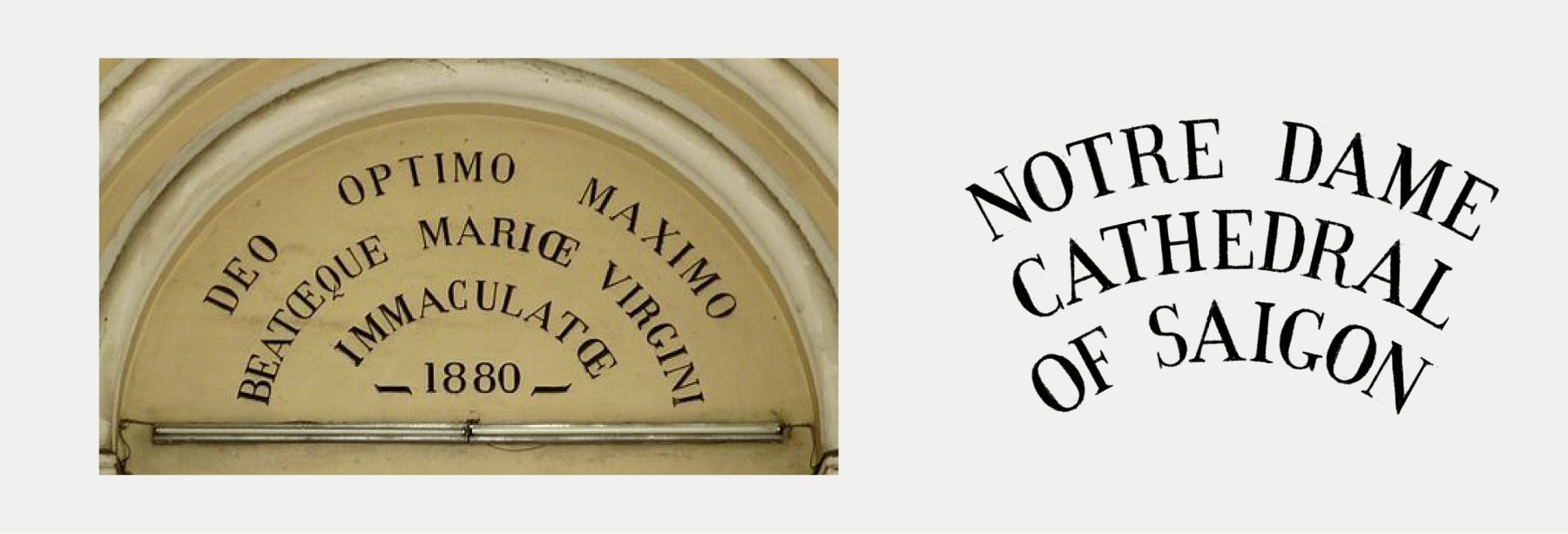
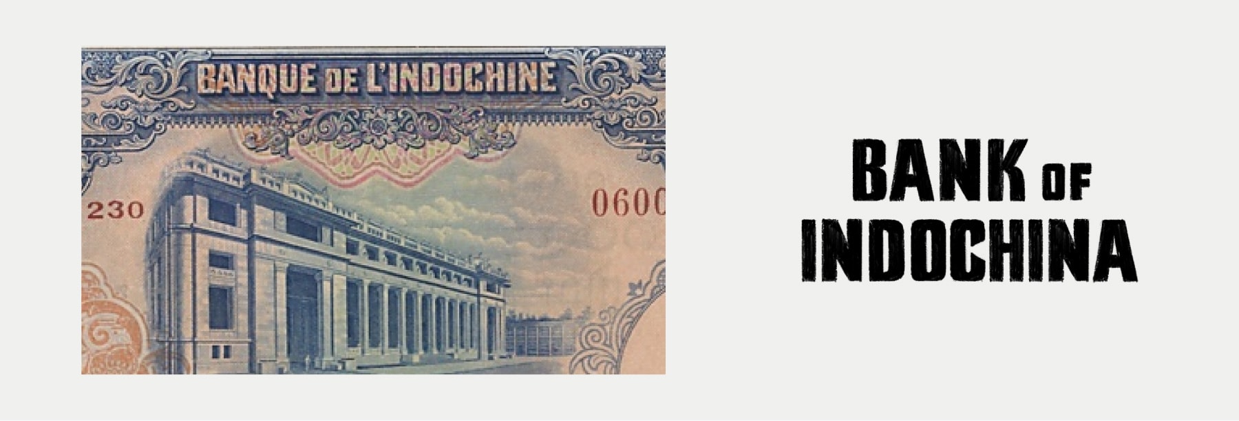
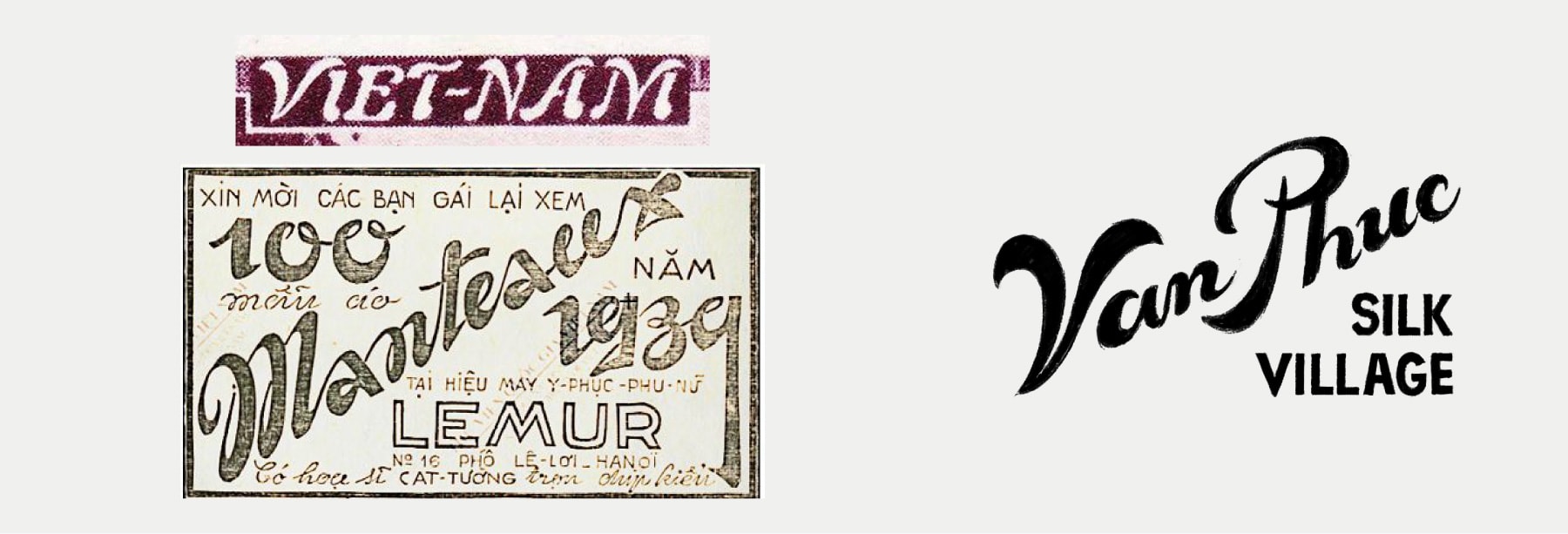
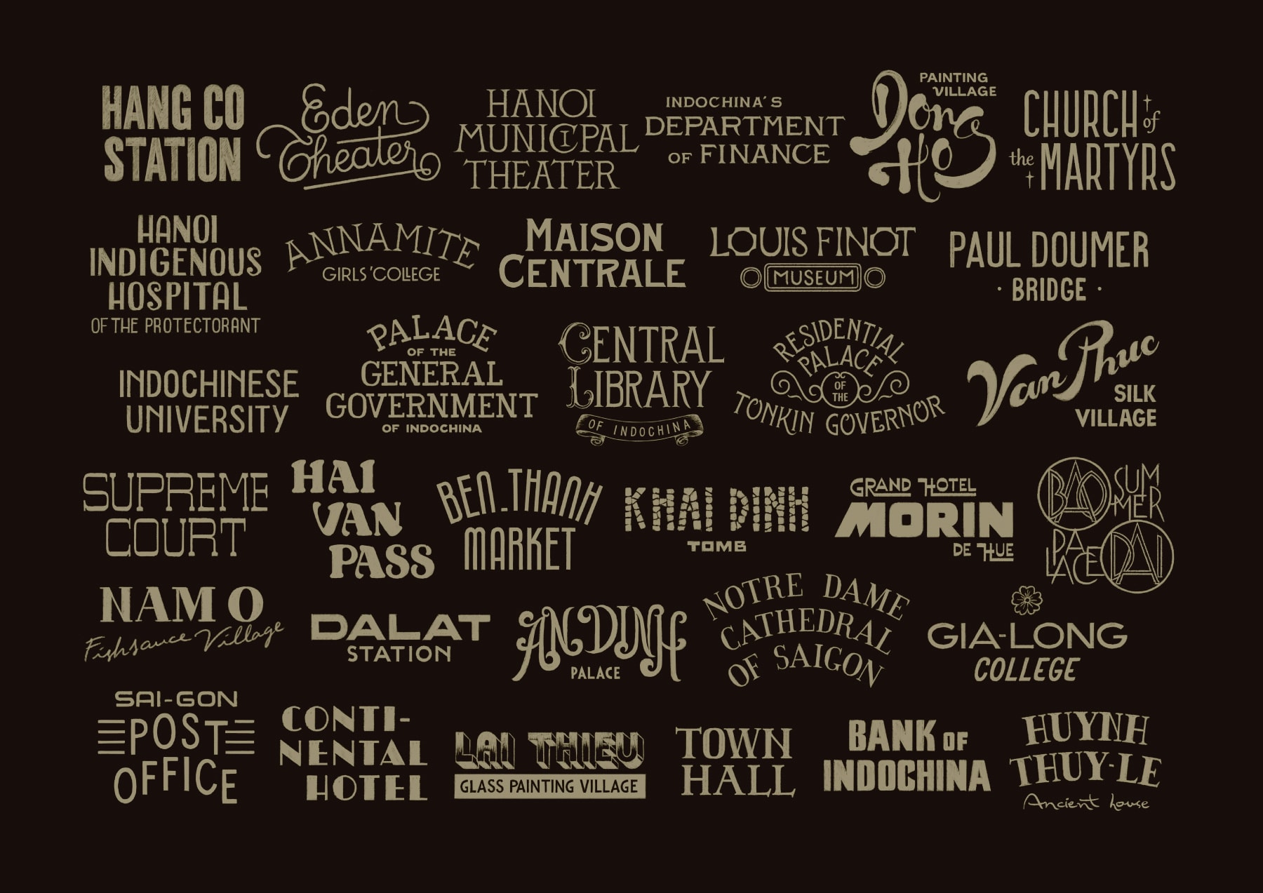
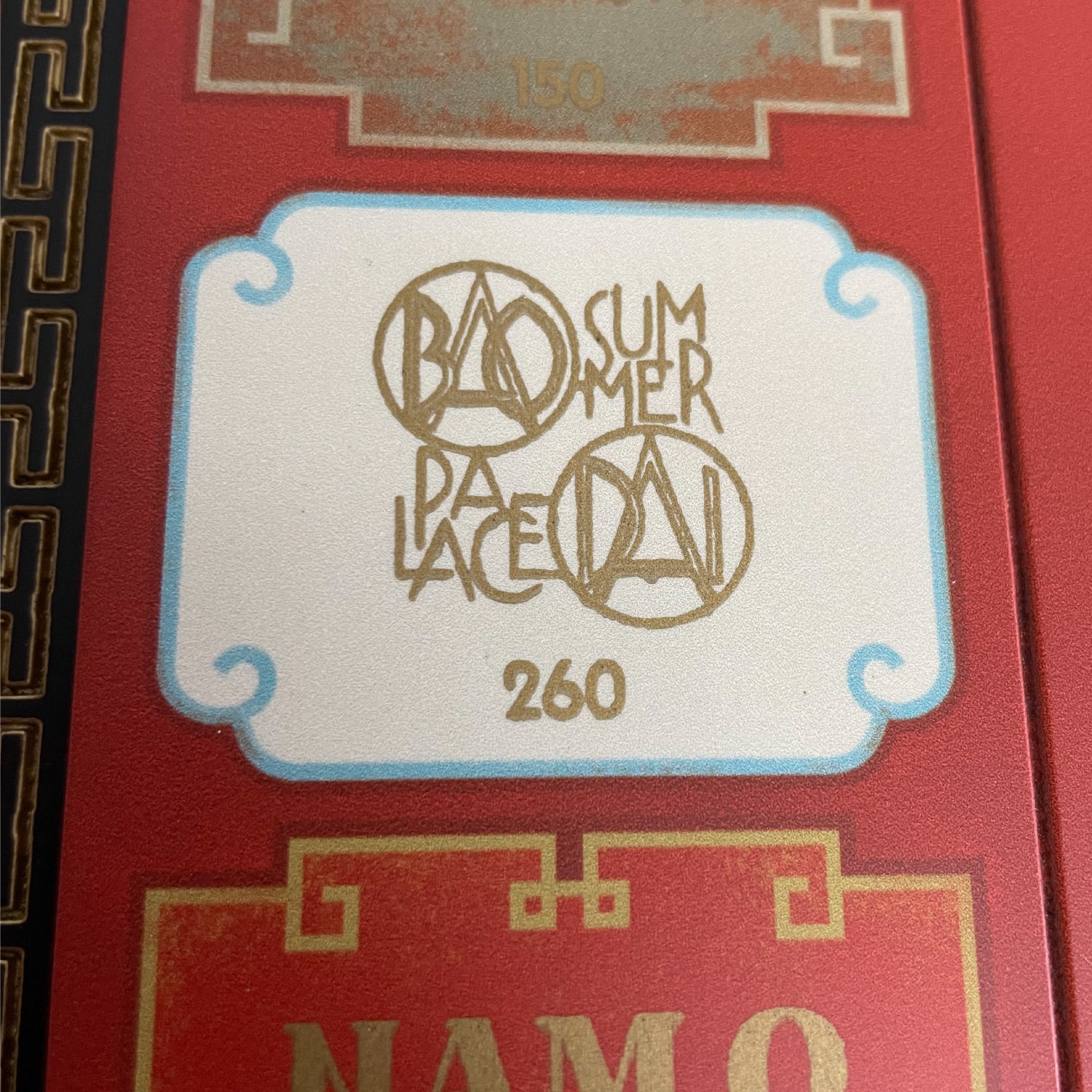
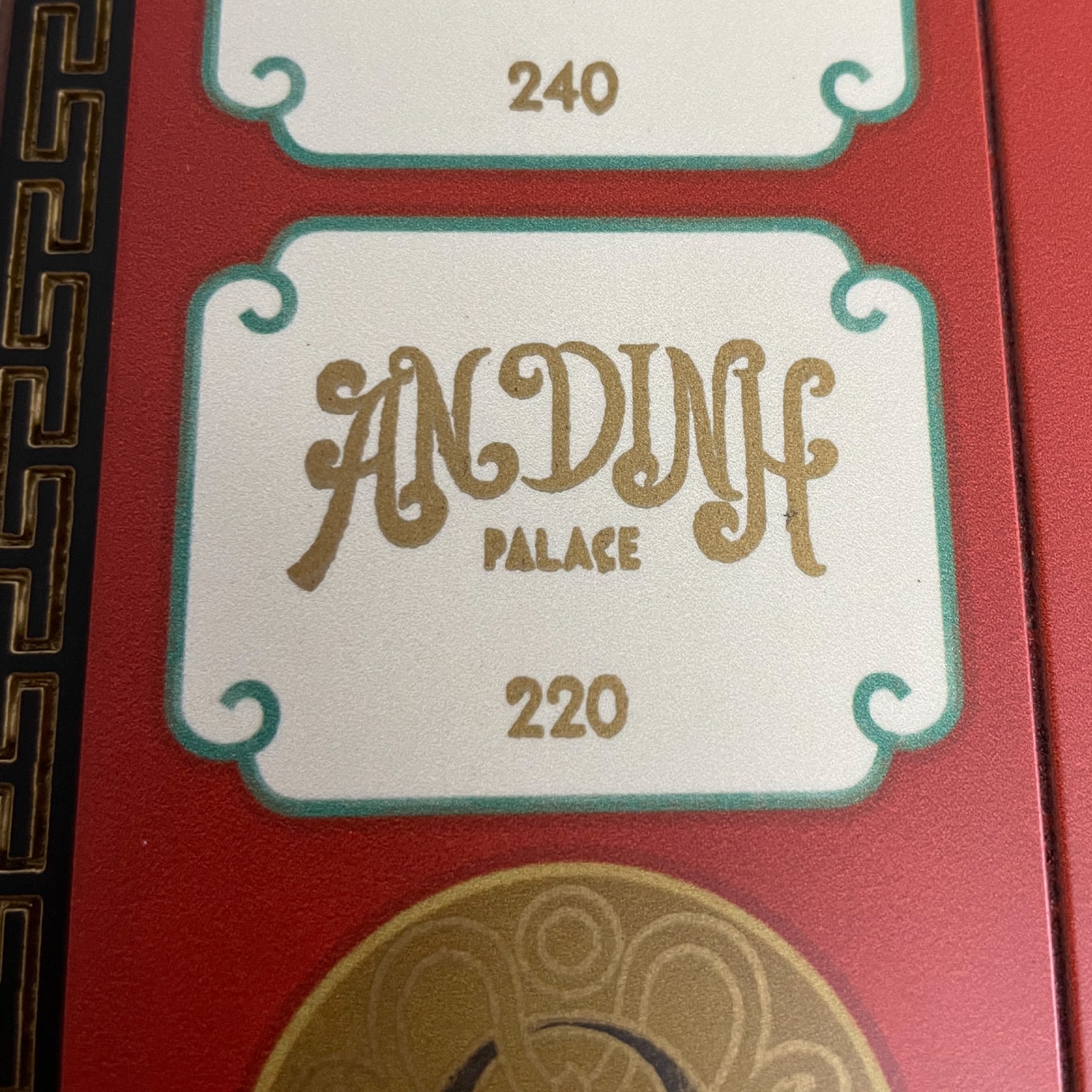
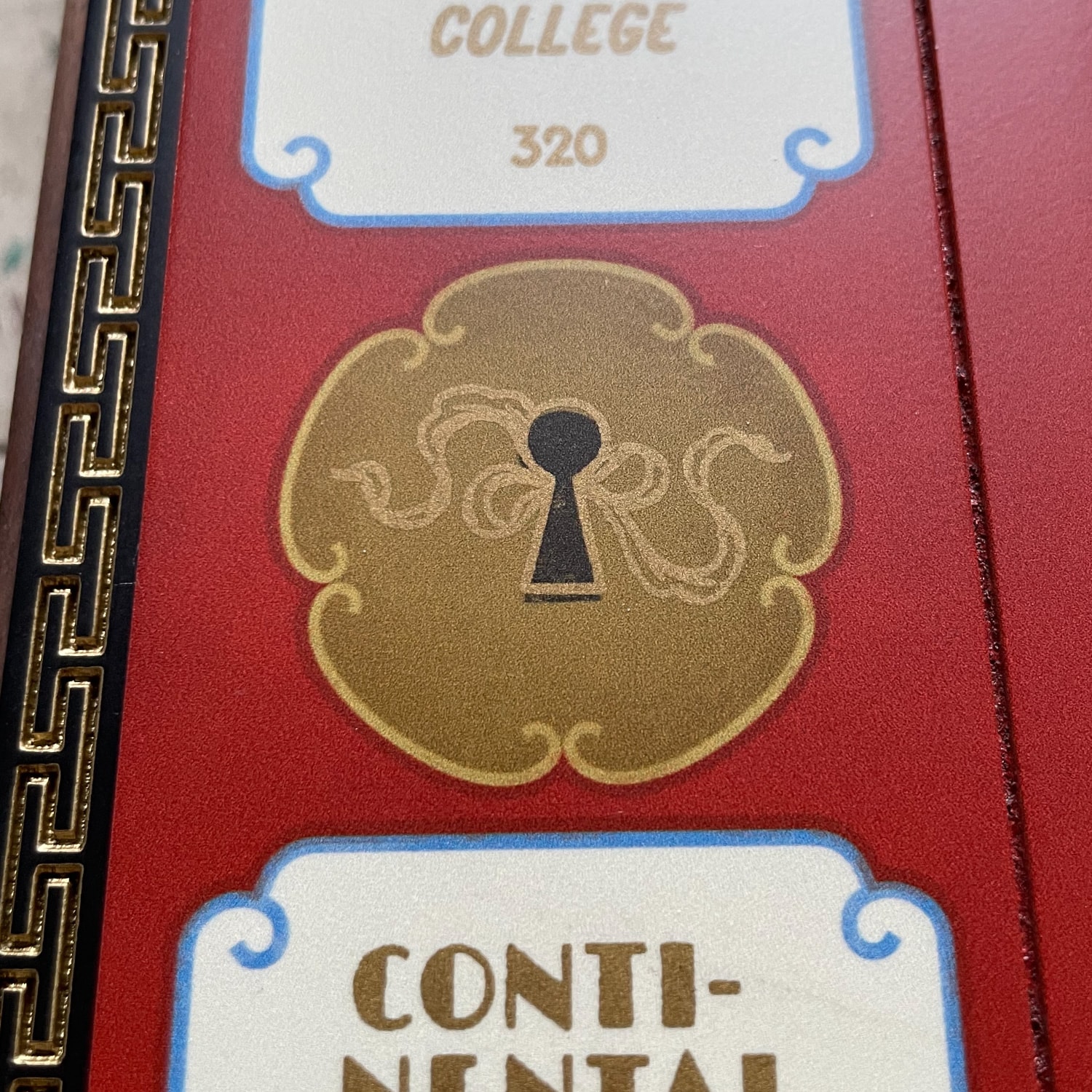
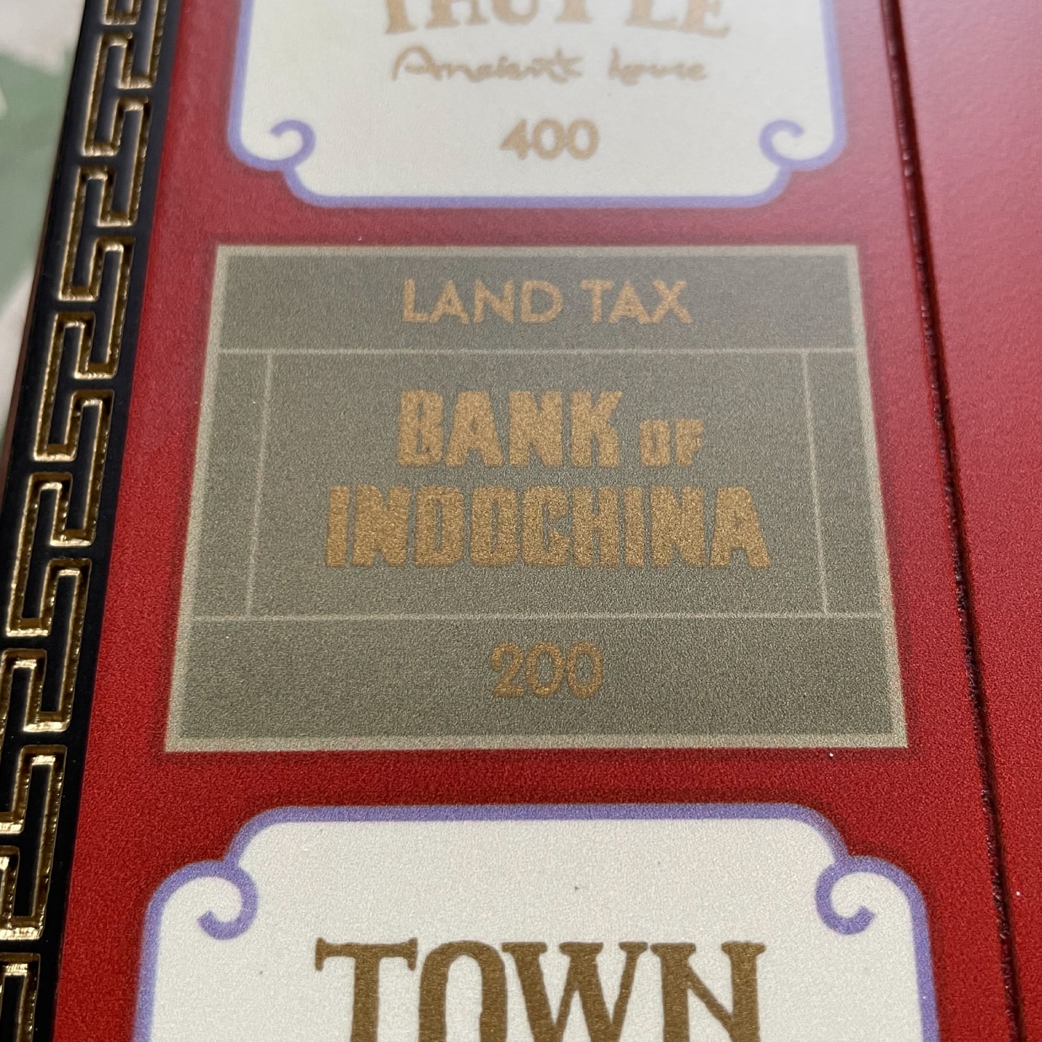
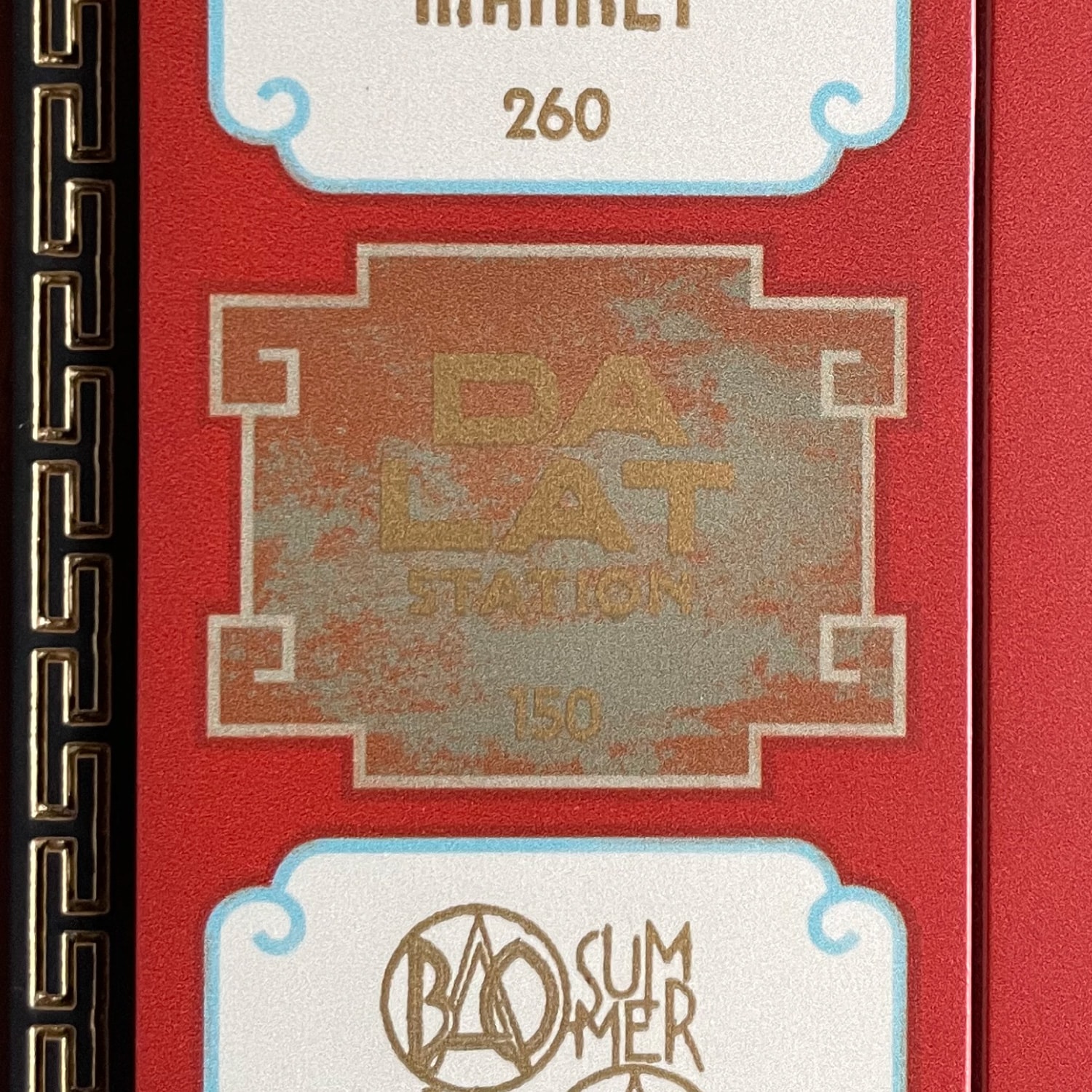
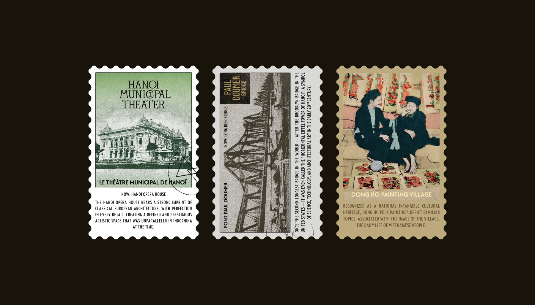
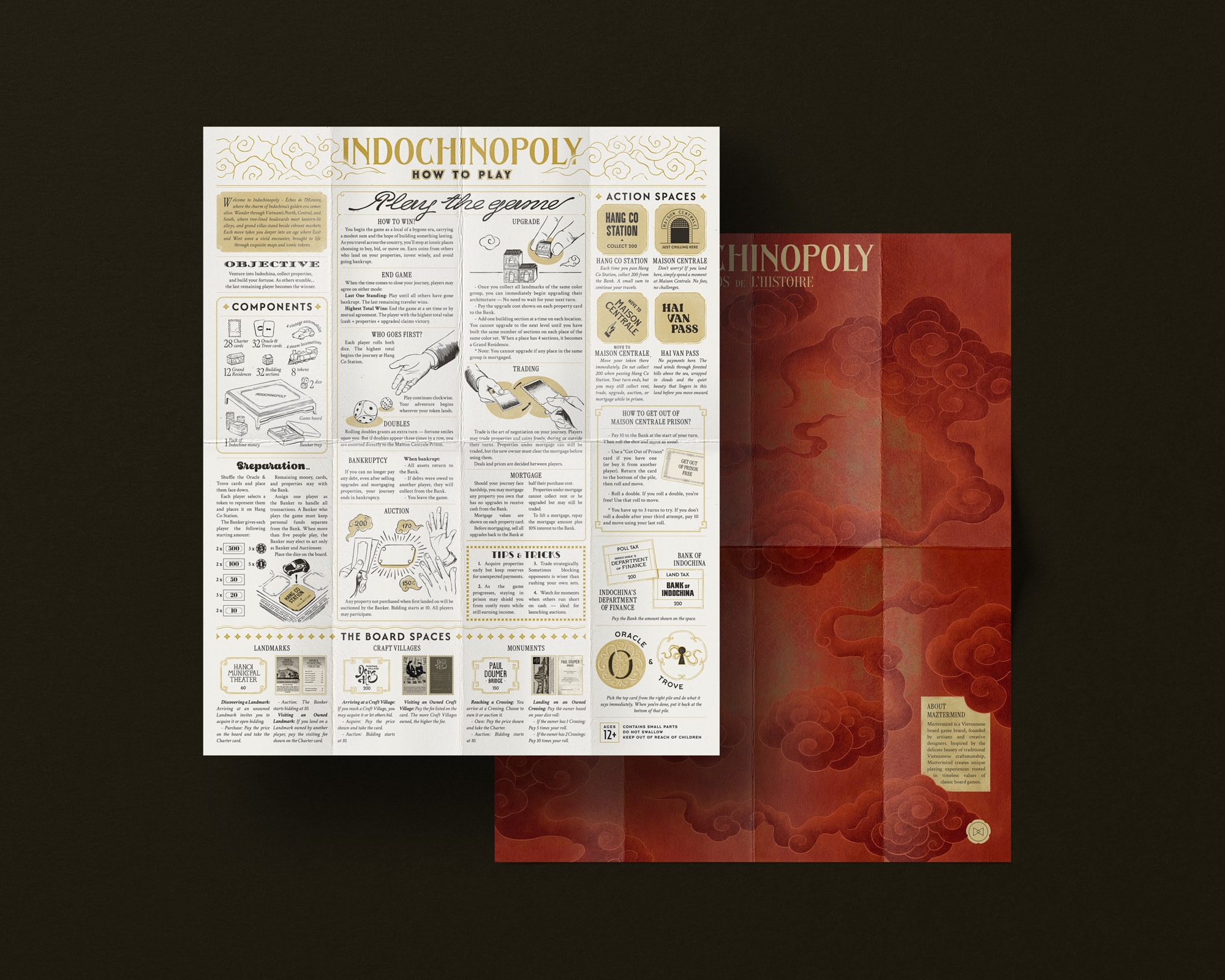
Typography plays a central role. Each location is expressed through lettering, drawing from signage, printed materials, and visual references of the time. This creates diversity while maintaining a cohesive system.
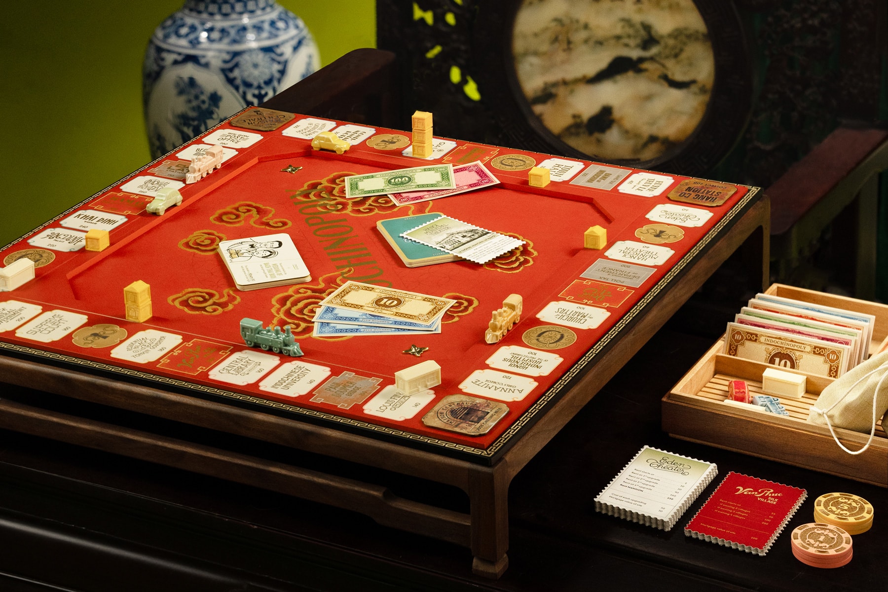
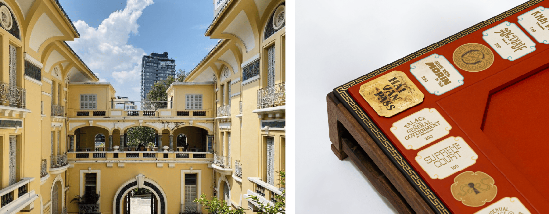
About four physical prototypes were developed to calibrate color accuracy and ensure material consistency across the board and game cards. The initial sample served as a primary study for scale and ergonomic adjustments, allowing for critical refinements during the early design phase.
The second iteration reached 90% completion, introducing multi-layered printing techniques to create tactile depth. This included gold leafing on cloud motifs, silk-screened metallic inks for the "Indochinopoly" logotype and pathways, and recessed borders hand-finished with gold pigment.
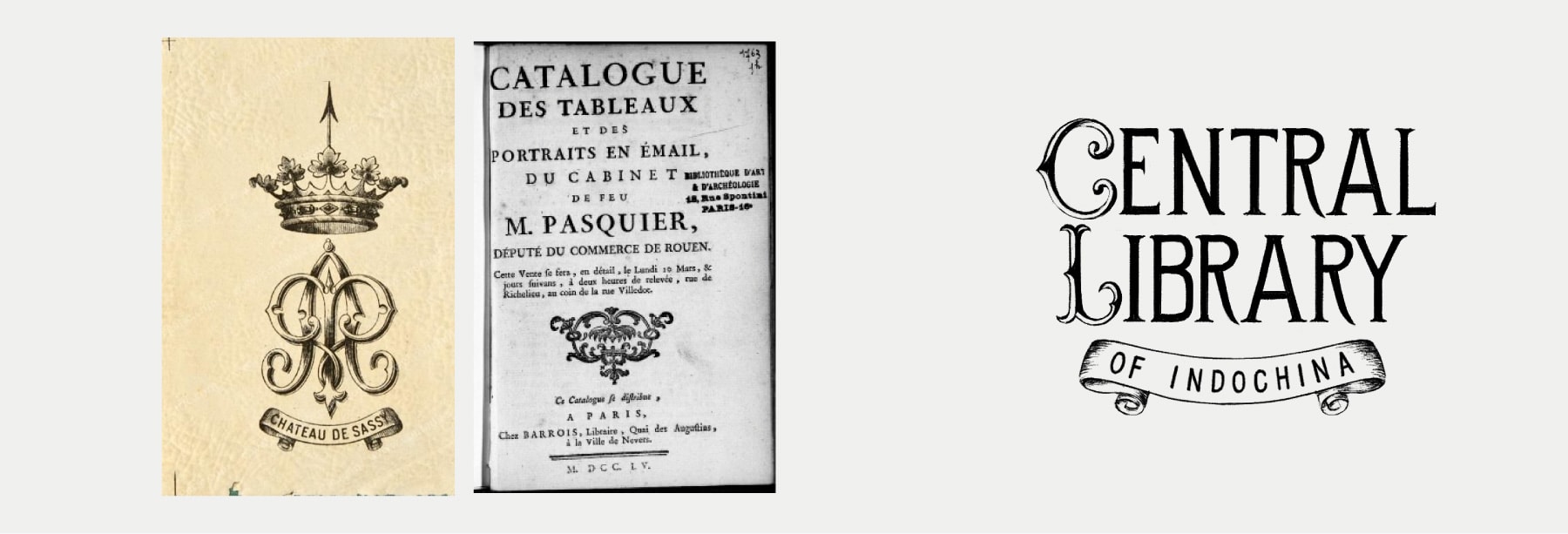
For locations with existing typographic references, lettering was developed by reconstructing and adapting those forms. This helps preserve a sense of authenticity and historical connection.
For locations without clear references, lettering was developed through interpretation — drawing from similar contexts and visual characteristics. These cases required more intuition, balancing research with design judgment.
For printing on the board, focus was placed on the legibility of metallic inks against varied color backgrounds and the management of silk-screening nuances, specifically regarding ink bleed and registration accuracy.
The four corner tiles were crafted from laser-cut brass, each chemically treated to achieve a unique antique patina.
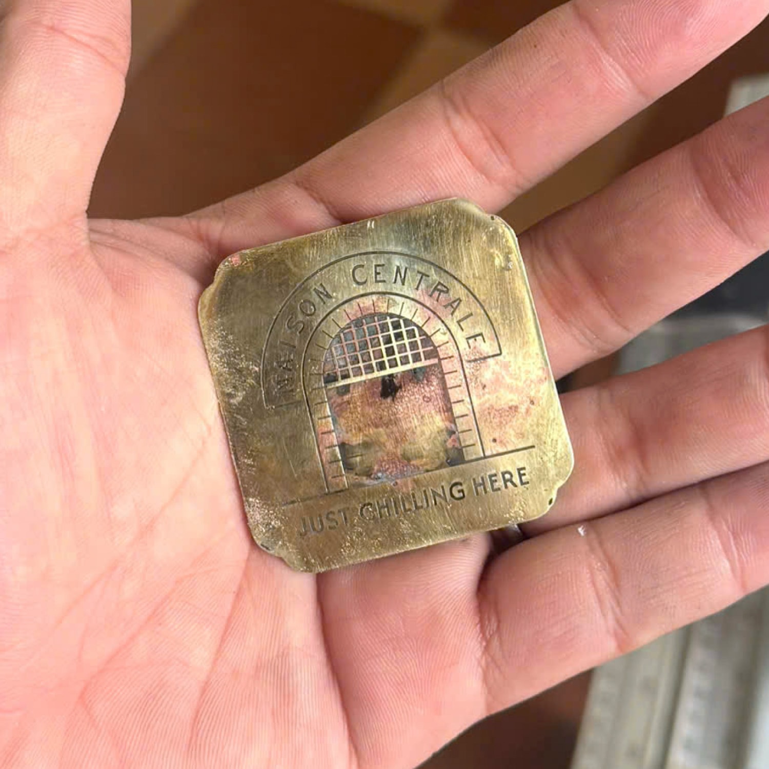
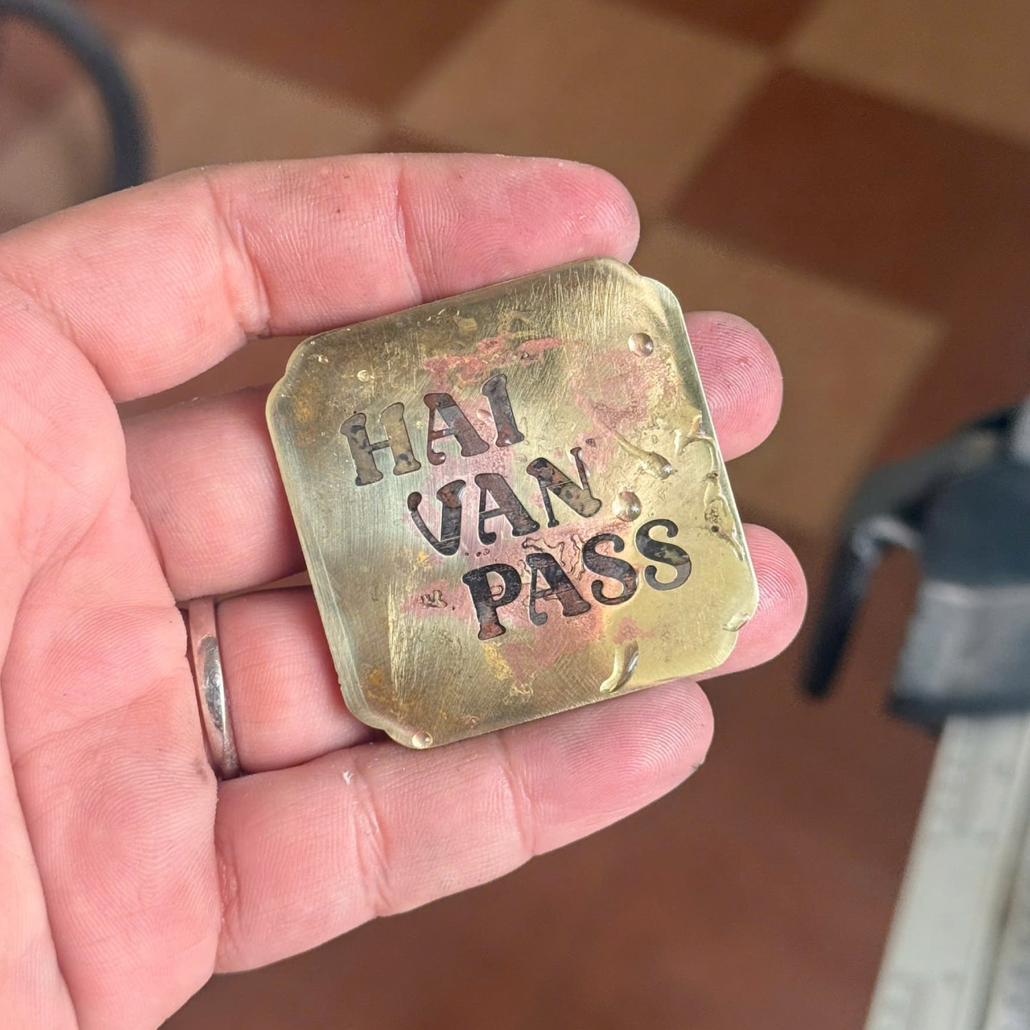
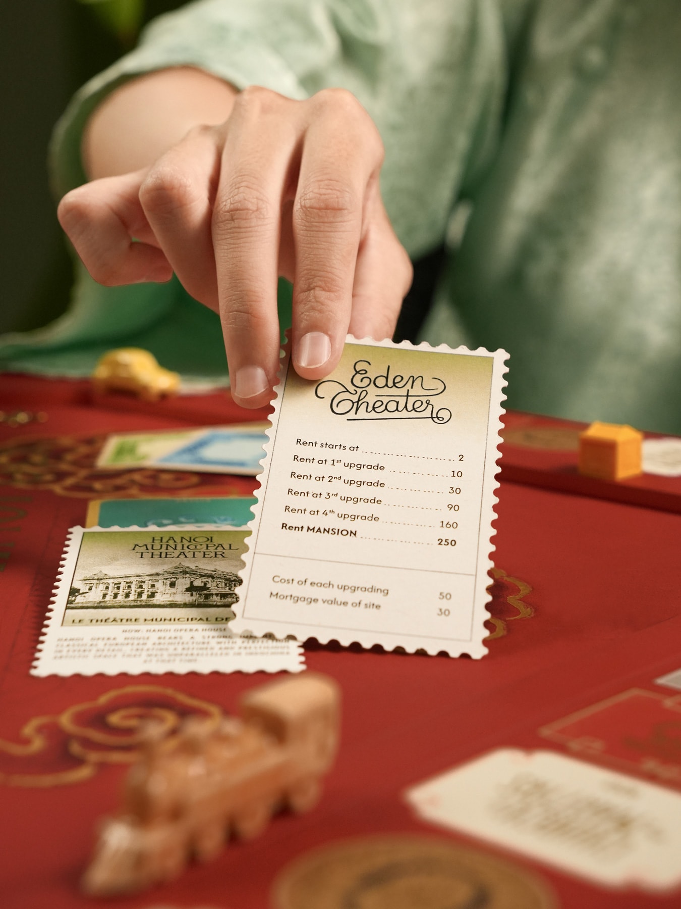
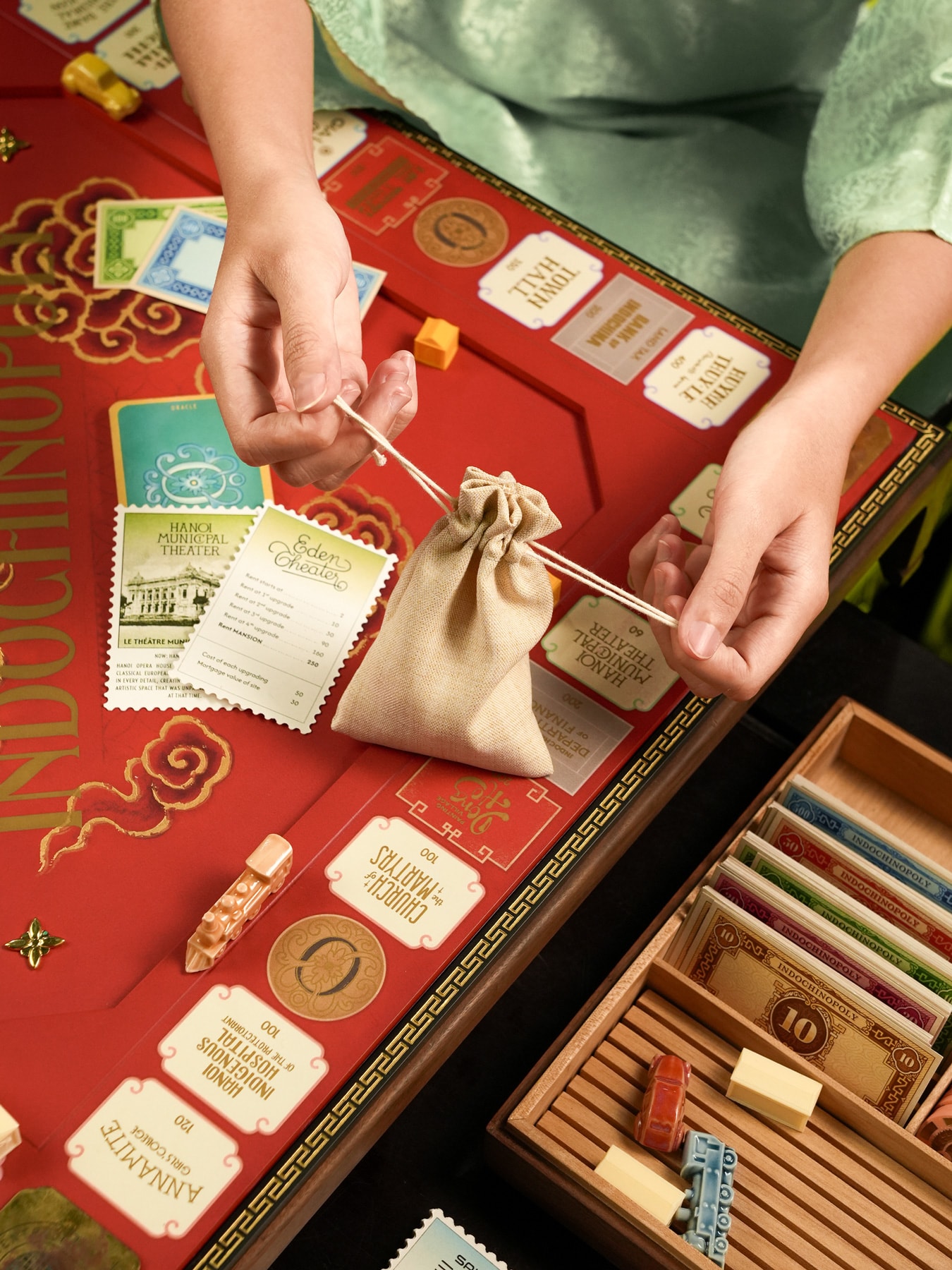
Property cards draw from the visual language of Indochine-era postage stamps, where imagery is detailed yet constrained by printing techniques. This translates into a reduced, graphic style that remains consistent across the system.
Some elements introduce material-specific treatments. Transportation-related locations use oxidized metal textures to reference infrastructure. Traditional craft villages use colorized imagery inspired by hand-tinted photography.
These variations helped break the system just enough to keep it visually engaging.
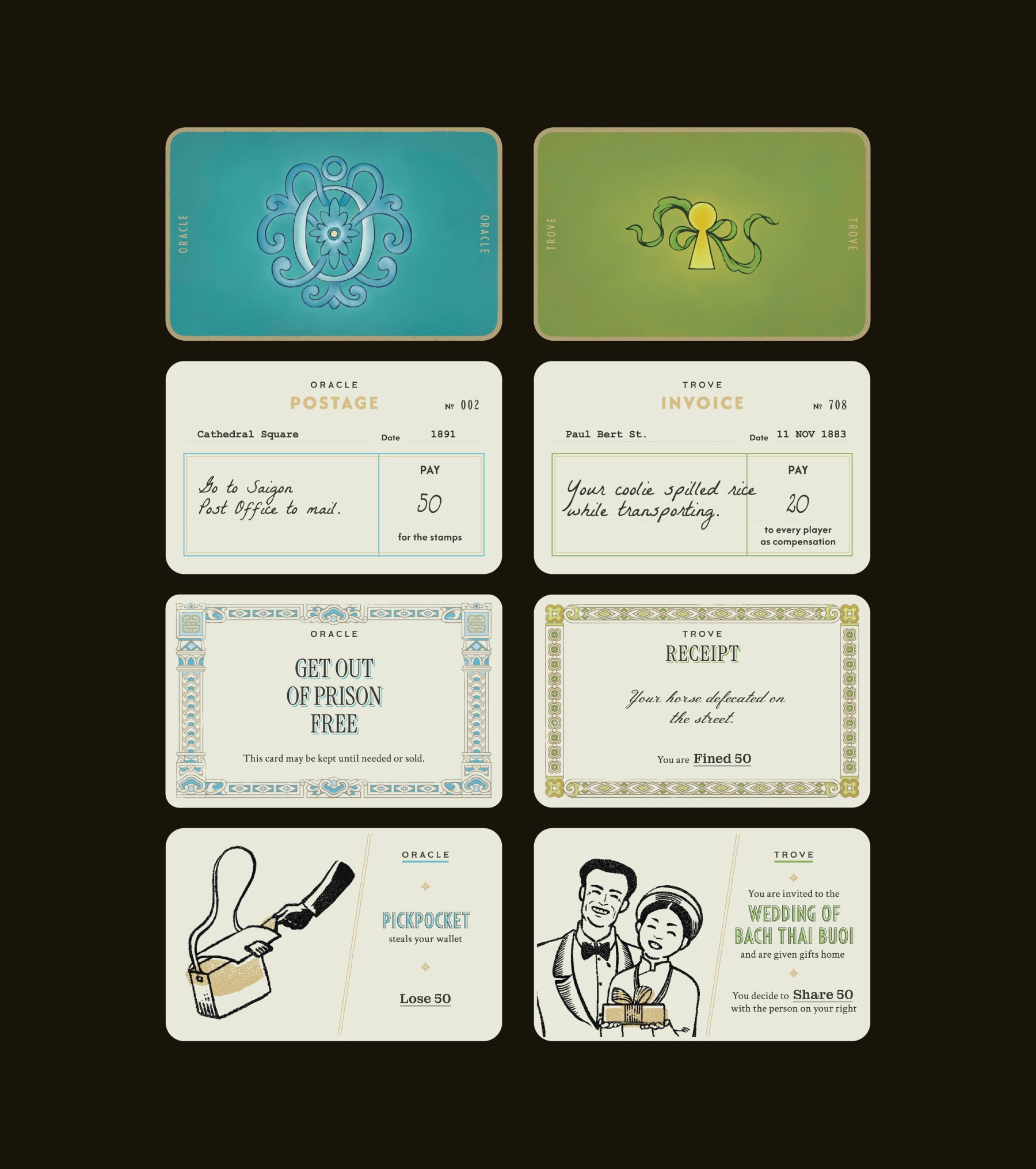
The two draw card types - Oracle and Trove - extend the narrative dimension of the game.
Their cards’ designs are grouped into three formats referencing tickets, official documents, and printed advertisements of the time.
Some cards also include subtle references to real historical events through secondary details.
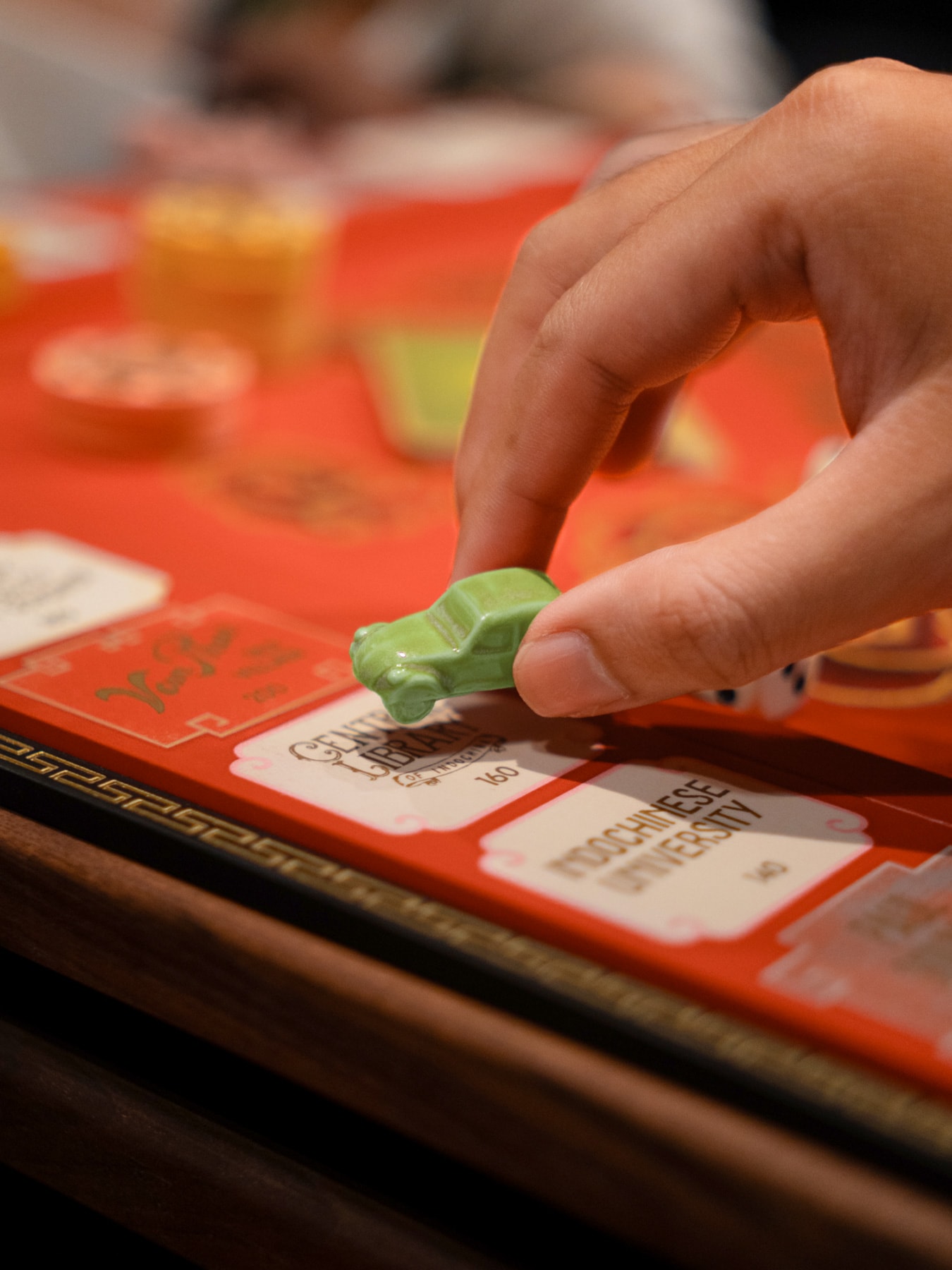
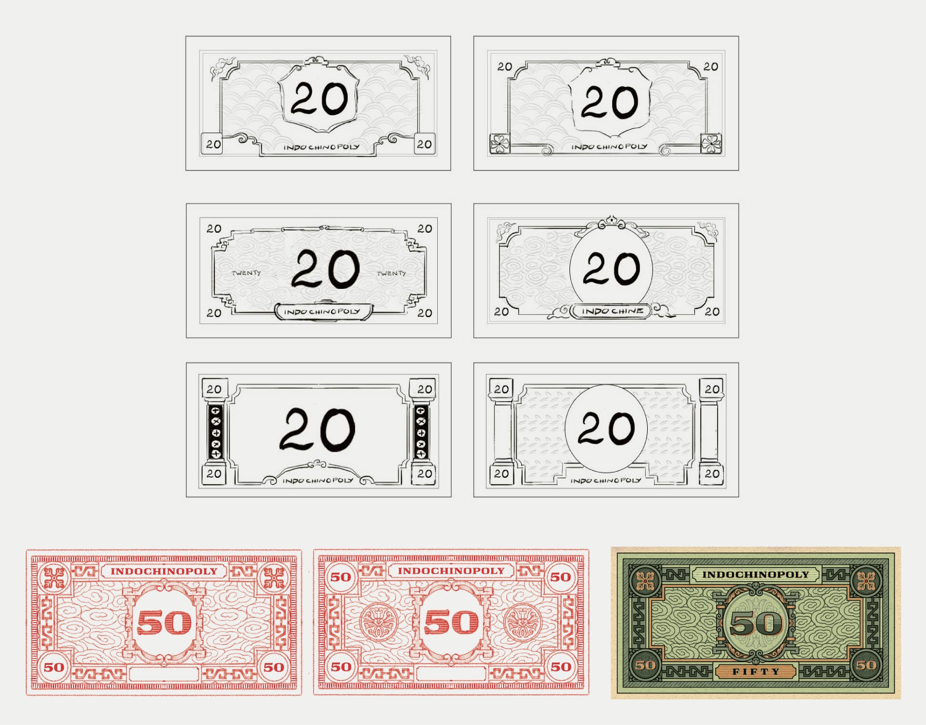
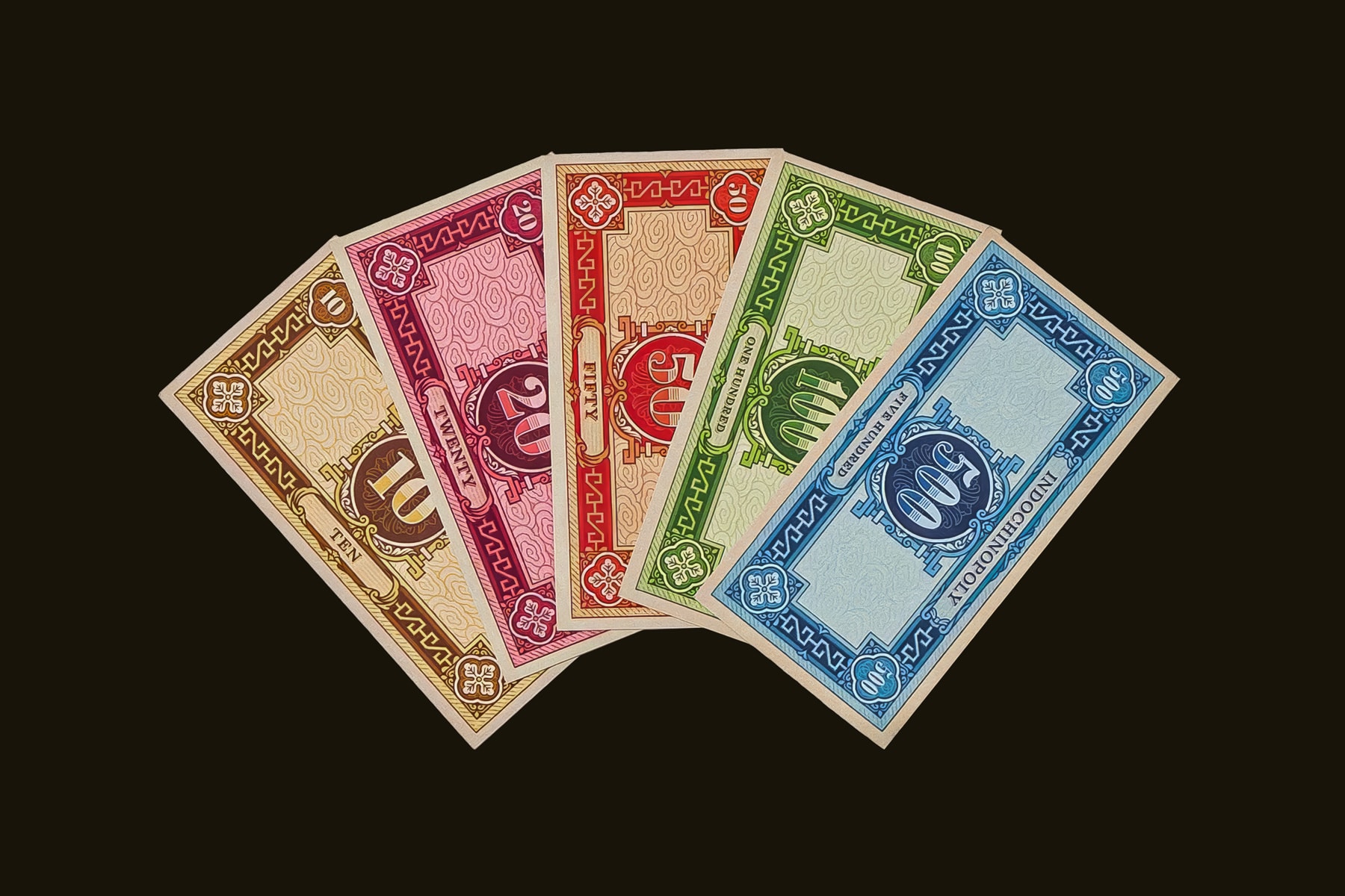
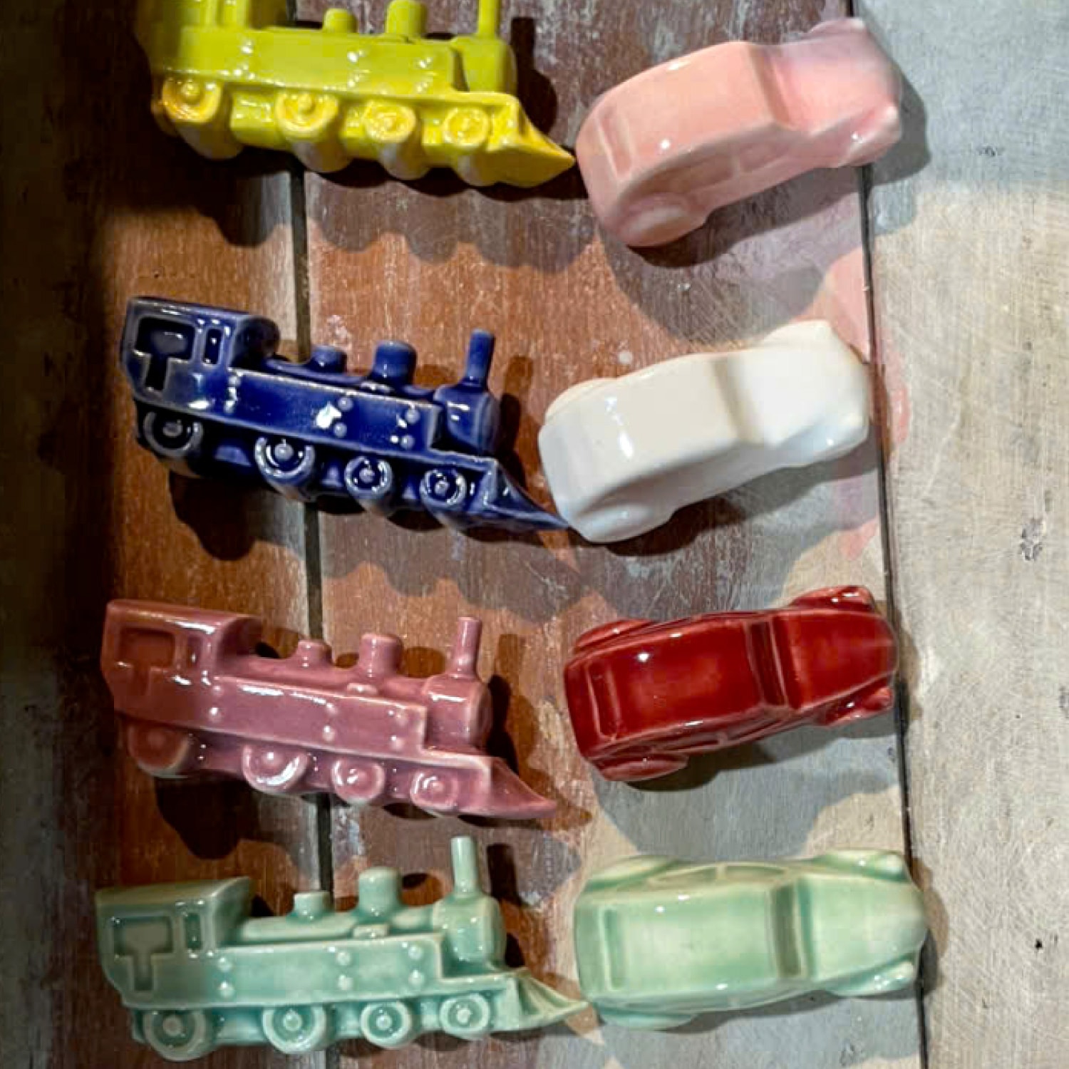
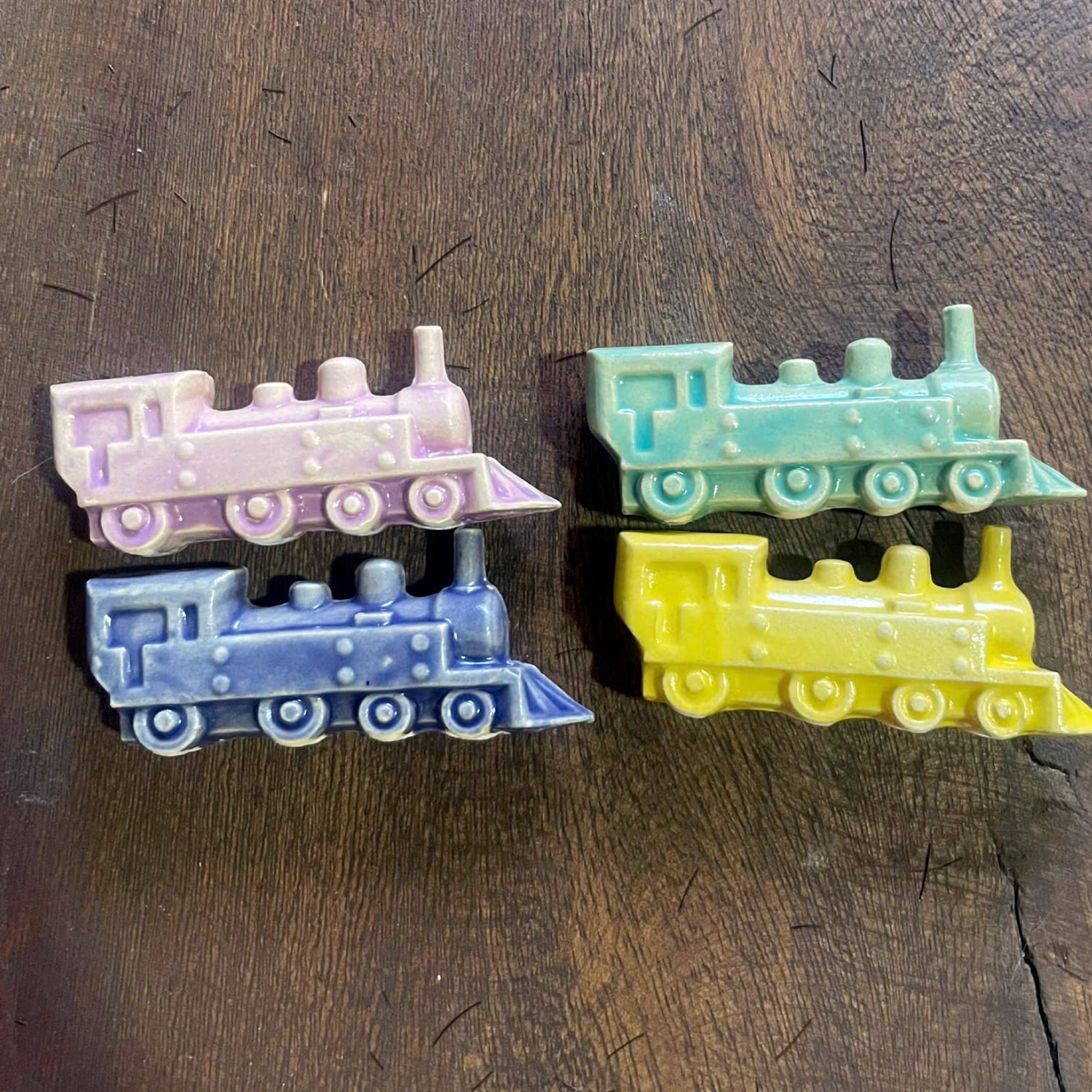
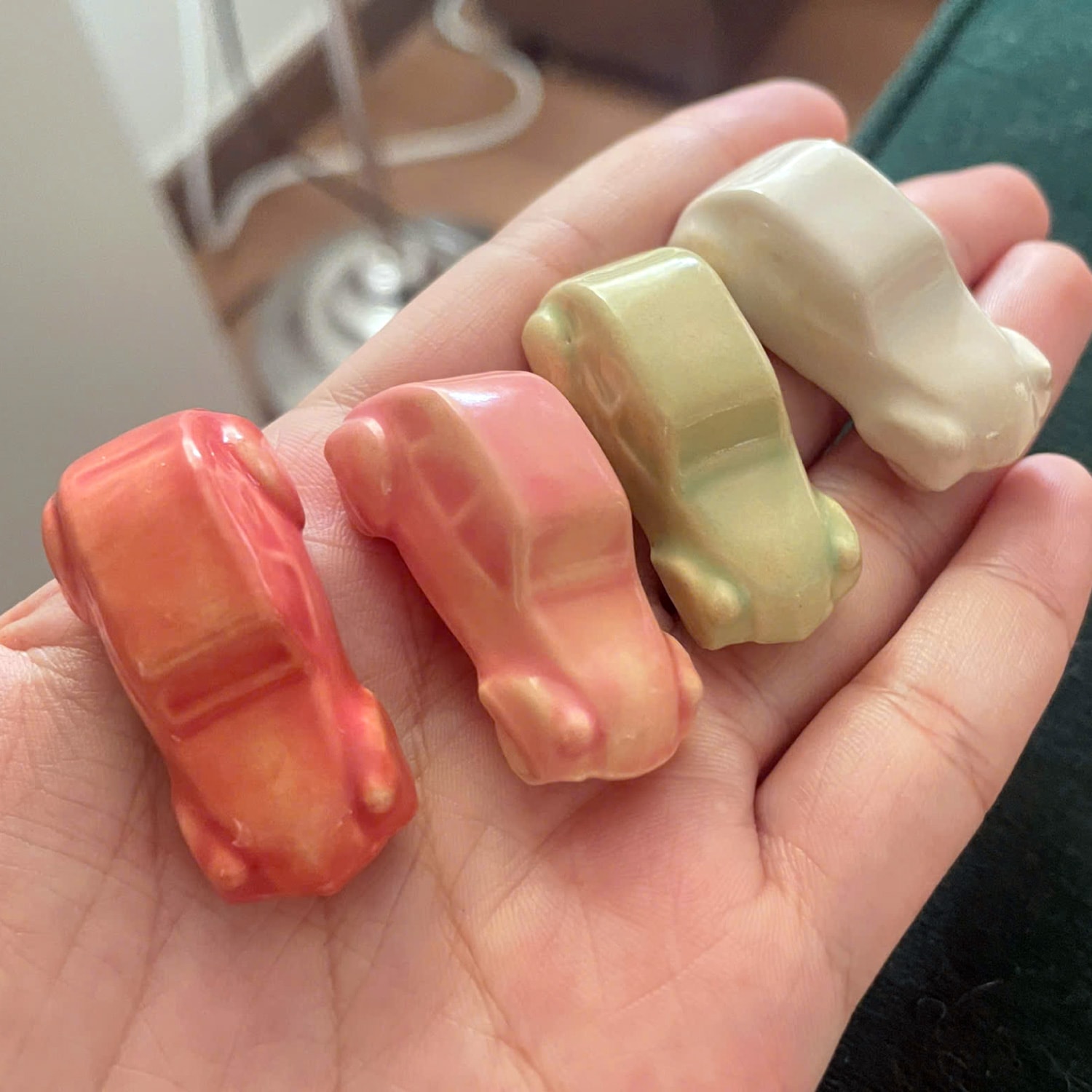
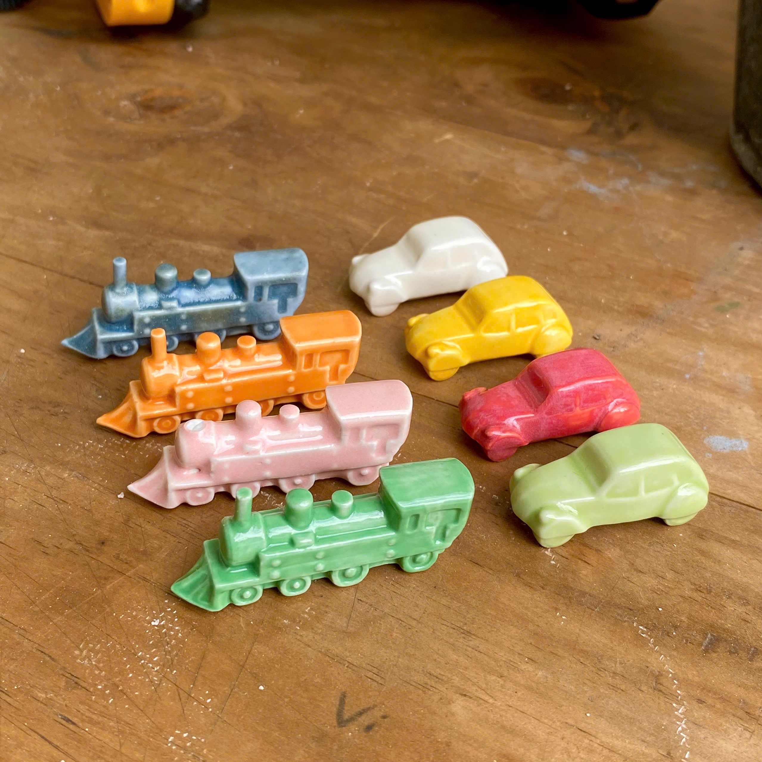
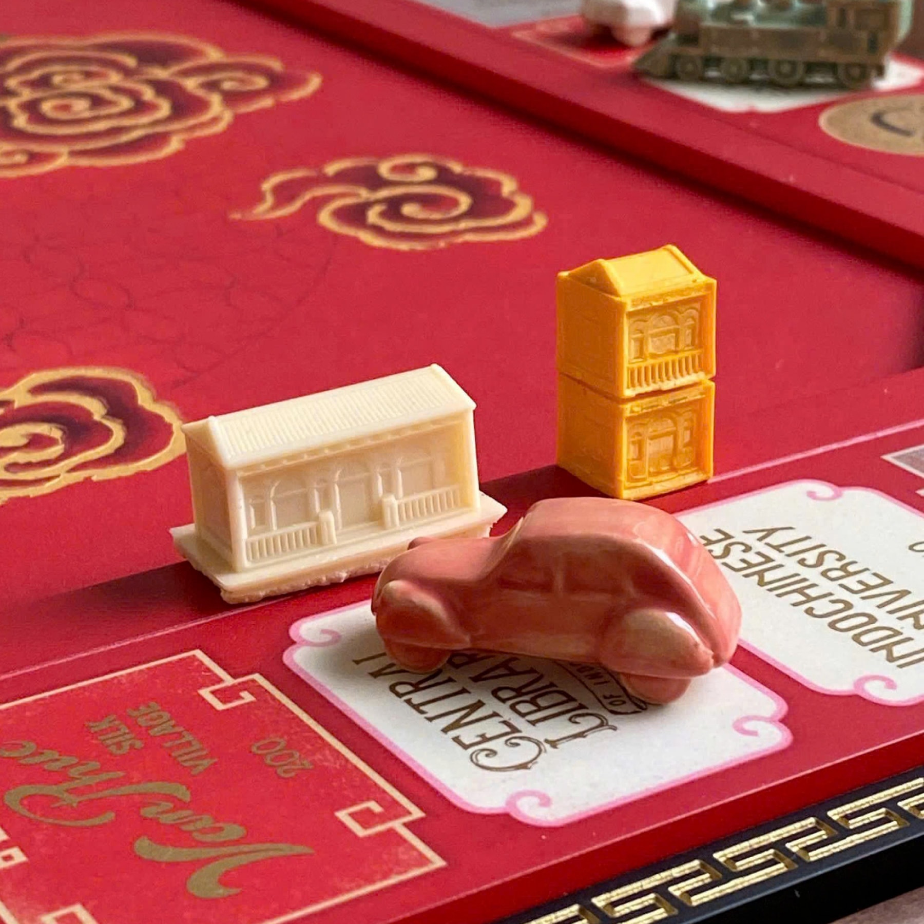
Physical elements - tokens, houses, and currency - are developed through selection and abstraction.
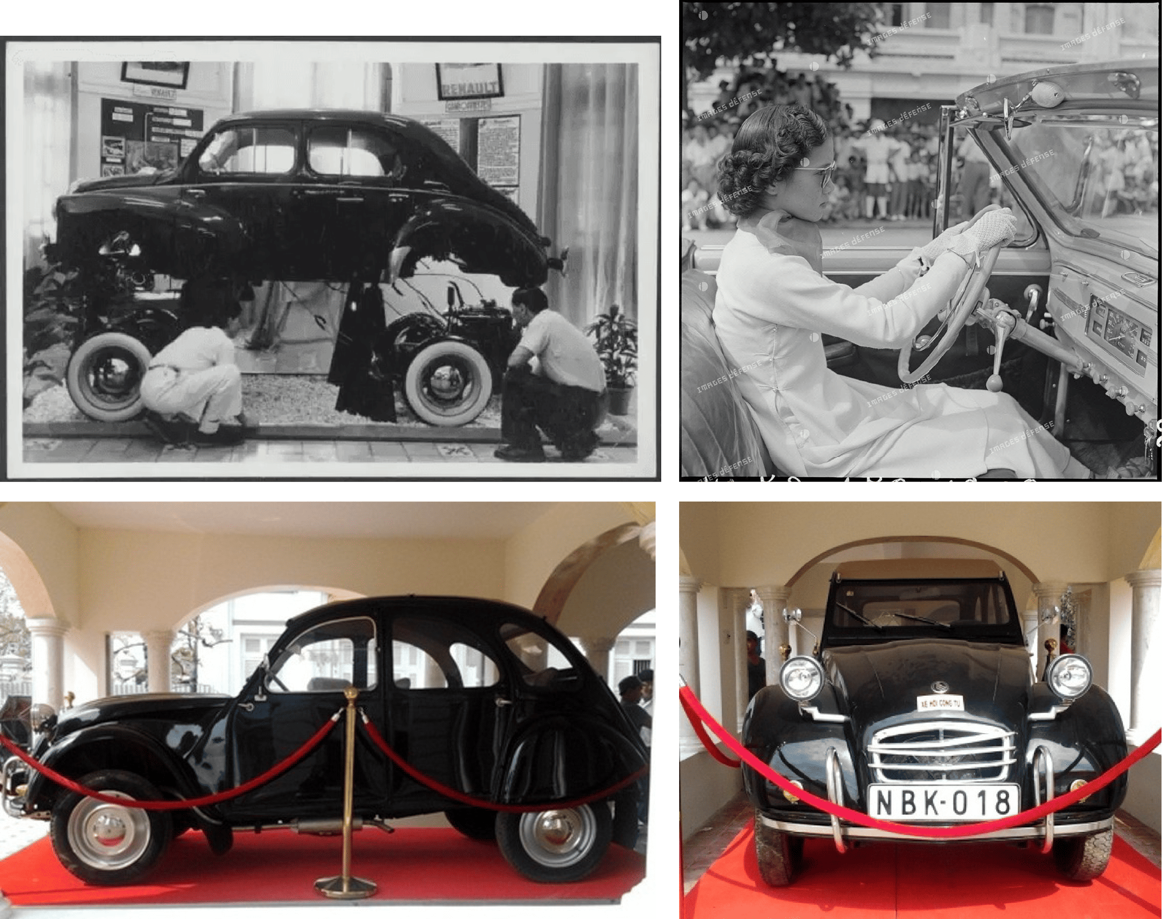
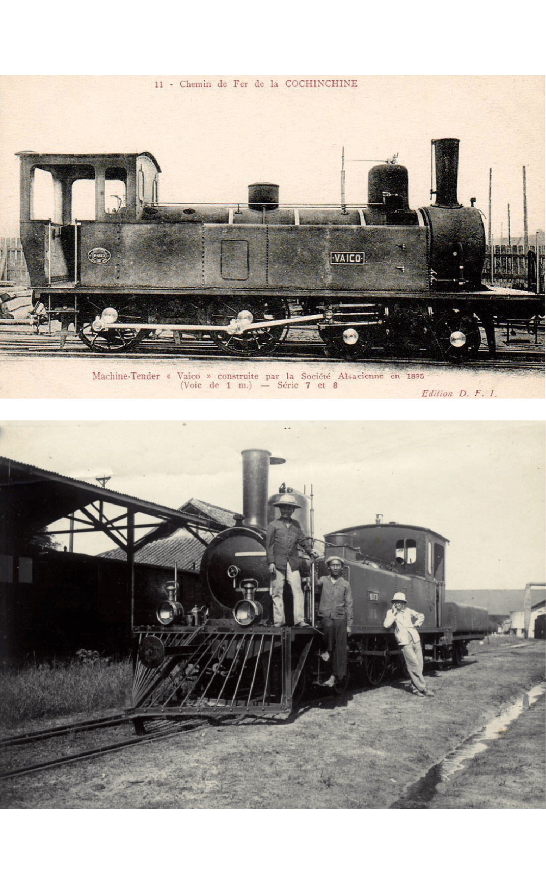
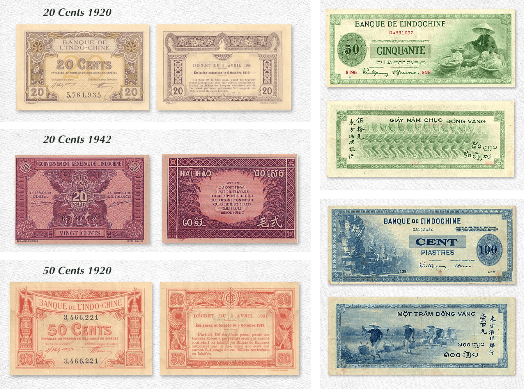
Vehicle and train tokens are simplified from historical references. Architectural modules reflect regional housing typologies. Currency draws from multiple iterations of the Indochine piastre, distilled into a cohesive system.
Extensive color testing was conducted for the tokens and houses to ensure a cohesive palette that harmonizes with the broader visual system.
Here, reduction became as important as reference.

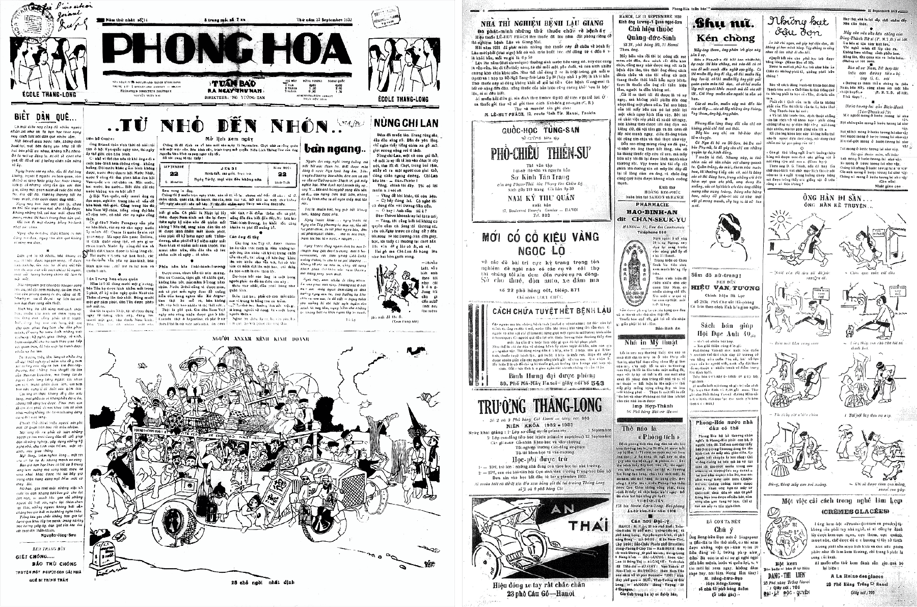
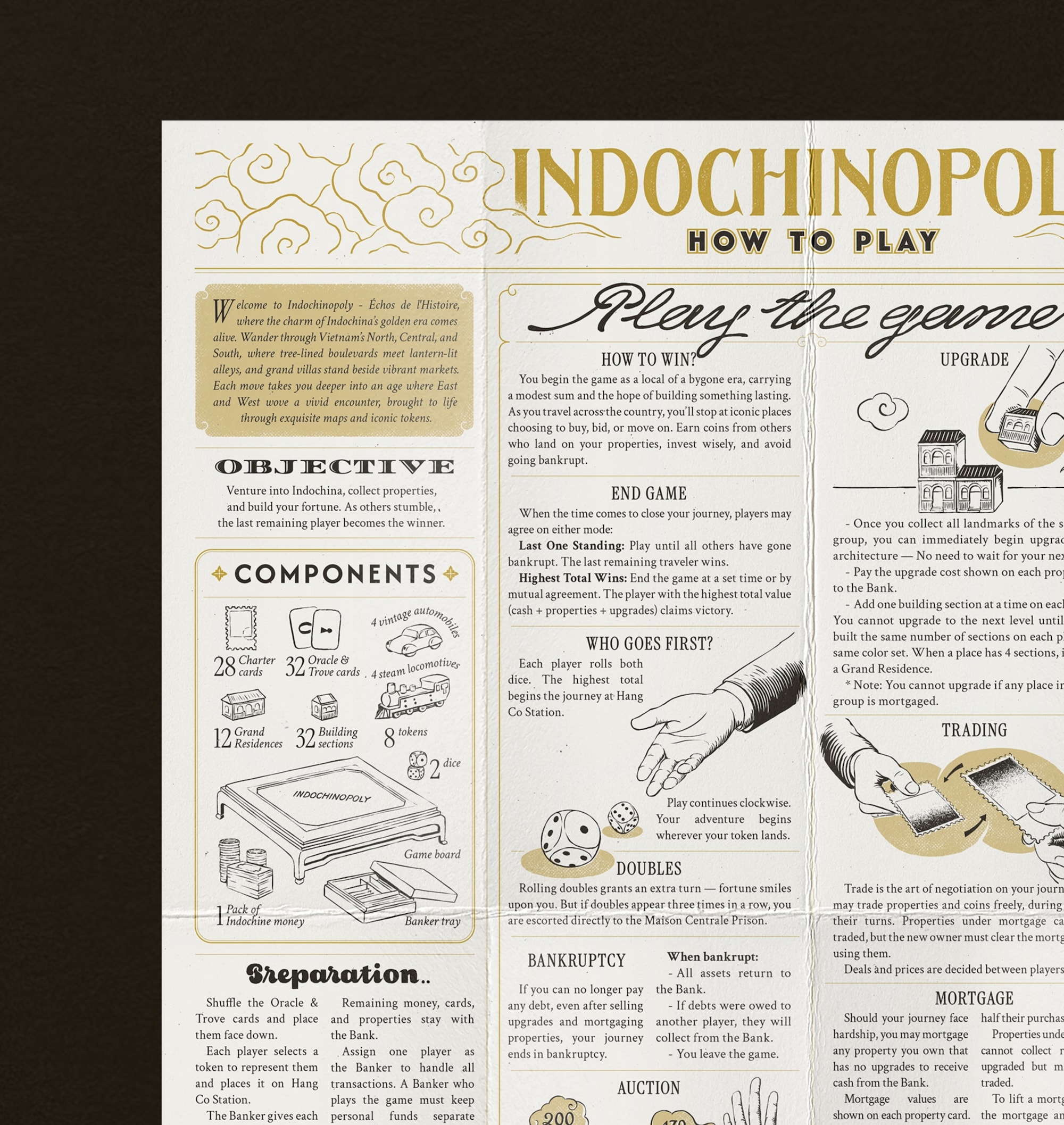
Printed materials such as the rulebook and brochure extend the world beyond the board. Layouts draw from early 20th-century publications, combining typography and illustration to reflect the visual culture of the period.
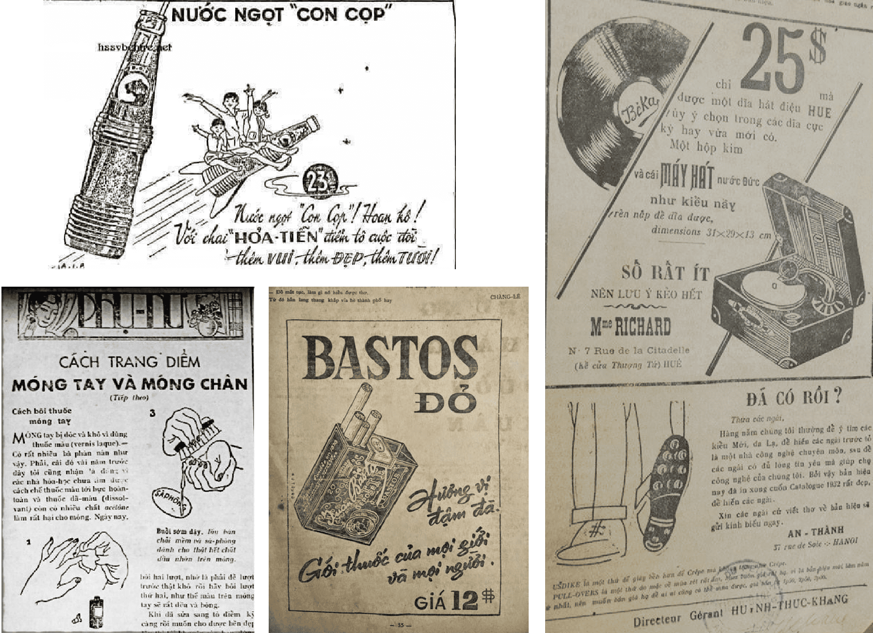
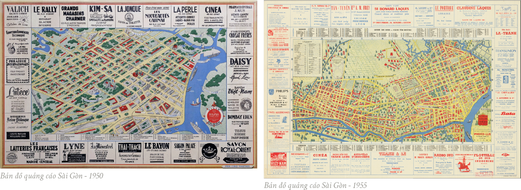 Saigon advertising maps, 1950s
 Initial prototype
 Second prototype
 Second prototype - different printing techniques
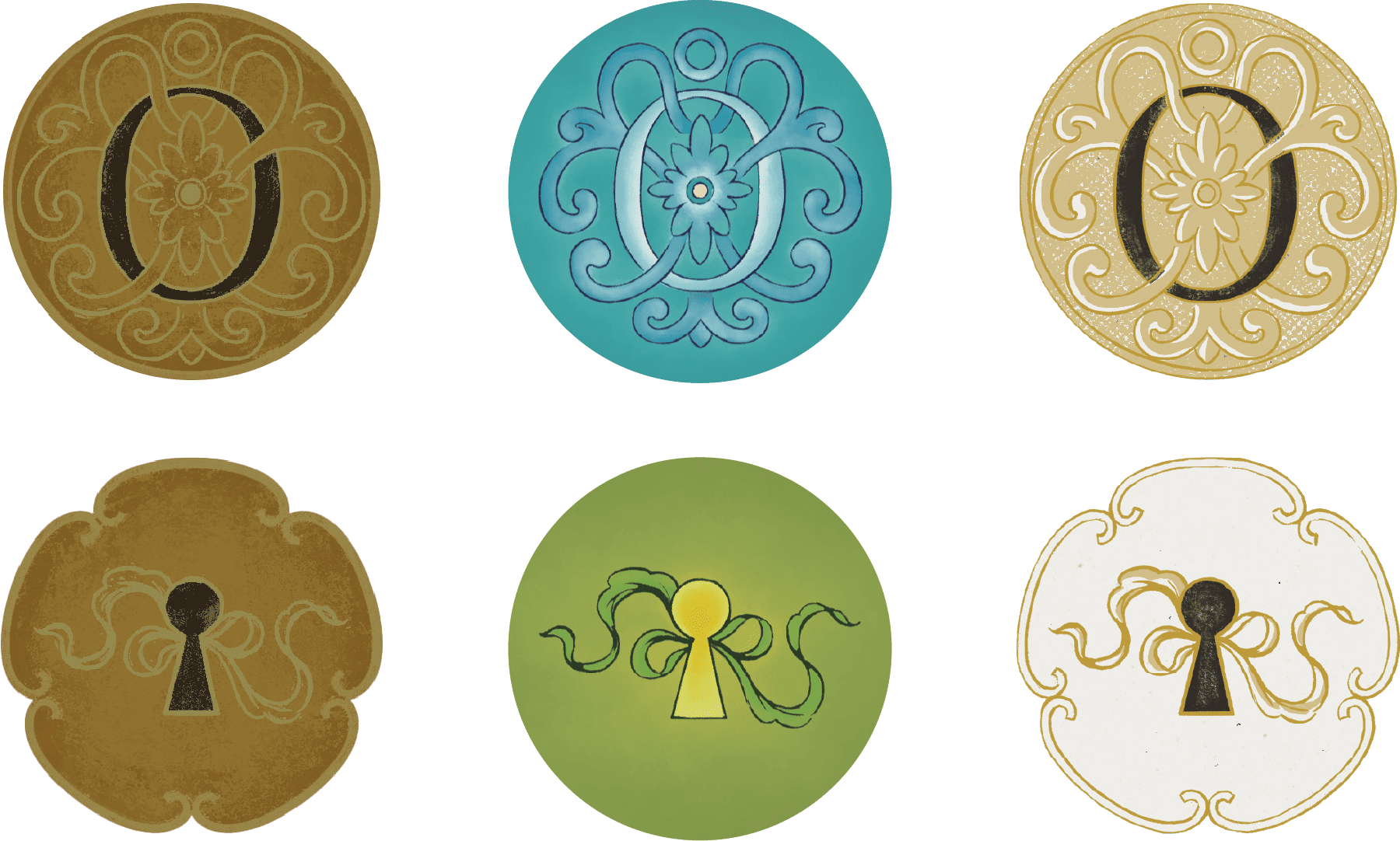 Different interpretations of each symbol on the board, the card
and rulebook
Different interpretations of each symbol on the board, the card
and rulebook
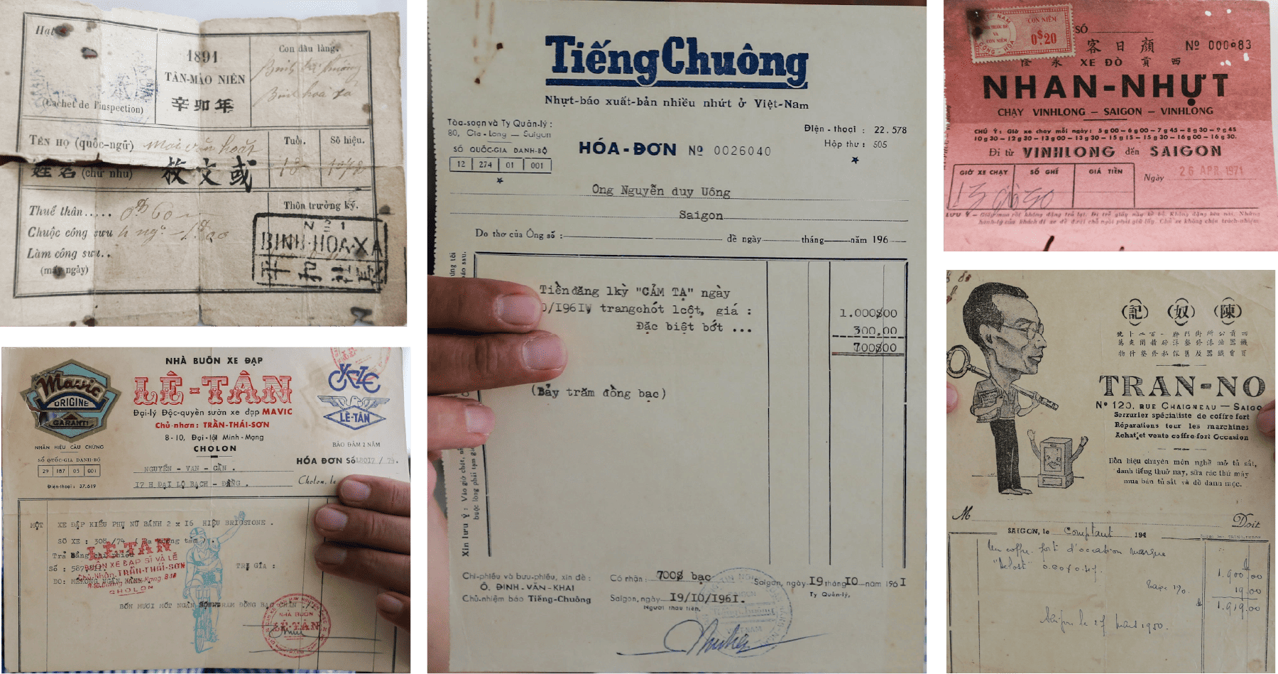 Ticket and receipt-inspired layouts
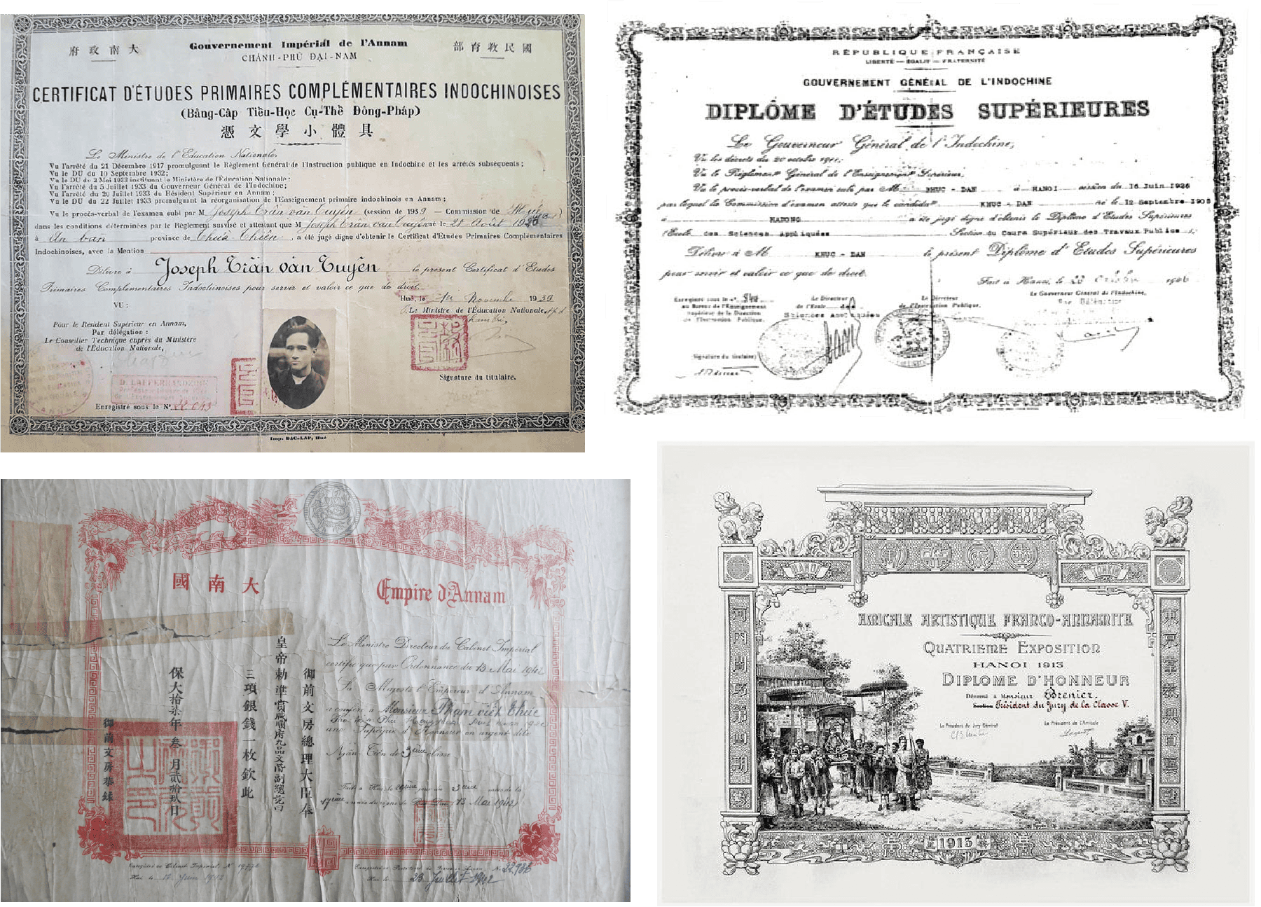 Official document formats
 Advertisement-style compositions

 Final colors
 Final colors