
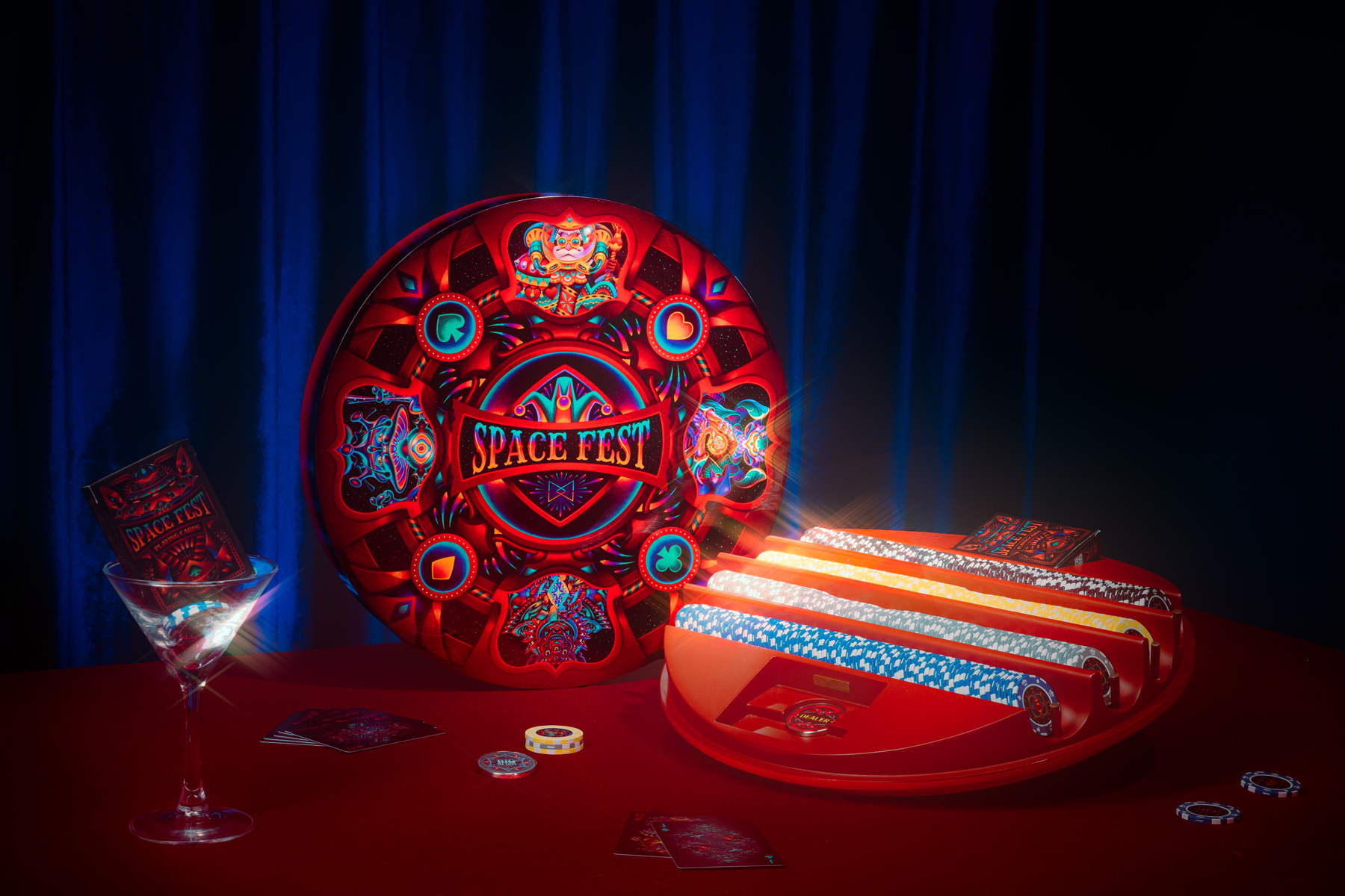
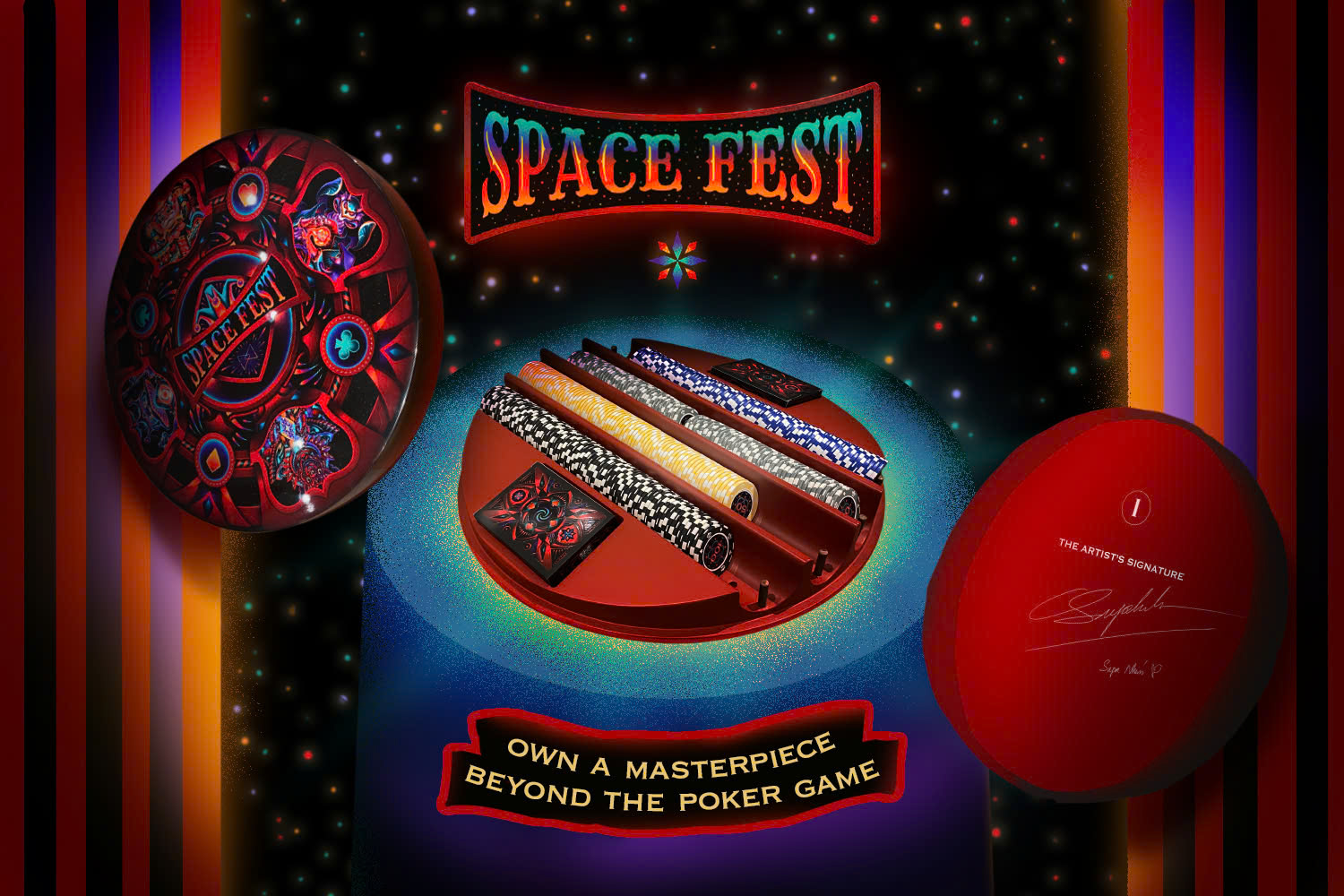
Spacefest began as a deck of playing cards and later expanded into a poker set, developed in collaboration between Supa Nhím and Maztermind's in-house product design team. Created during the global lockdown in 2020, the project emerged from a shared sense of confinement, while the desire to connect and celebrate remained strong.
It imagines a carnival in space - a space that could exist within the mind or somewhere far beyond - where different characters and stories come together.
The campaign extends this world beyond the product itself, bringing together image-making, motion, and storytelling into a cohesive visual system.
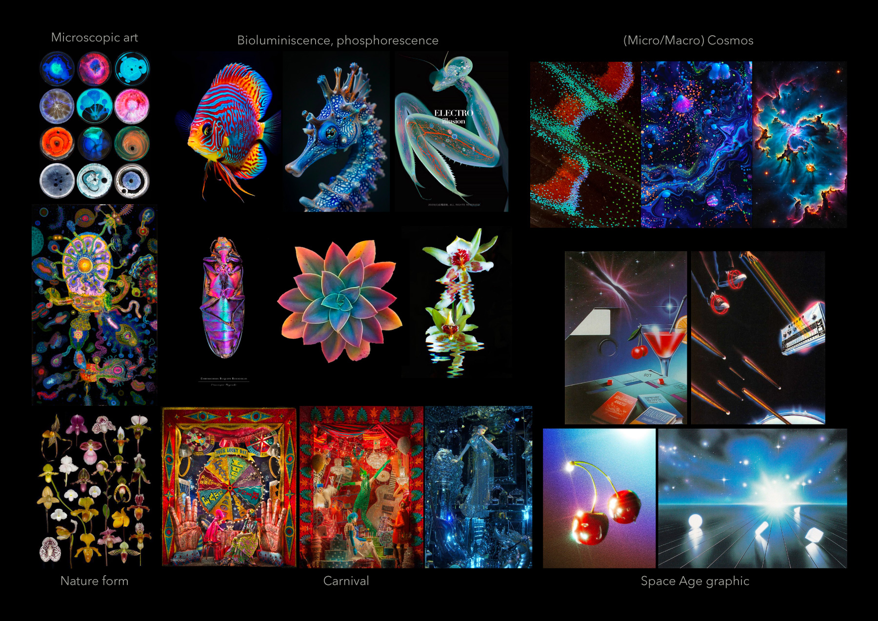
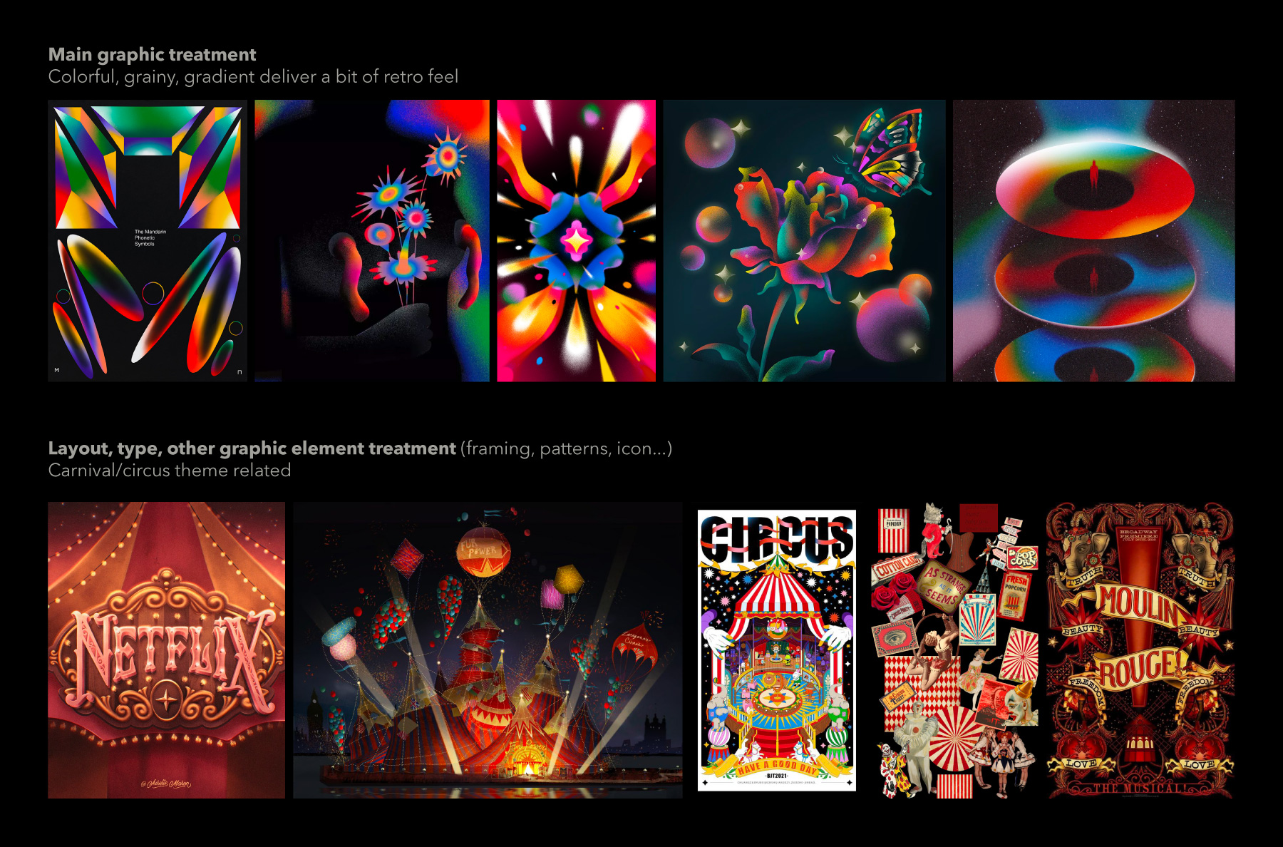
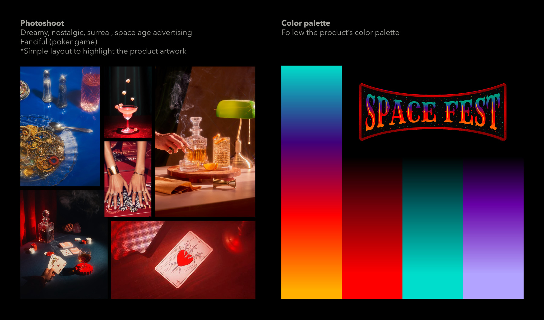
Building on this cosmic-carnival theme, I translated the idea into the campaign's art direction, combining 2D, 3D, motion, and product photography to create a surreal visual language.
This was a production-heavy project, developed within a relatively short timeline. Working closely with an in-house team that was both skilled and aligned made it possible to carry the project through within two months.
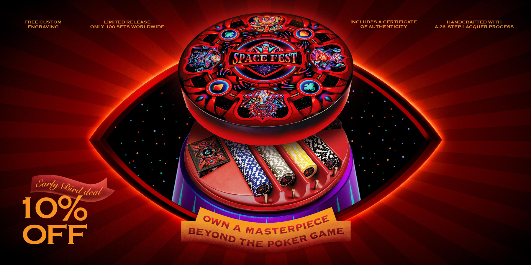
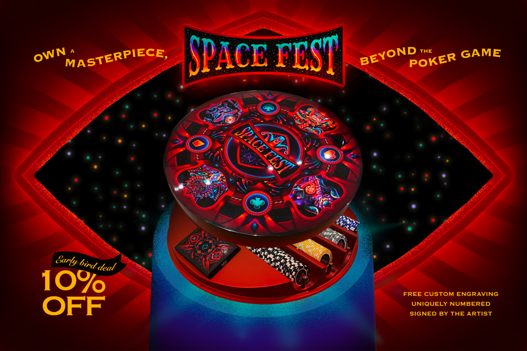
The key visual draws from the structure of the human iris - often seen as something both intricate and expansive, almost like a contained universe.
The idea was to connect Spacefest Poker with the image of an eye in outer space, with the product itself forming the iris. By slightly opening the lid, the composition suggests a break from normal constraints, aligning with the campaign's underlying message.
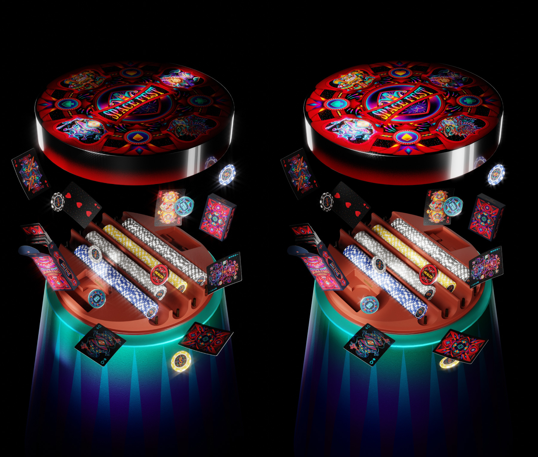
This was also my first time directly combining 3D elements with product photography in a key visual. The approach helped reduce production time and cost, while giving me more room to focus on other outputs such as the landing page and motion work.
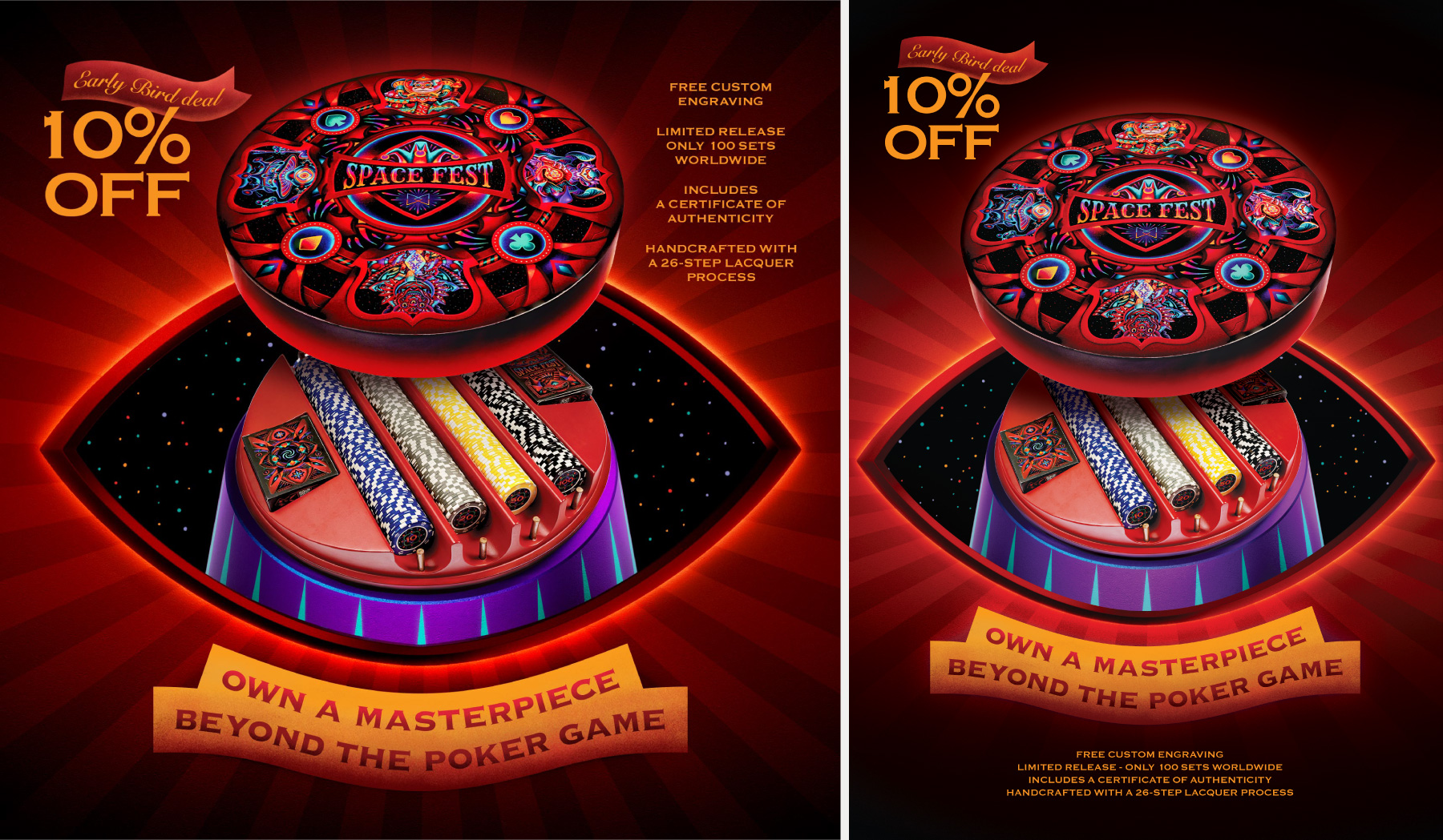 KV adapted for PC, mobile web versions and print
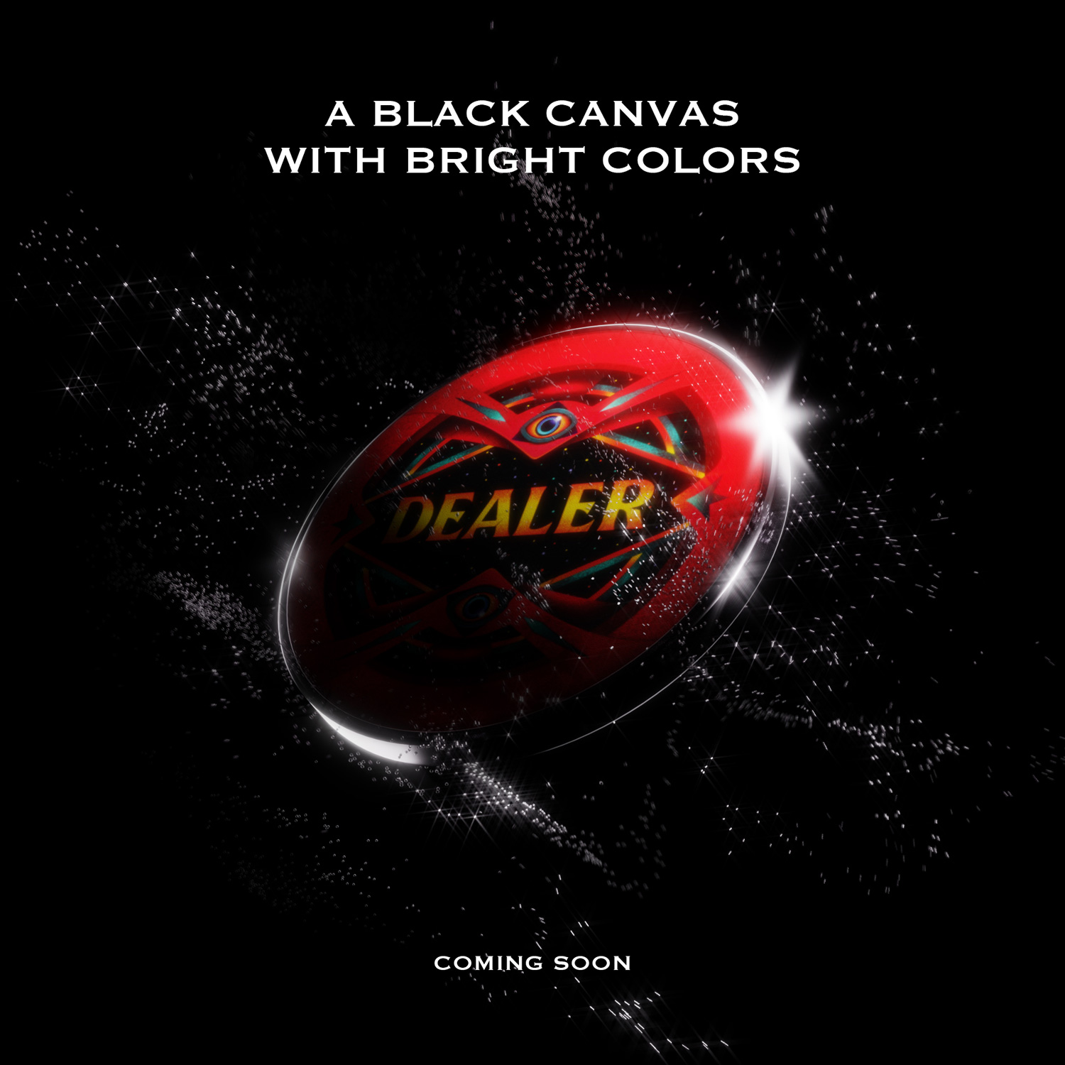
This direction was the second iteration. The initial concept was more literal - presenting the product as a magician emerging from a cosmic stage.
To better express the narrative behind Spacefest, we focused on bringing in the voice of the artist and the world behind the artwork. Our team conducted a series of interviews with Supa Nhím, developing short video pieces that introduce the story and thinking behind the designs.
Alongside that, I produced motion clips for teasing, introduction, and world-building.
Motion (and 3D) was not my primary discipline, so much of the process involved learning while making - testing techniques, adapting workflows, and finding ways to achieve the intended results within my limitations.
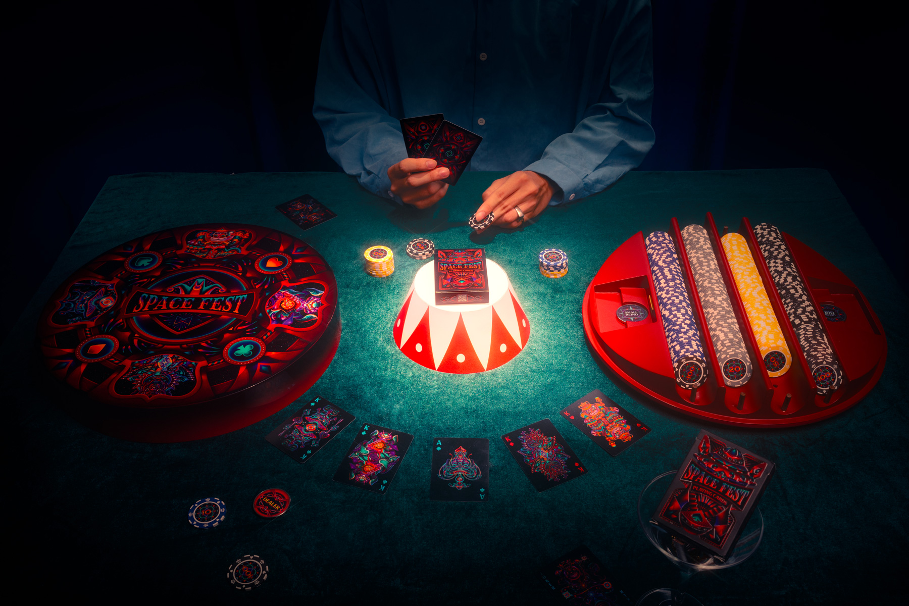
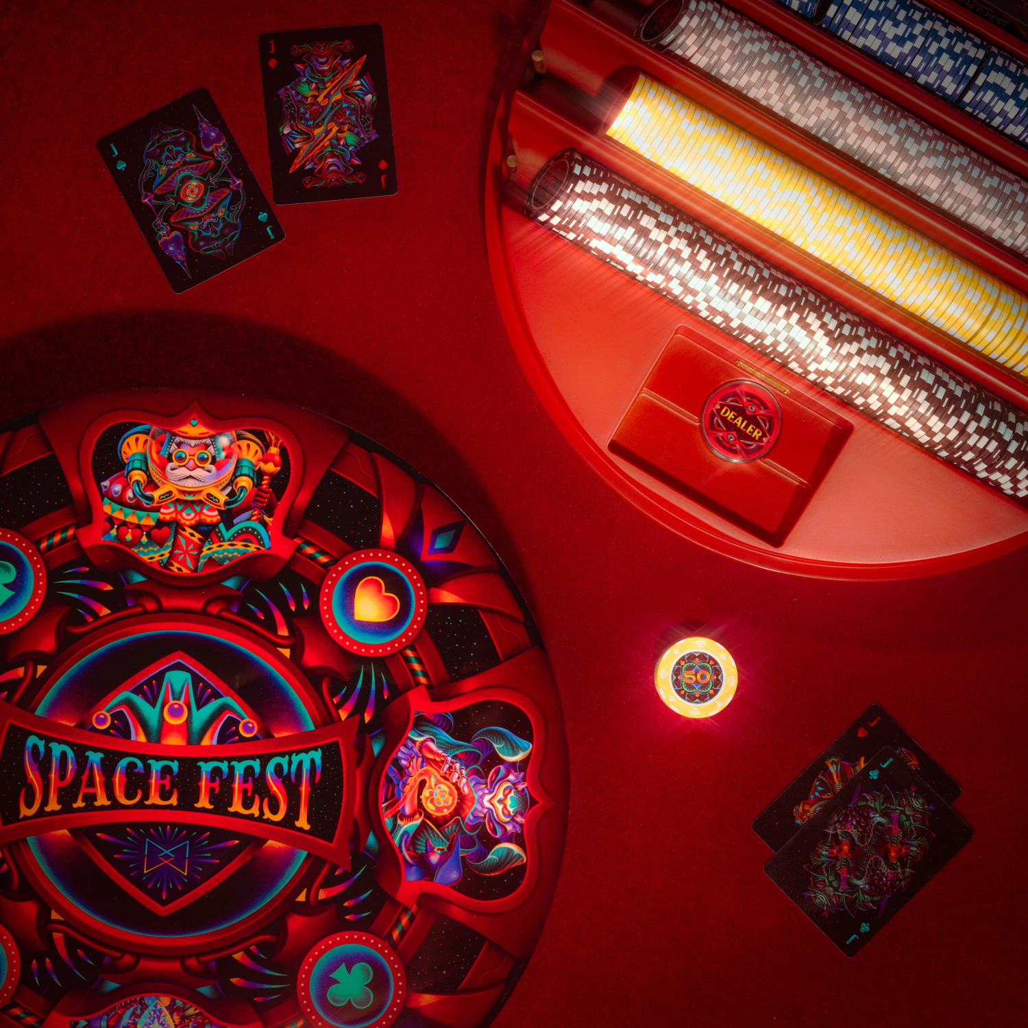
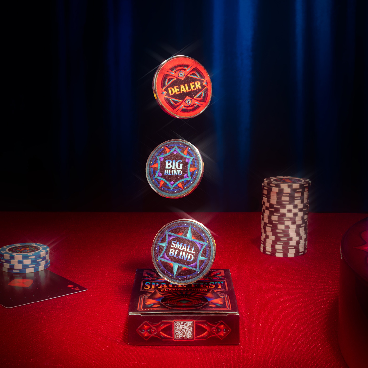
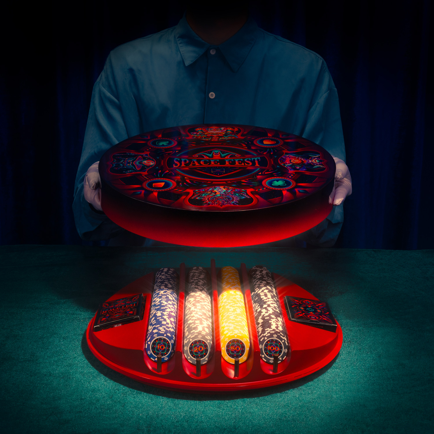
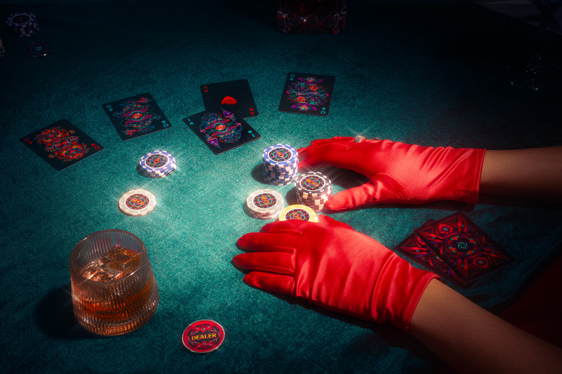
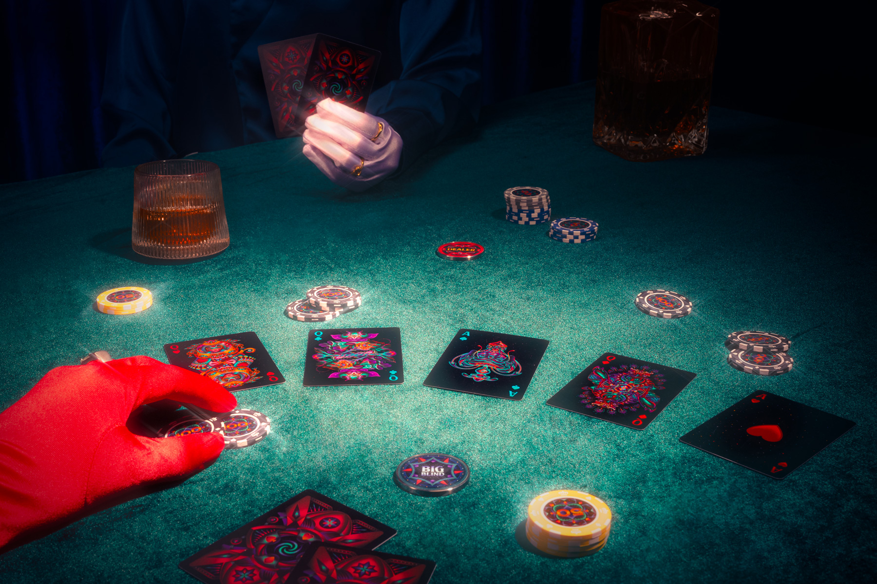
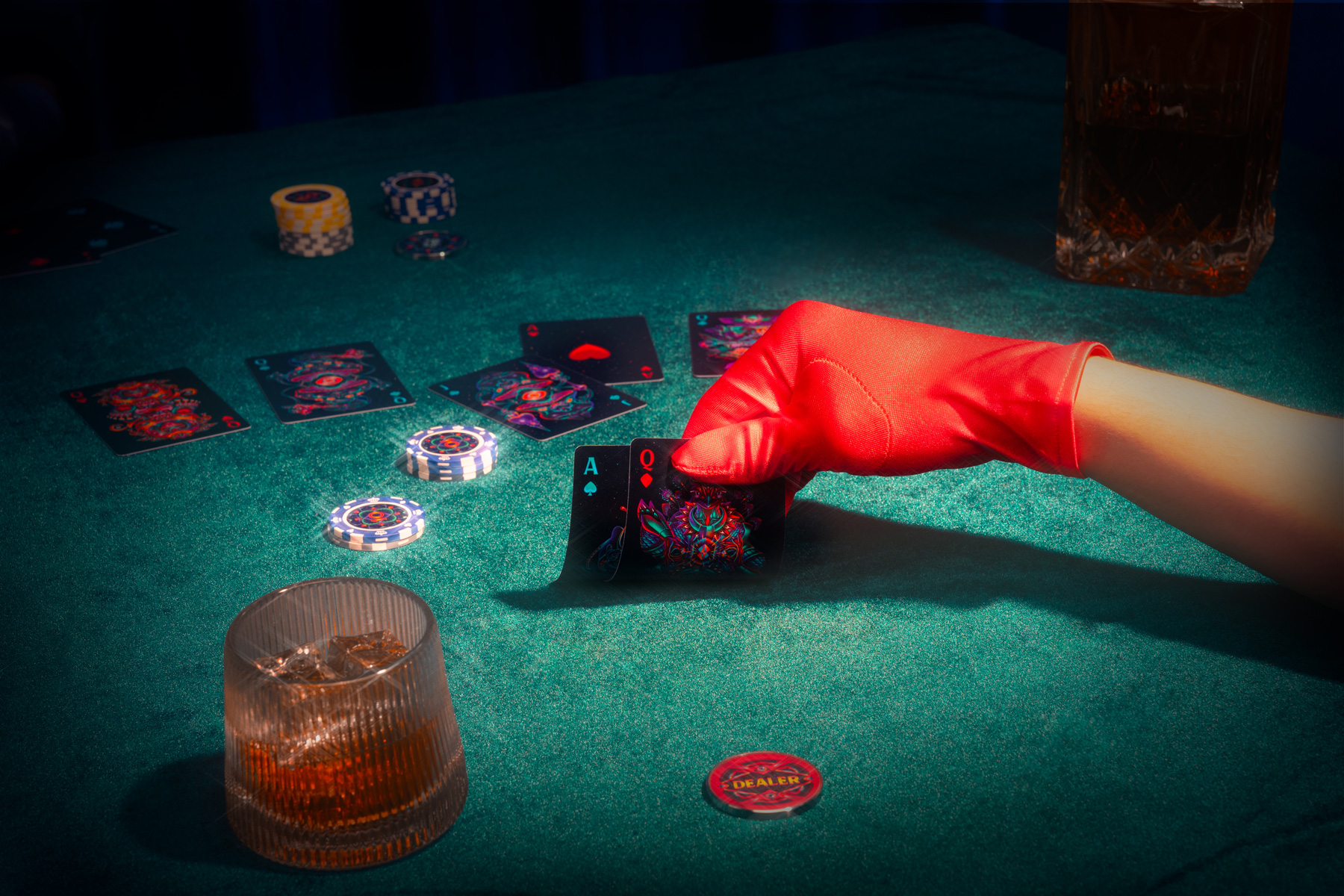
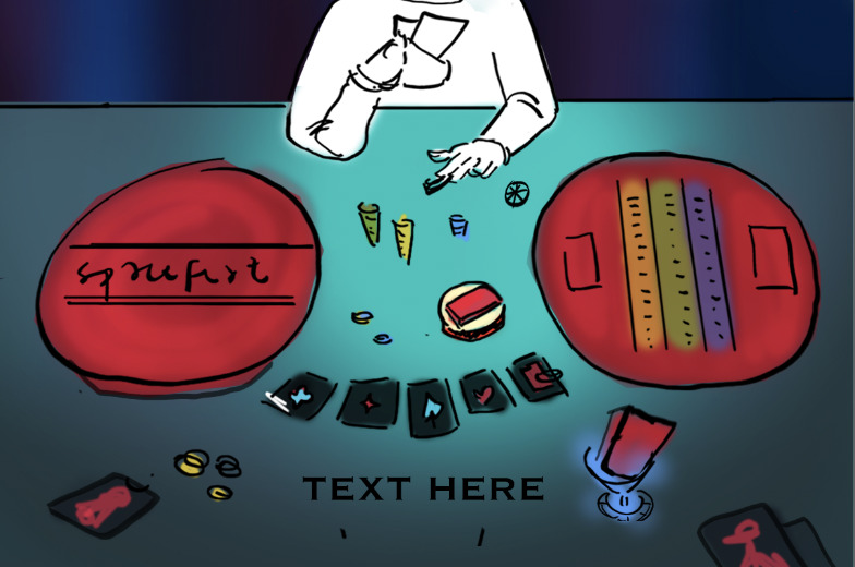
Alongside the key visuals, we developed a set of concept photos to further shape the emotional tone of the campaign. The images recreate a poker scene, built around subtle visual cues from the core concept - a circus stage, silk gloves, velvet curtains - set within a slightly eerie, nostalgic atmosphere.
This layer helped connect the design concept more directly to the product, bringing everything into a more cohesive and complete expression of the campaign's narrative.
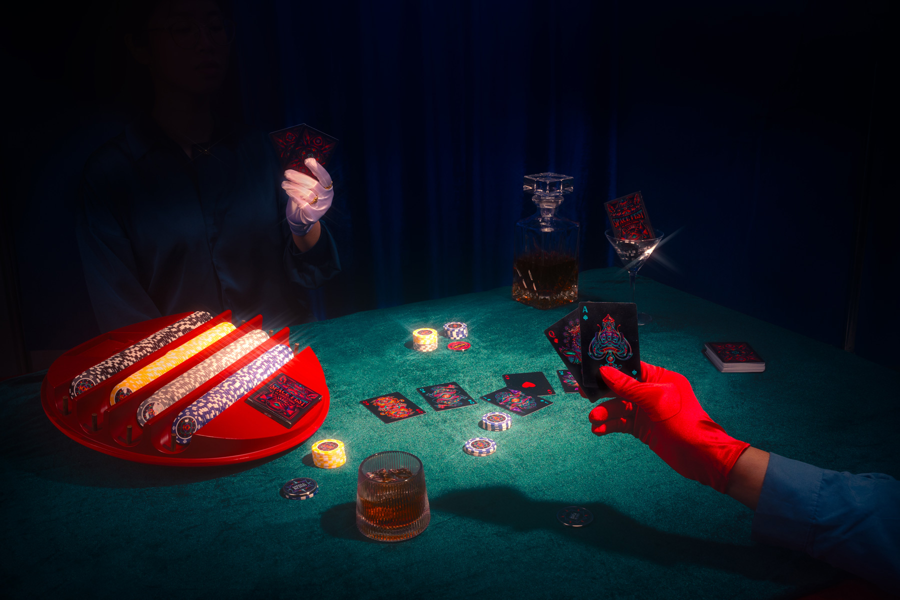
 Layout sketches & Product styling: Vinh / Retouching: me &
Ngọc
Layout sketches & Product styling: Vinh / Retouching: me &
Ngọc
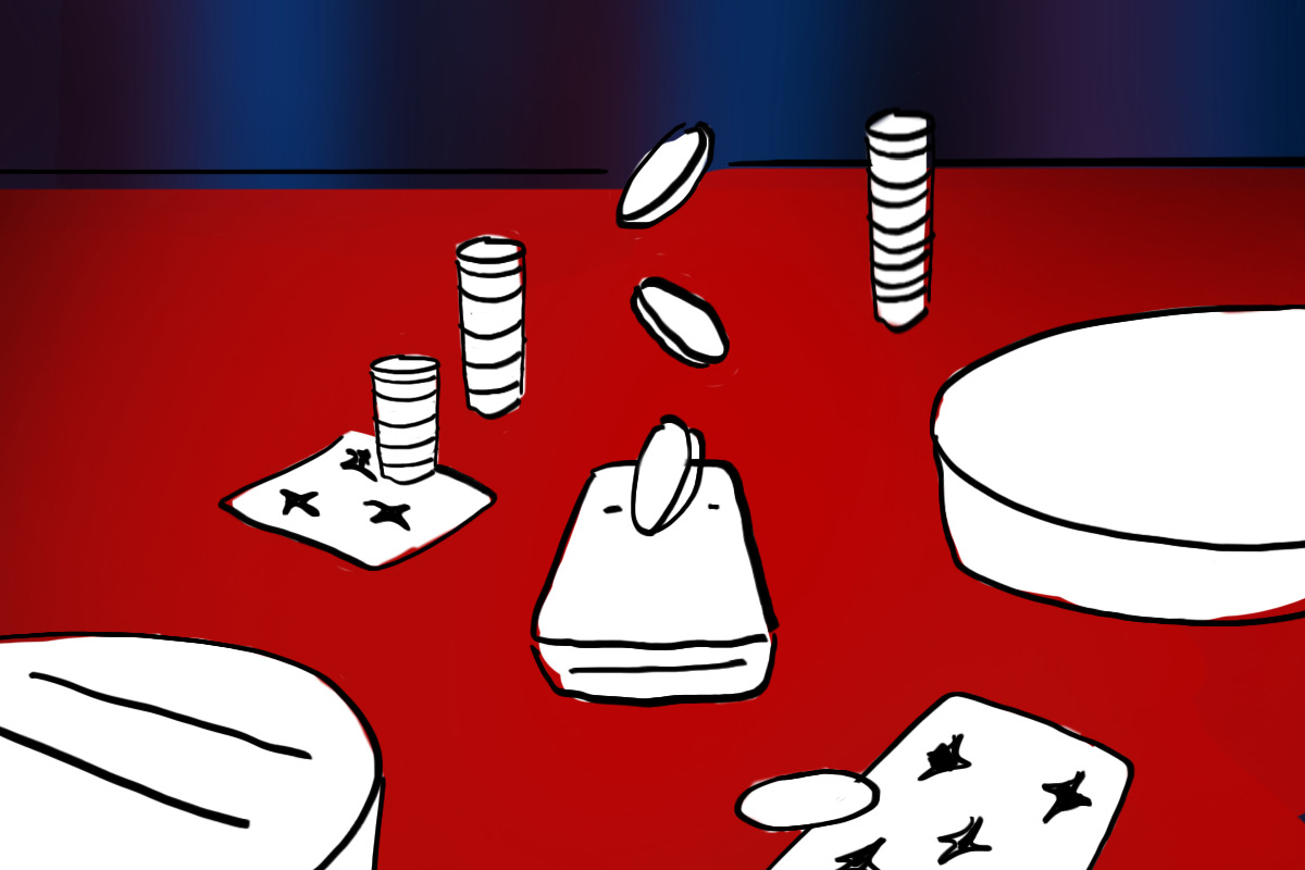
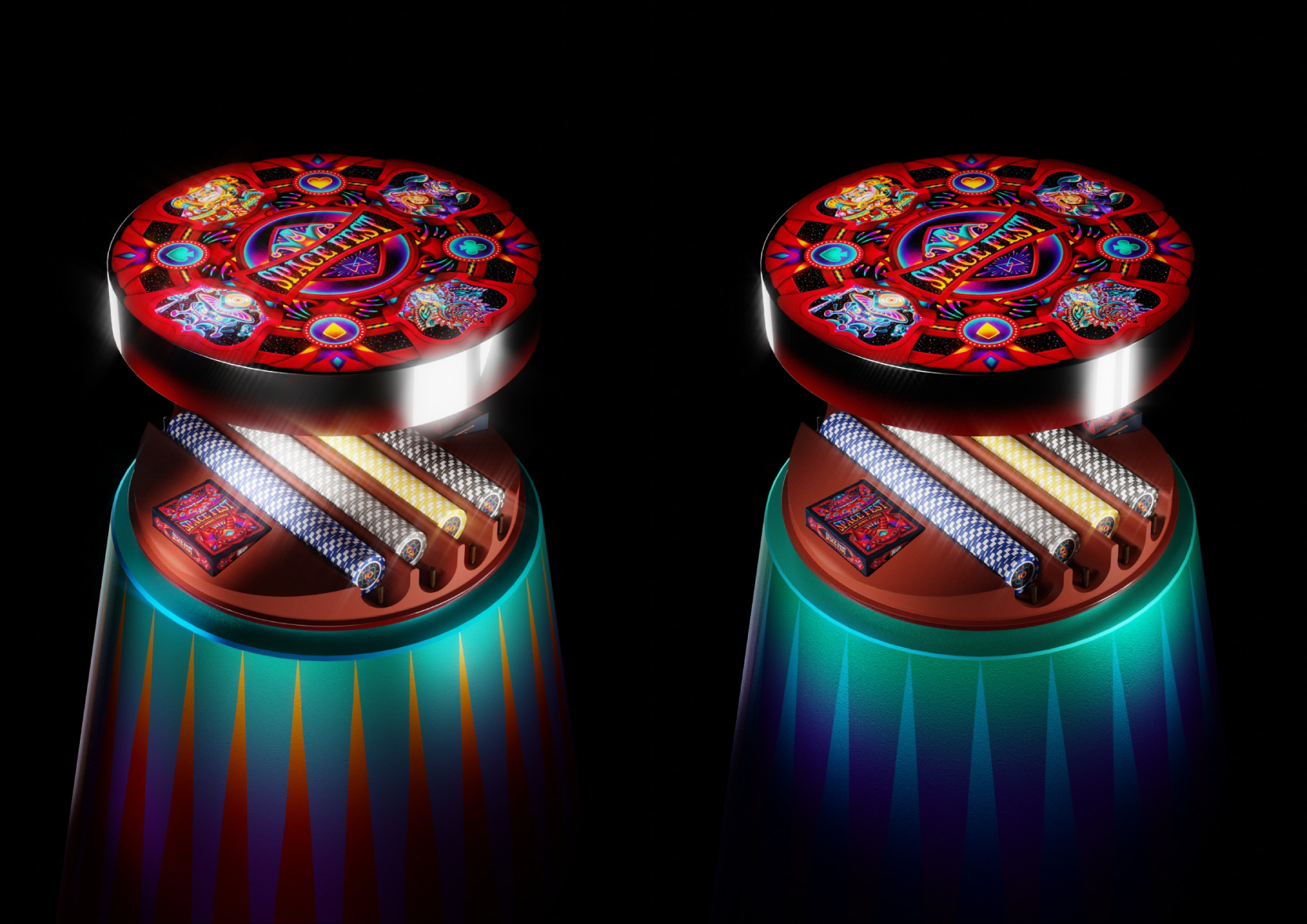 Some alterations of the platform and lighting in 3D
environment.
Some alterations of the platform and lighting in 3D
environment.
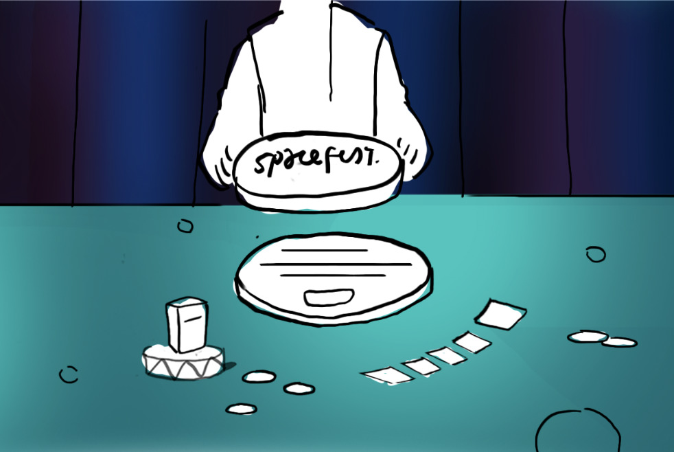
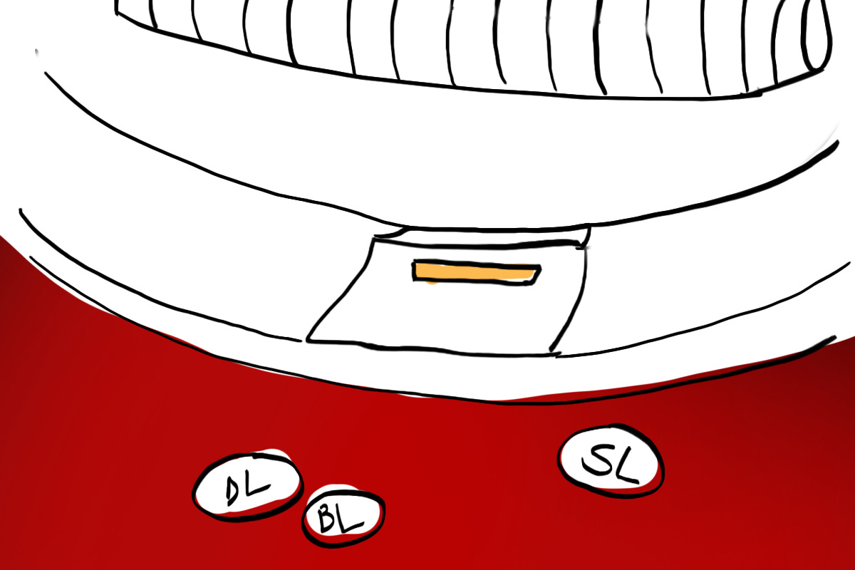
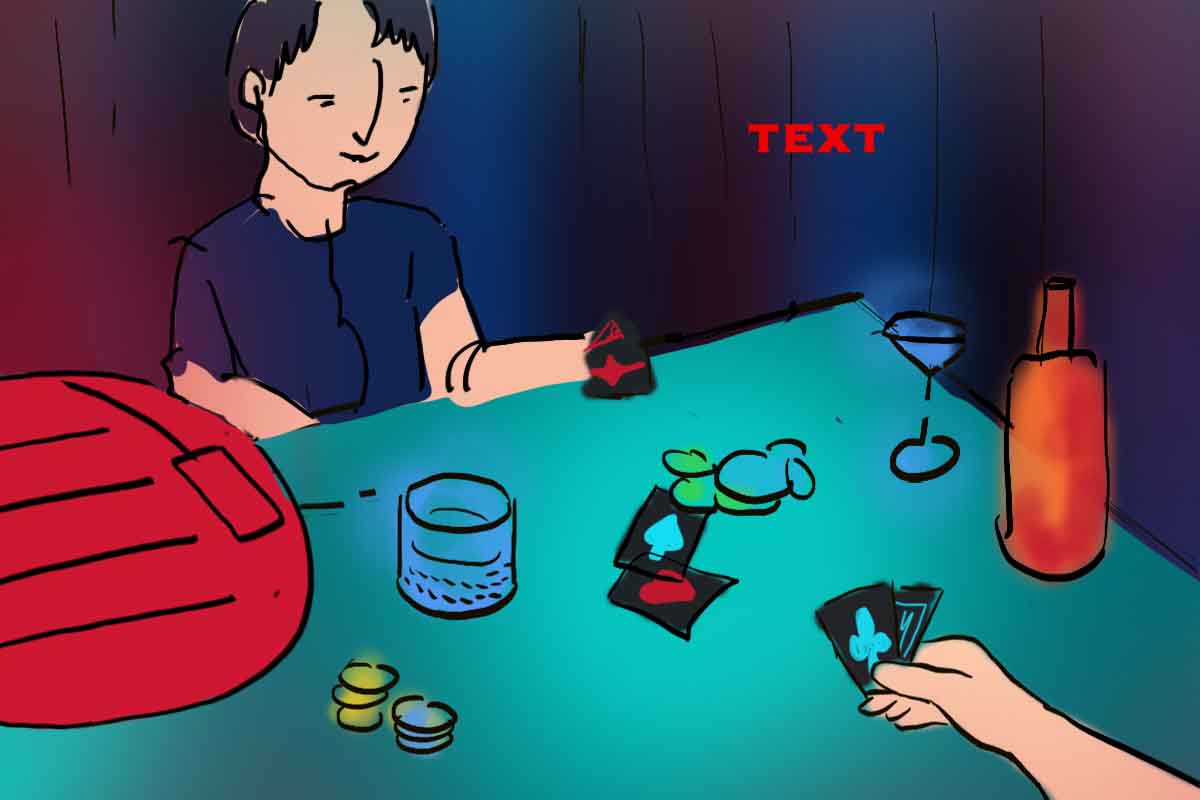
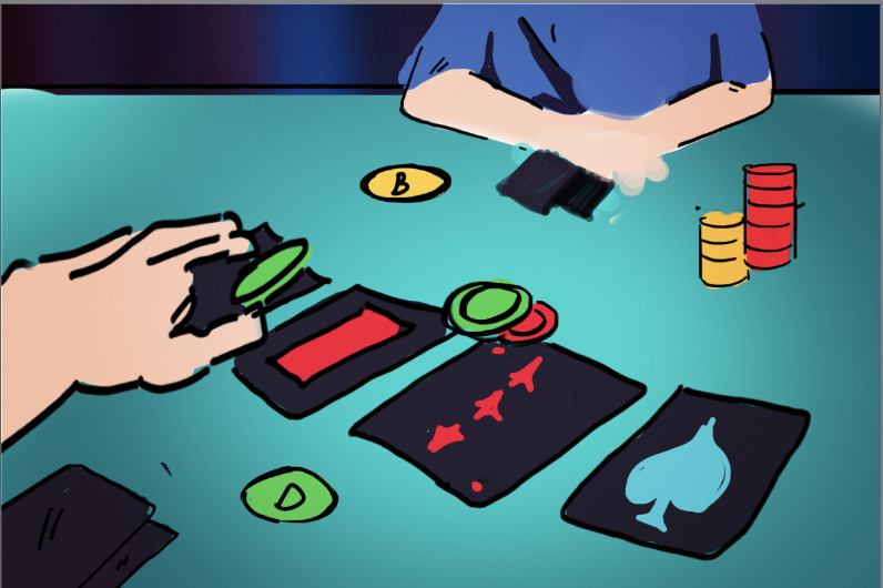
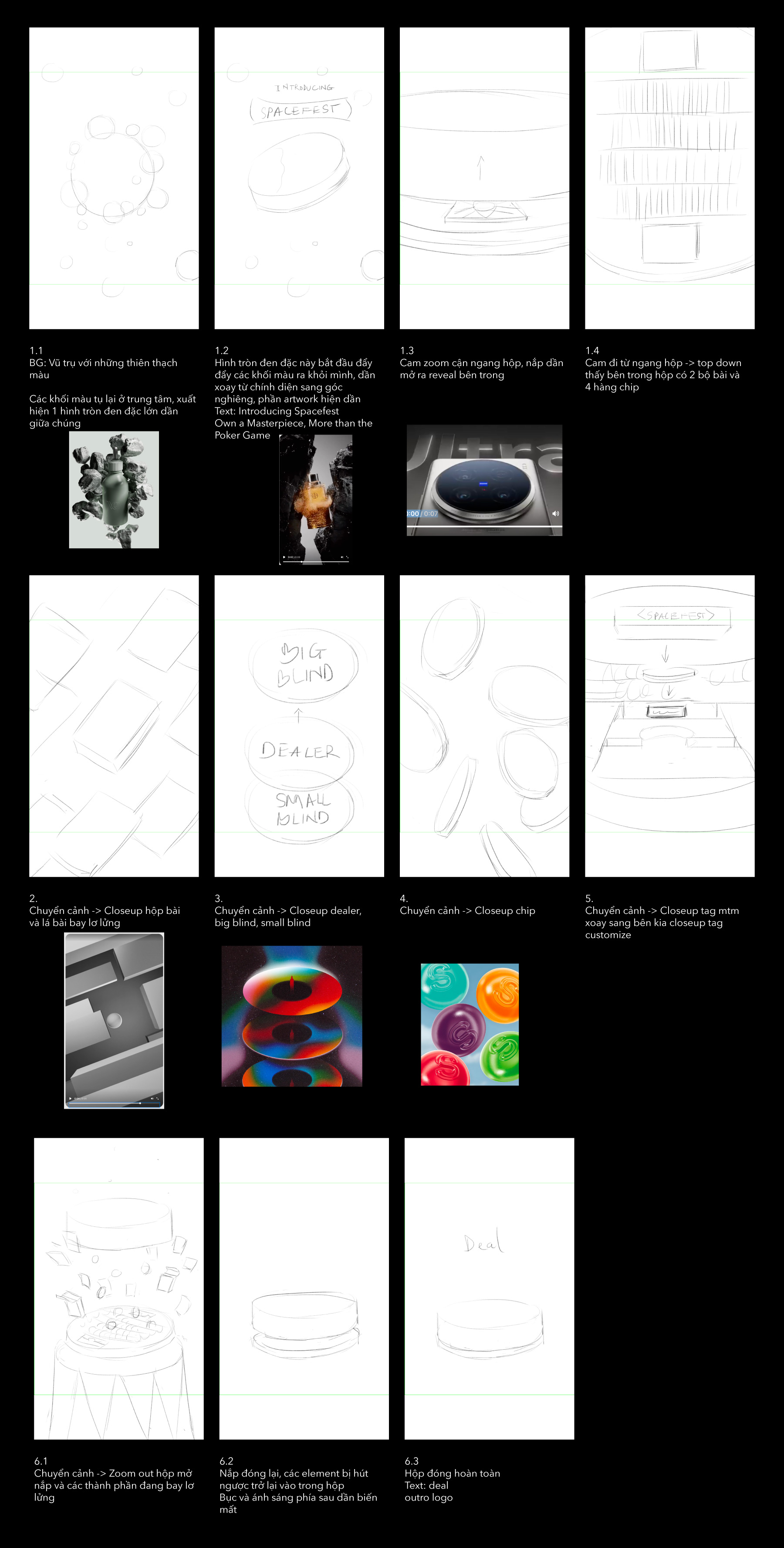 Storyboard is very sketchy & some parts were omitted during
execution due to rushing time.
Storyboard is very sketchy & some parts were omitted during
execution due to rushing time.