In early 2023, The Craft House was a brand at a crossroads. As a retail hub for an eclectic ecosystem of makers - including Maztermind, Looxury, and TiCK&PiCK - it was shifting its focus toward a more defined gifting service. When I stepped in, a new visual identity had already been live for a few months, yet it hadn't quite "clicked" with leadership.
My task was delicate: to audit a brand-new system and find the missing link between the visual expression and the brand’s artisanal soul.
Inheriting someone else's work so soon after launch is a unique challenge. I found myself questioning my own perspective: "Was the need for change objective, or was it just me?" I believe it is rarely wise to overhaul a brand simply because a new director has arrived. I had to set aside my ego and act as a strategist first, identifying only the refinements necessary to bridge the gap between where the brand was and where it needed to go.
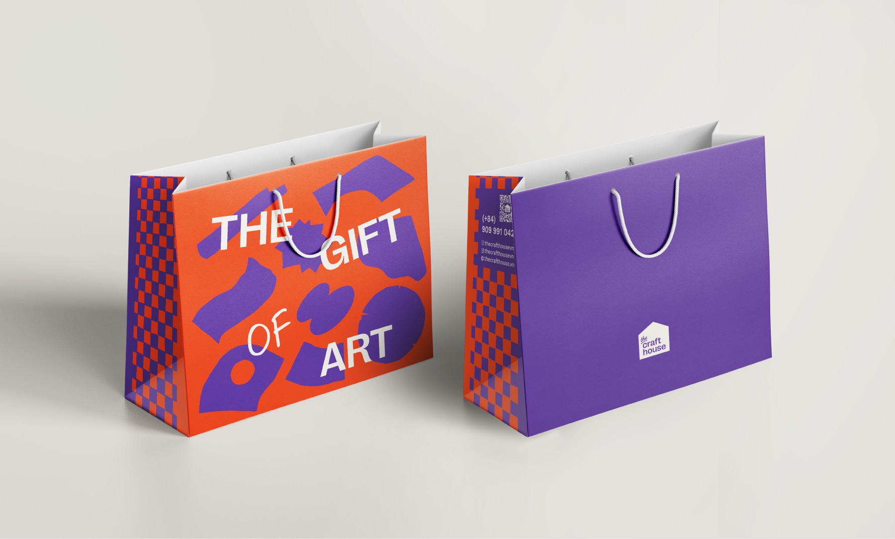
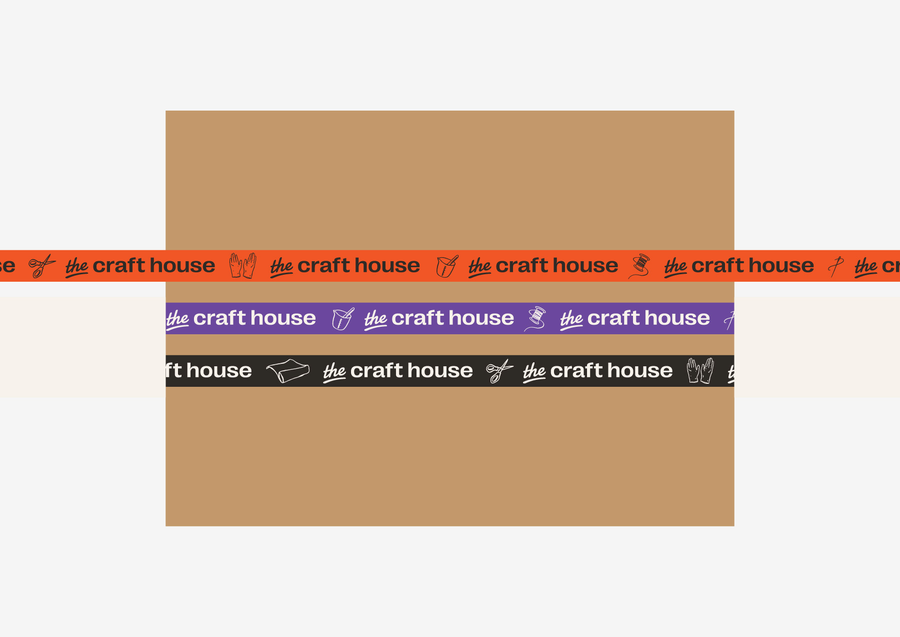
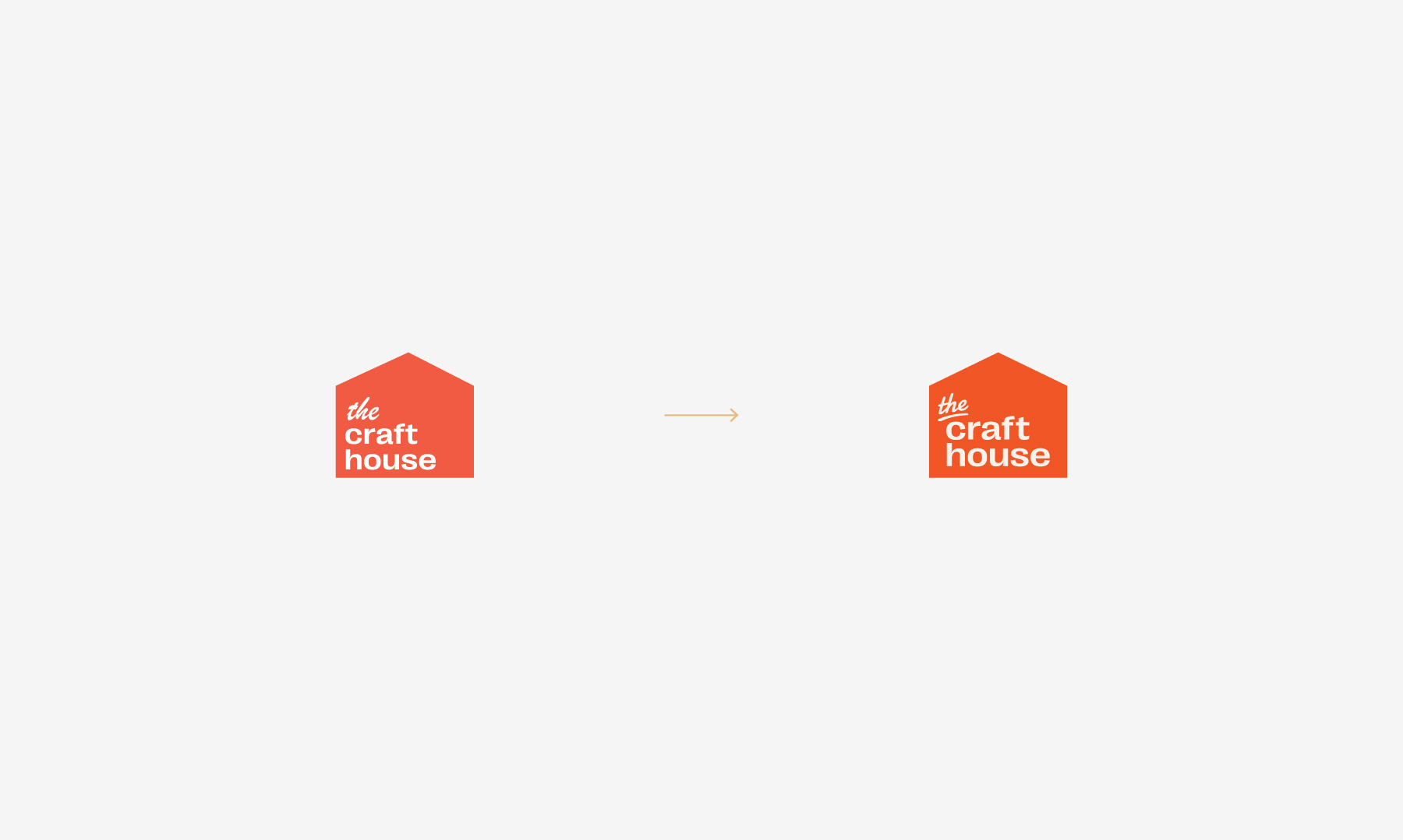
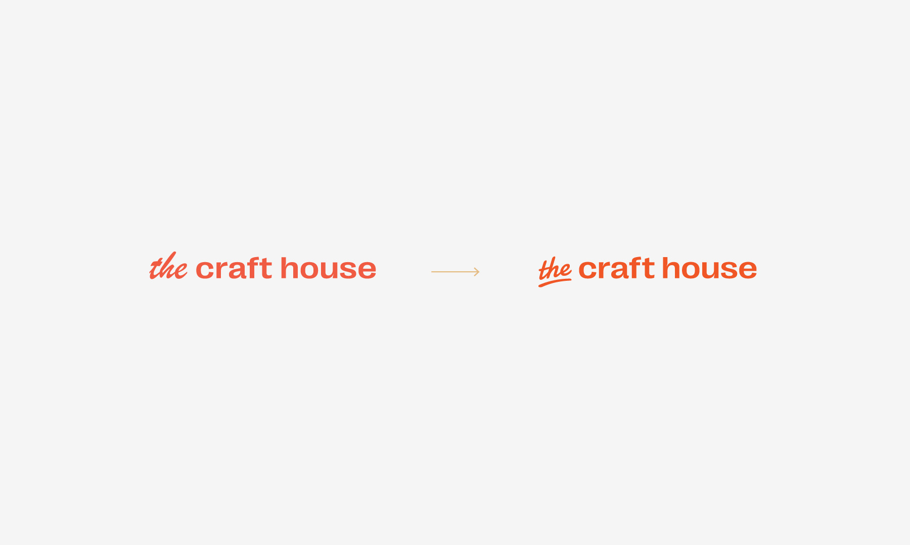
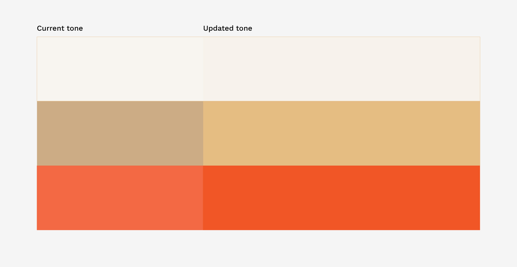
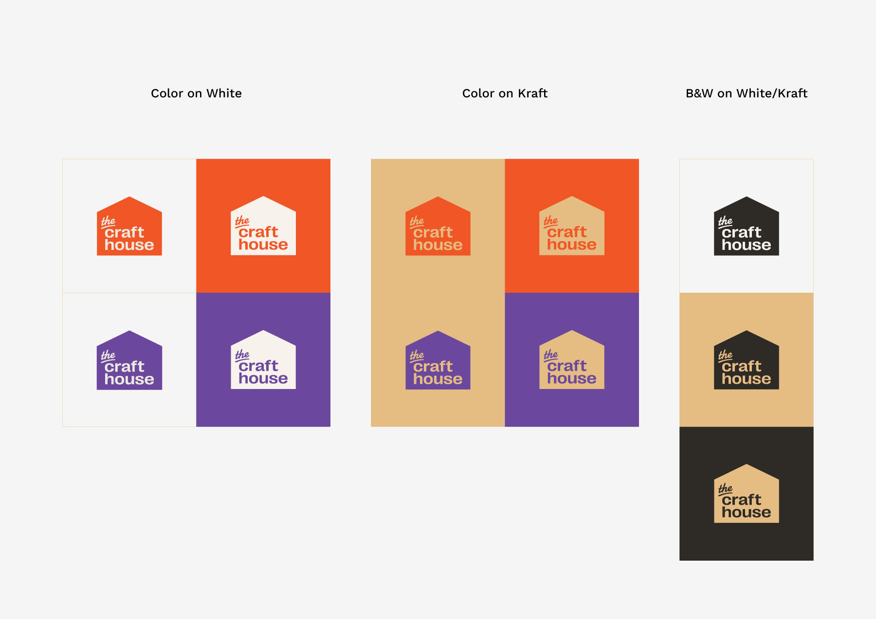
The logo had already transitioned from its original "house" with a slab-serif font into a more minimalist silhouette with a script and sans-serif pairing. The direction was sound, but the execution lacked balance. To find the right "temperature" for the change, I developed three iterations ranging from subtle tweaks to a bolder typographic shift. Ultimately, we chose the most refined, minimal-change version-preserving brand equity while polishing the details for a more premium feel.
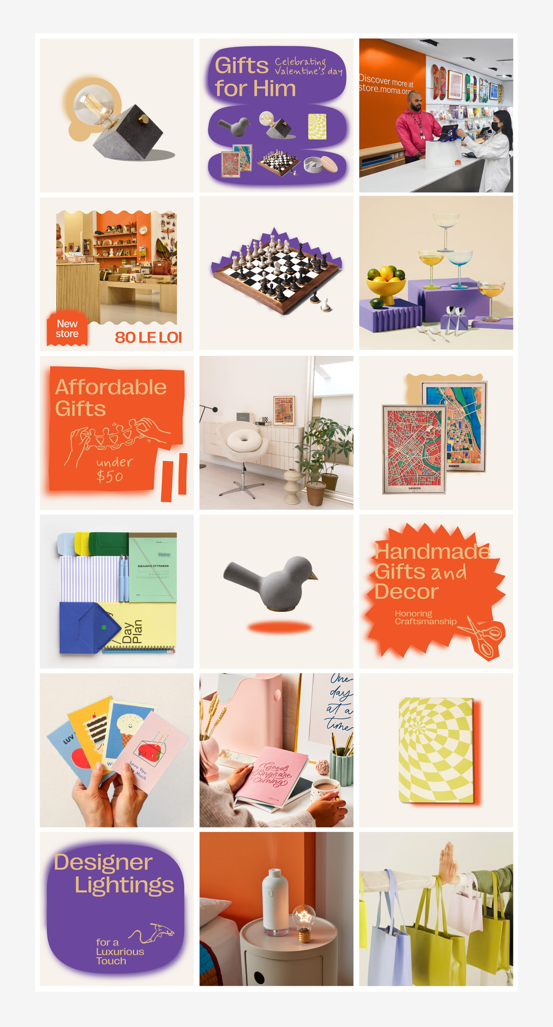
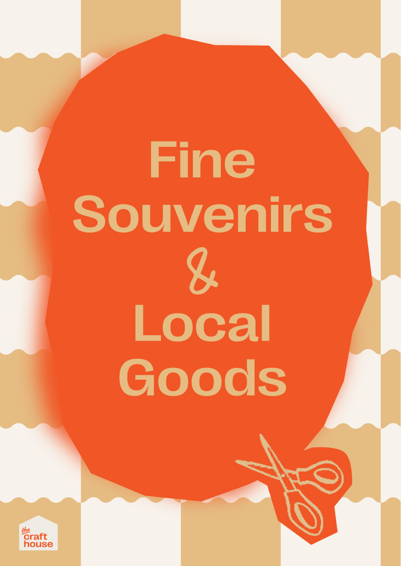
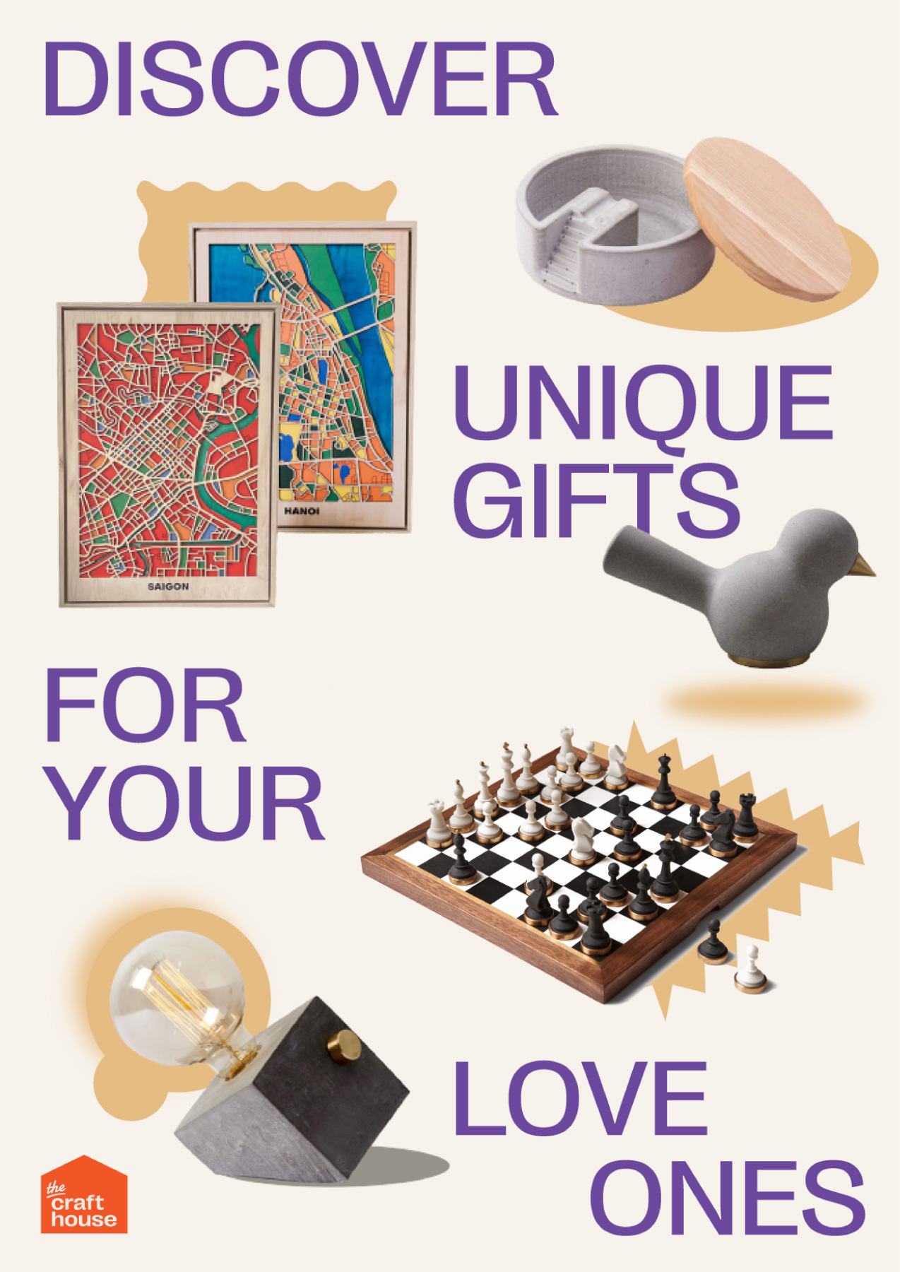
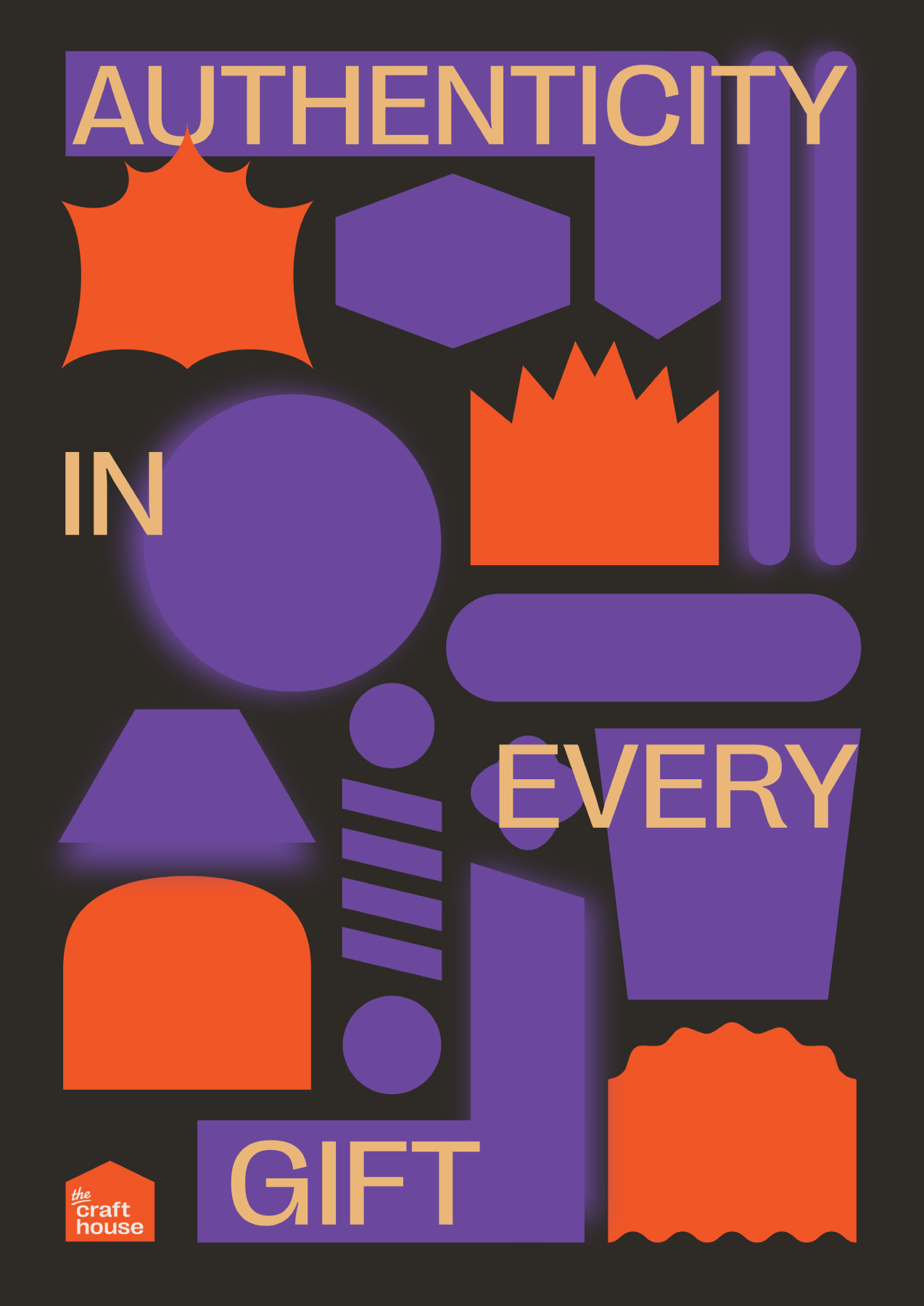
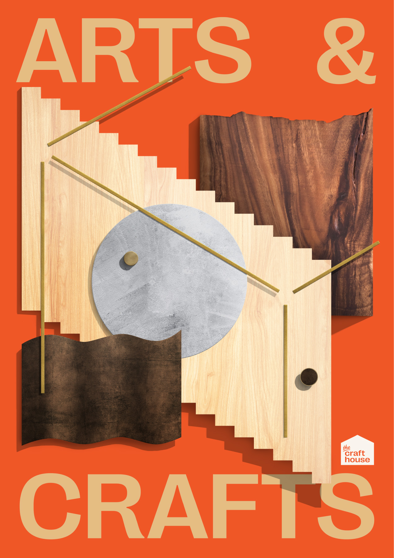
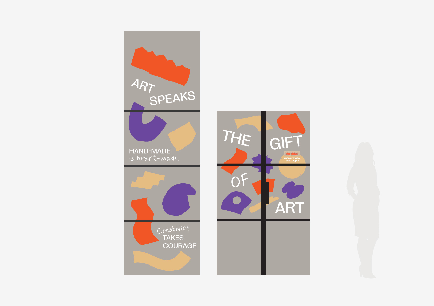
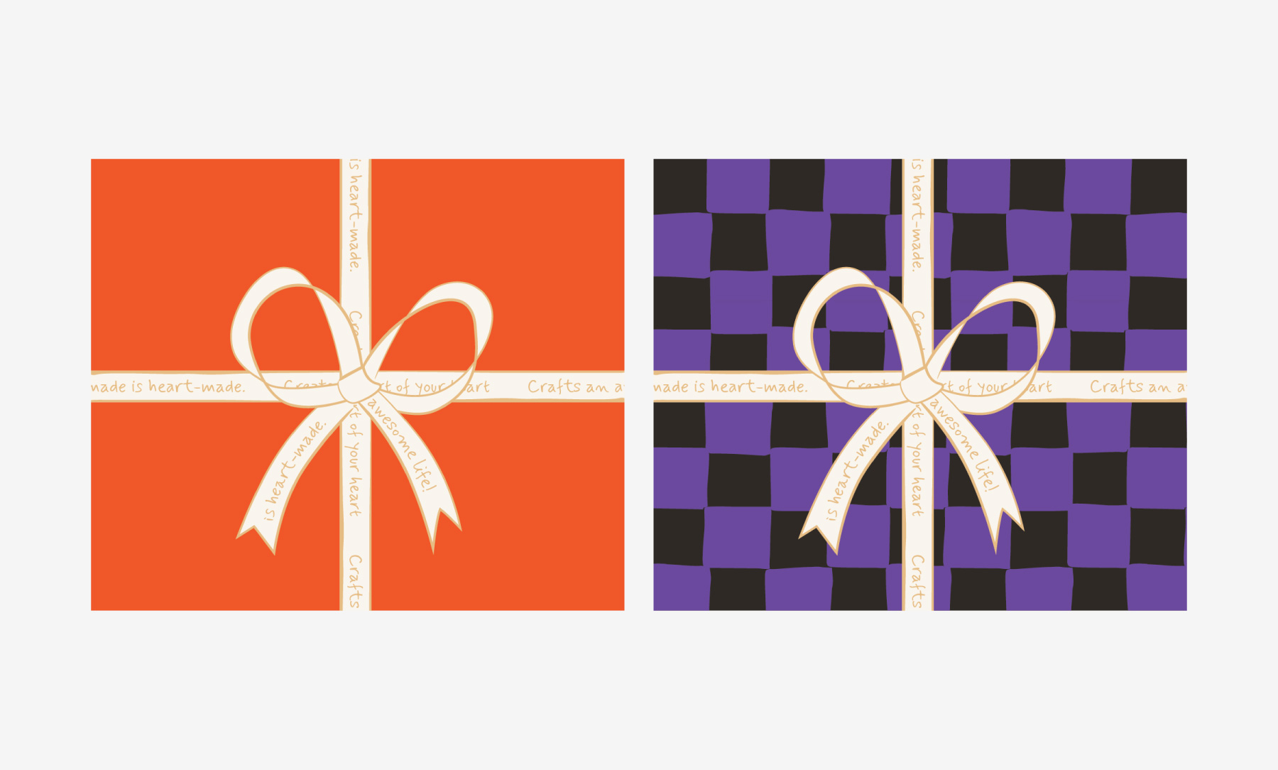
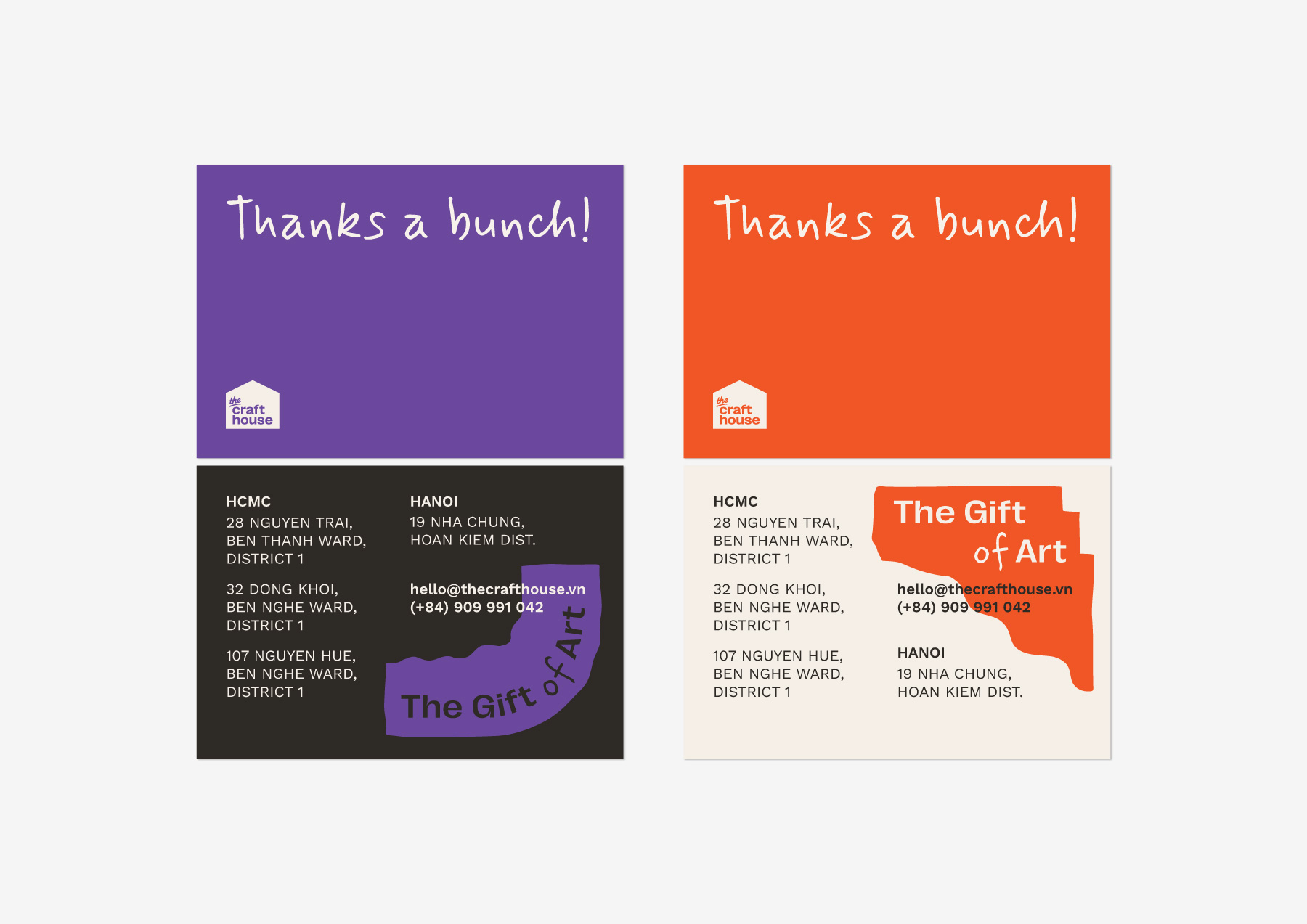
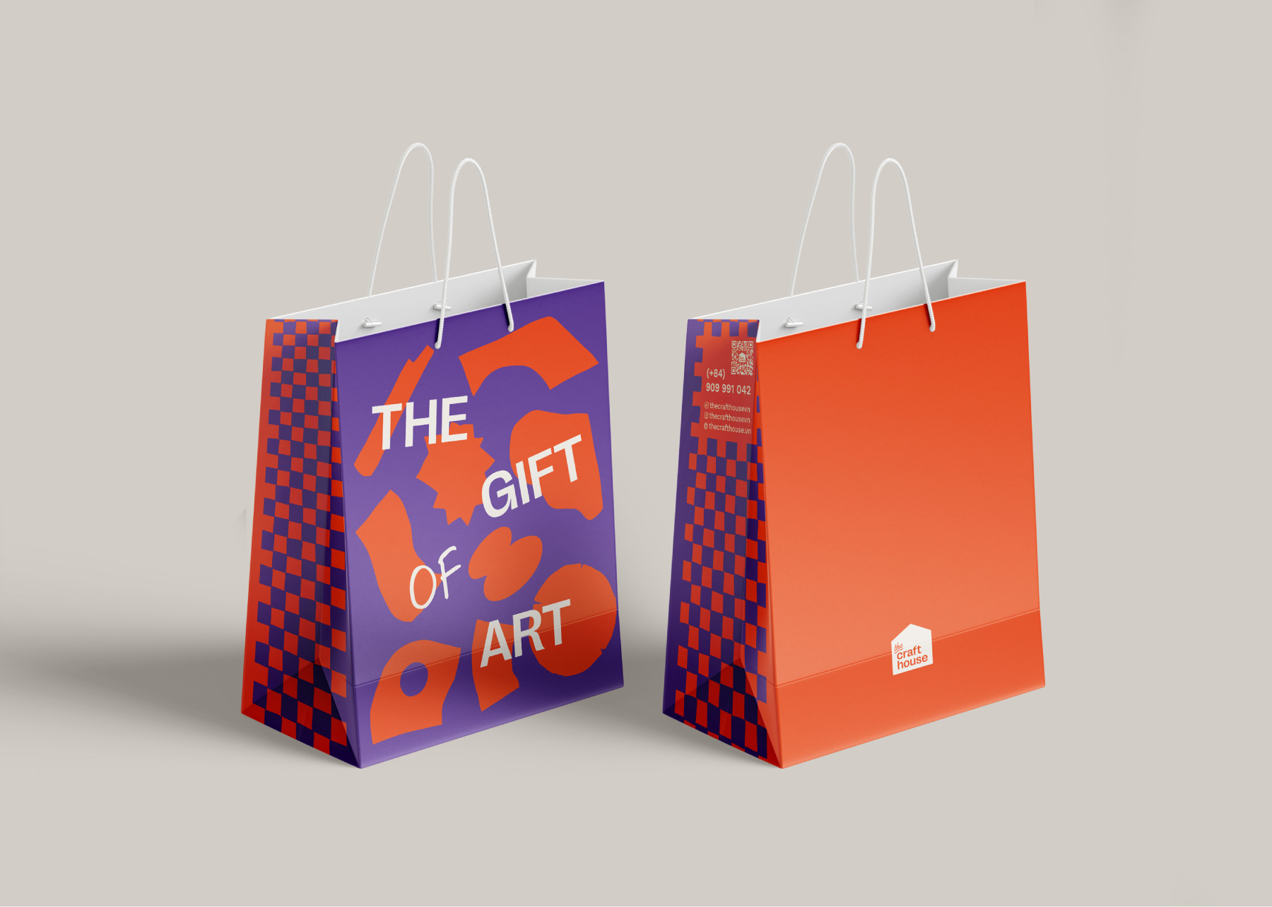
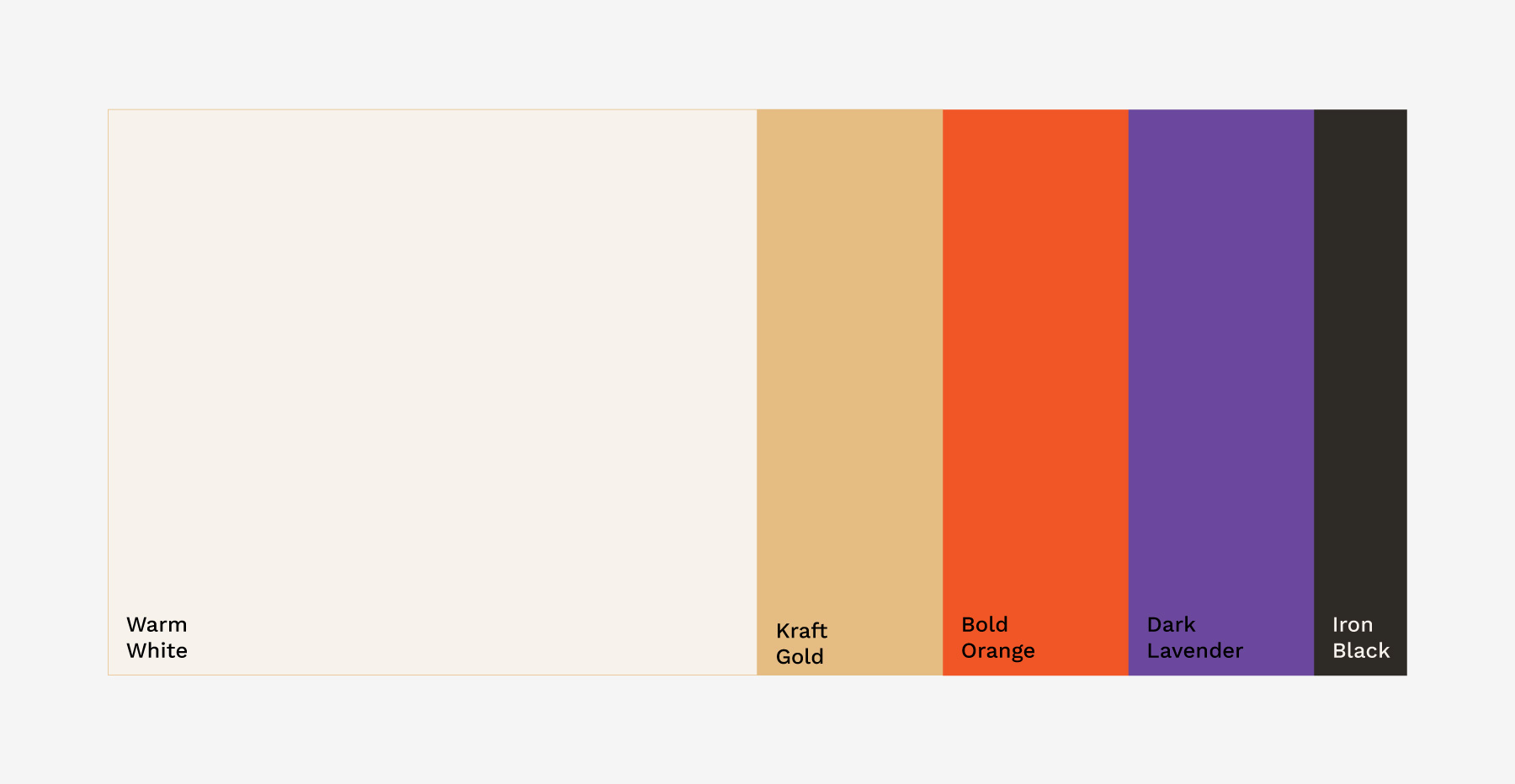
While the signature Bold Orange remained, I introduced a deep, contrasting Dark Lavender. This was not just an aesthetic choice. It was a strategic one. Dark Lavender added a layer of intimacy and romance, allowing the brand to speak to the more personal, emotional side of gifting that the previous identity had overlooked.
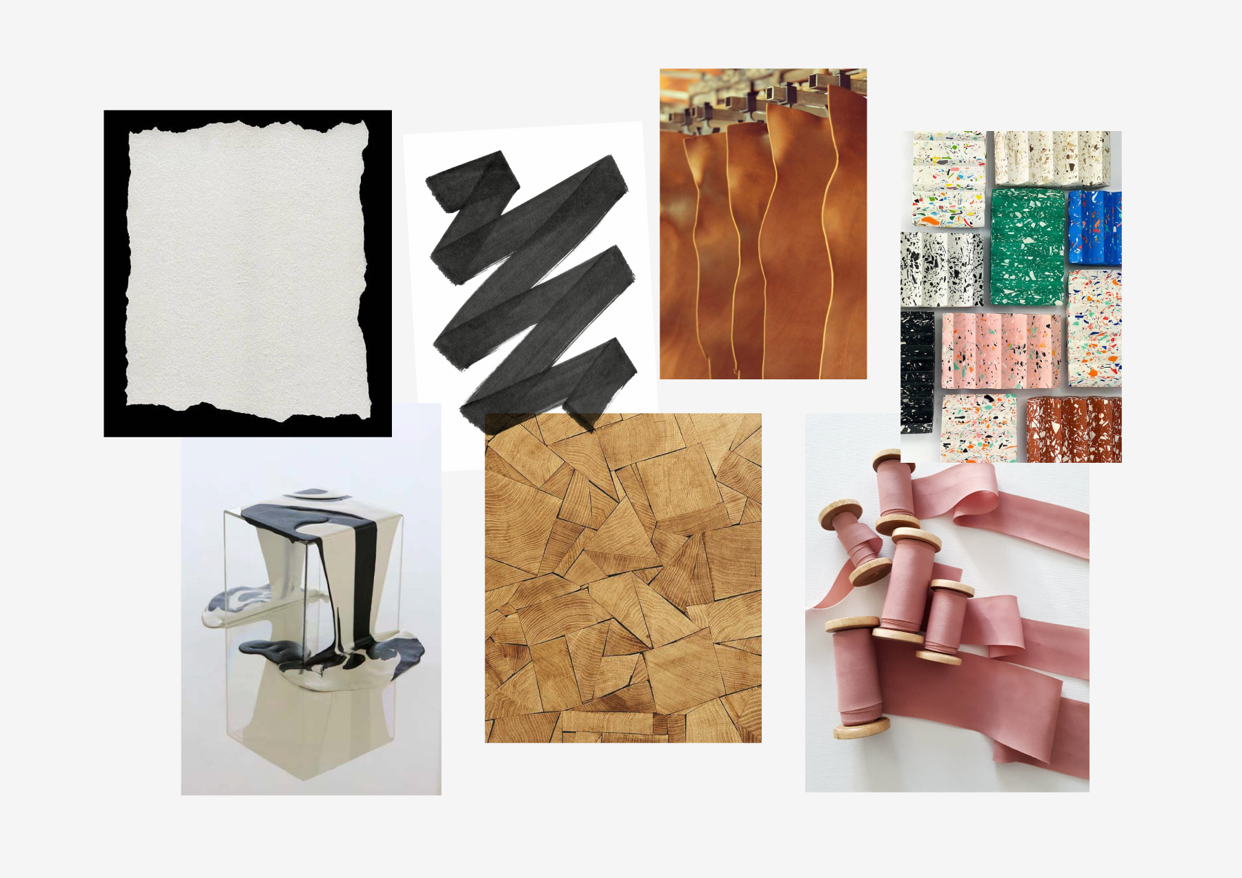
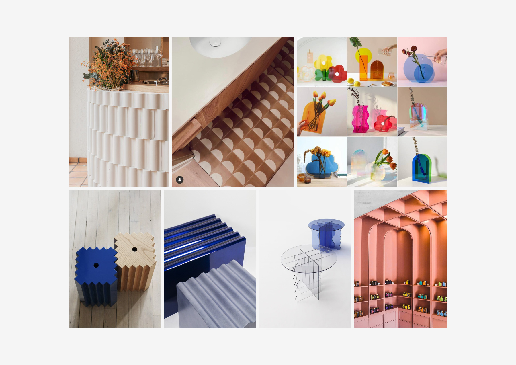
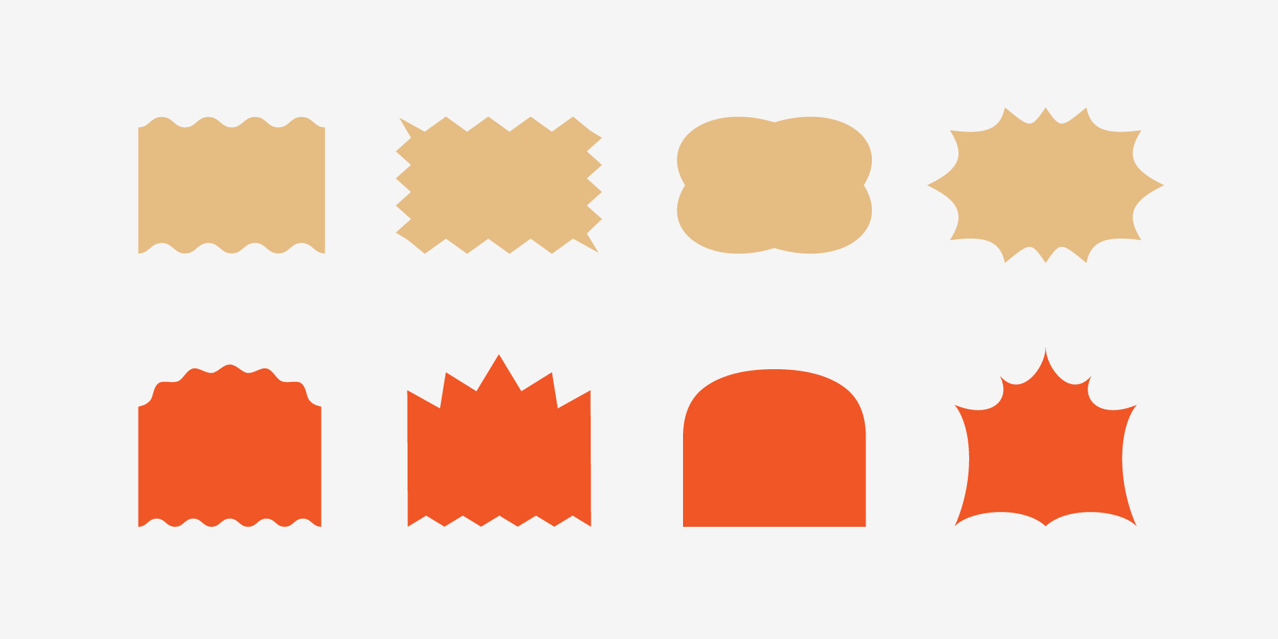
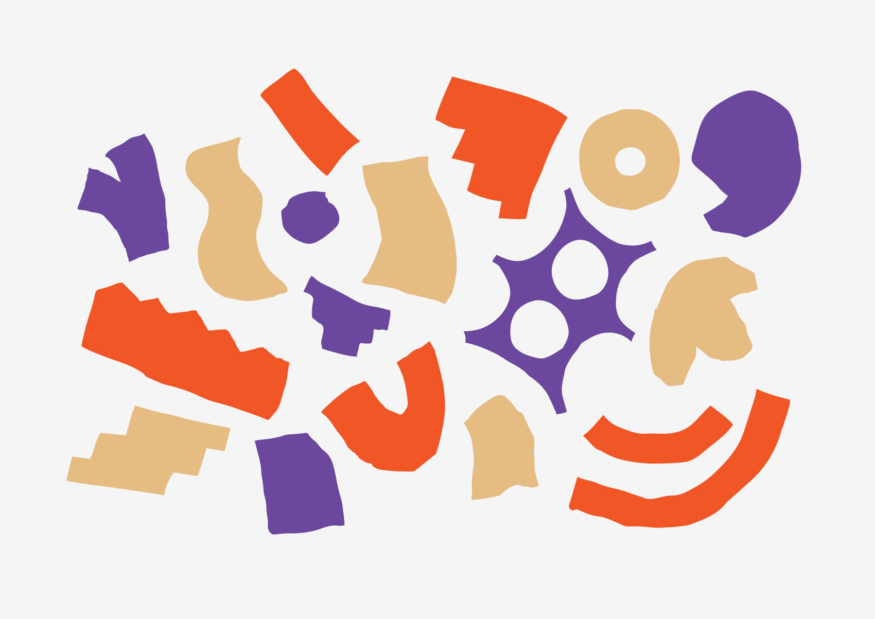
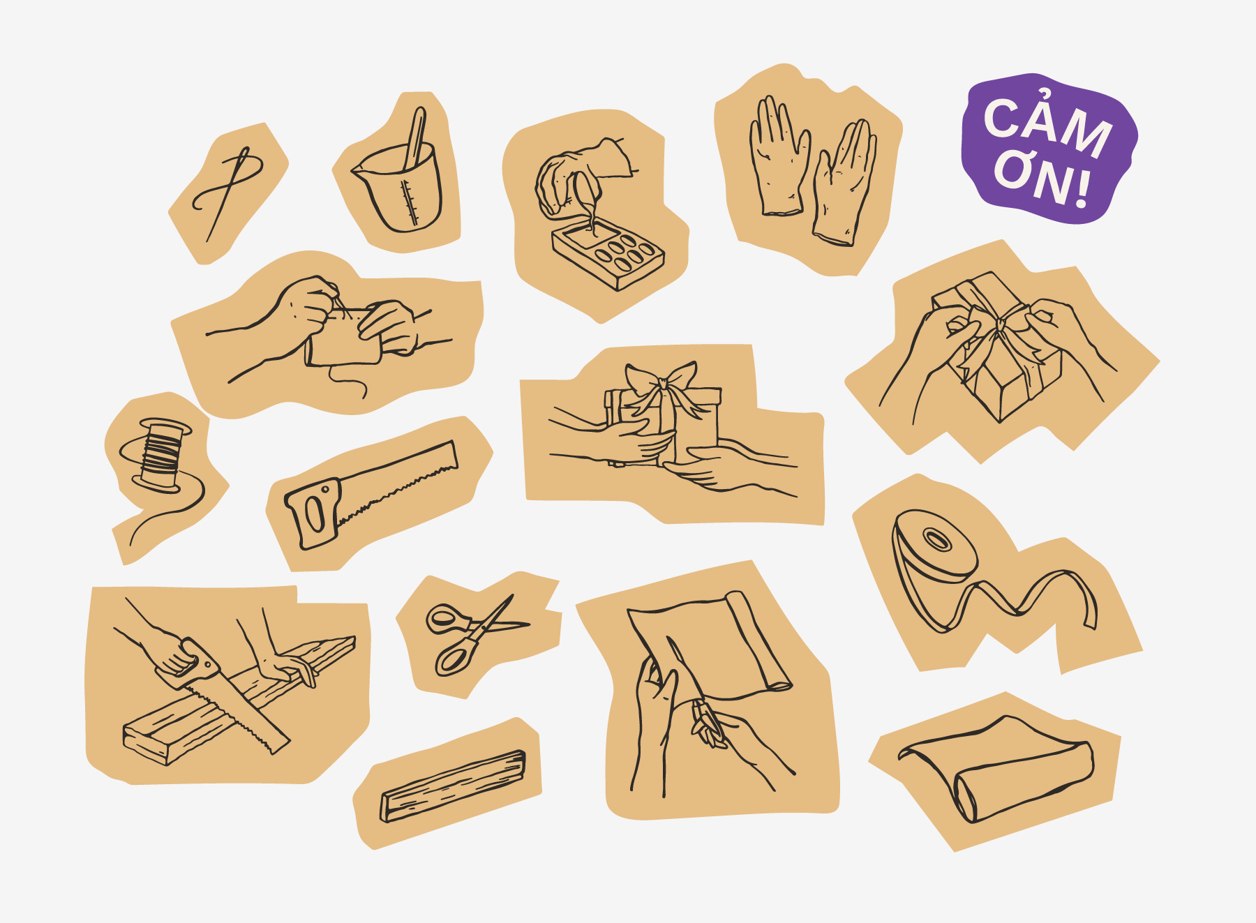
My first instinct was to simplify the diverse product silhouettes into geometric, rhythmic lines. I wanted a "rule-based" system that mirrored the store's interior architecture. However, the result felt too clinical, too sharp, and too mechanical for a brand built on human touch. It lacked the warmth of a gift.
I realized the beauty of The Craft House lies in its "perfect imperfection." I pivoted away from rigid geometry and embraced raw, organic visual elements and hand-drawn illustrations. By keeping the lines "unpolished," we captured the tactile spirit of the craftsmen themselves.